Skip to content
  • Unlock Pro
  • Log in with GitHub
Profile
OverviewSolutions
16
Comments
1

Elisabeth Erkekoglou

@elic4vetAllemagne180 points

I'm a Software Engineer specializing in Javascript. My currently interests include : Python, JavaScript Frameworks and Agile Agile development methodologies. You can check of my projects on my GitHub profile : https://github.com/elic4vet.

Latest solutions

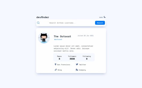
  • Devfinder


    Elisabeth Erkekoglou•180
    Submitted 12 months ago

    0 comments
  • Recipe page


    Elisabeth Erkekoglou•180
    Submitted over 1 year ago

    0 comments
  • Social-proof page


    Elisabeth Erkekoglou•180
    Submitted almost 2 years ago

    1 comment
  • Age calculator


    Elisabeth Erkekoglou•180
    Submitted almost 2 years ago

    1 comment
  • Article preview component solution


    Elisabeth Erkekoglou•180
    Submitted almost 2 years ago

    1 comment
  • Profile preview card with Html and Css


    Elisabeth Erkekoglou•180
    Submitted almost 2 years ago

    1 comment
View more solutions

Latest comments

  • Asim Amir•300
    @AsimAmir1
    Submitted almost 2 years ago

    Product Preview Card Component

    1
    Elisabeth Erkekoglou•180
    @elic4vet
    Posted almost 2 years ago

    Hello, you did a great work on this chalenge. There are just a few things that you could change. As i see in your code, you only use the mobile picture and not the desktop picture + the mobile picure. In this challenge we need to use both pictures. Your current main image overflows on the desktop version and it does not work properly.

    So that means that each image needs to be added with a specific class + alt :

    <img src="/images/image-product-desktop.jpg" alt="desktop-image" class="desktop-image" /> <img src="images/image-product-mobile.jpg" alt="mobile-image" class="mobile-image" />

    When a desktop device visits the page the mobile picture must NOT be displayed: .mobile-image { display: none; }

    I personnaly used for the desktop image the following settings:

    .desktop-image { width: 100%; height: 100%; border-top-left-radius: 10px; border-bottom-left-radius: 10px; border-radius: 0.5rem 0 0 0.5rem; }

    And later to block the desktop image for the mobile devices : I used media queries :

    @media (max-width: 767px) { .desktop-image { display: none; }

    .mobile-image { display: inline-block; } }

    Have you thought about using display : flex / grid ? So that you can have two columns ? i used for my container : .container { display: grid; grid-template-columns: 1fr 1fr; } And for the body { body display: flex; flex-direction: column; align-items: center; justify-content: center; min-height: 100vh; }

    Hope this helps you a little bit :)
Frontend Mentor logo

Stay up to datewith new challenges, featured solutions, selected articles, and our latest news

Frontend Mentor

  • Unlock Pro
  • Contact us
  • FAQs
  • Become a partner

Explore

  • Learning paths
  • Challenges
  • Solutions
  • Articles

Community

  • Discord
  • Guidelines

For companies

  • Hire developers
  • Train developers
© Frontend Mentor 2019 - 2025
  • Terms
  • Cookie Policy
  • Privacy Policy
  • License

Oops! 😬

You need to be logged in before you can do that.

Log in with GitHub

Oops! 😬

You need to be logged in before you can do that.

Log in with GitHub

Oops! 😬

You need to be logged in before you can do that.

Log in with GitHub

Oops! 😬

You need to be logged in before you can do that.

Log in with GitHub

Oops! 😬

You need to be logged in before you can do that.

Log in with GitHub

Oops! 😬

You need to be logged in before you can do that.

Log in with GitHub

Oops! 😬

You need to be logged in before you can do that.

Log in with GitHub

Oops! 😬

You need to be logged in before you can do that.

Log in with GitHub

Oops! 😬

You need to be logged in before you can do that.

Log in with GitHub

Oops! 😬

You need to be logged in before you can do that.

Log in with GitHub

Oops! 😬

You need to be logged in before you can do that.

Log in with GitHub

Oops! 😬

You need to be logged in before you can do that.

Log in with GitHub

Oops! 😬

You need to be logged in before you can do that.

Log in with GitHub

Oops! 😬

You need to be logged in before you can do that.

Log in with GitHub

Oops! 😬

You need to be logged in before you can do that.

Log in with GitHub

Oops! 😬

You need to be logged in before you can do that.

Log in with GitHub