Not Found
Not Found
Not Found
Not Found
Not Found
Not Found
Not Found
Not Found
Not Found
Not Found
Not Found
Not Found
Not Found
Not Found
Not Found
Not Found
Not Found
Not Found
Not Found
Not Found

All comments

  • Travolgi 🍕 31,500

    @denielden

    Submitted

    Hi there! 😀

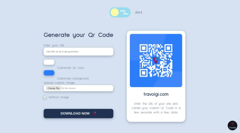
    This is my advanced solution for the Qr Code Component. This app generates Qr Code based on the url entered.

    Added features:

    • Light / dark mode theme switcher
    • Dark color customization
    • Font customization
    • Qr Code DenielDen profile link default on loading
    • Dynamically generating the Qr Code as you type the URL
    • Dynamically update the color and background of the Qr Code
    • Dynamically update the customized image of the Qr Code
    • Removes the custom image of the Qr Code
    • You can download the .png of the generated Qr Code

    Any feedback and advice are welcome!

    Happy coding 😁

    React QR Code Generator

    #react#accessibility

    3

    @elidakirigo

    Posted

    Impressive!!! DENIEL DEN 😀

    1
  • @elidakirigo

    Posted

    hello there EXCUUSEMOI! I think you've done a pretty great job there. (thumbs up)

    I have noted the top and bottom light blue images are missing from your part of the image, I would suggest using before or after tag attributes to get them placed on the body of your code, using background color and background image may be of help too.

    thanks, happy coding :)

    0
  • @elidakirigo

    Posted

    hello there! MOHAMED. you've done a pretty great job completing the challenge. (thumbs up)

    -> I'd like to add that you can use background-image, and background color to get both into one div setting or combine them with background: image then color; -> use HTML semantics such as main, footer, or nav to avoid accessibility errors and make it readable to others.

    thanks.

    Marked as helpful

    1
  • Daniel 330

    @daniel-web-developer

    Submitted

    I don't know if the measurements are right, and the text size certainly isn't, but I liked the result. I think it looks similar enough and hopefully I can call it a success for a first project.

    @elidakirigo

    Posted

    it looks awesome, its like a twin to the original

    0
  • @elidakirigo

    Posted

    hi Emtiaz!

    the attention to detail is quite on point!

    nice!

    I can suggest

    1. Reduce the blockquote font to 500 of font-weight to match the original design.
    2. Change the box shadow from the buttons to the profile image.

    to reduce accecibility errors try putting all content on a main tag like <main> or <header> or <footer>

    Marked as helpful

    0
  • @elidakirigo

    Posted

    i did box-shadow: 0px 25px 24px -10px rgba(132, 132, 132, 0.372);

    Marked as helpful

    0