


@eslamwaleed1
Hi! I'm Elizabeth, a web developer and user advocate from Oklahoma City, OK. I love all things product and design, and am constantly looking to upskill. In my spare time I enjoy riding my scooter with my dog, reading fantasy novels, and crafting. Let's connect!
I’m currently learning...At present I am learning React.js and JavaScript DSAs.
Latest solutions
React.js Responsive Mortgage Calculator App
#react#viteSubmitted 9 months agoI would like help with rendering custom error states as shown in the mockup. I made the input fields
requiredbut aside from that it doesn't change the color of the labels when a field is empty.Responsive Product List with Cart using CSS Grid/Flexbox/JavaScript
#accessibilitySubmitted 9 months agoI would like help with the use of the Document Fragment. In my project, I reused a Fragment twice to create the items in the cart and order confirmation and I am wondering if this is a common practice to reuse the Fragment. I feel like when each item is dynamically created my code looks a bit repetitive with the use of
createElementandsetAttributefor each item so I'm wondering if there's a better/cleaner way to go about populating the cart/order confirm modal.FAQ accordion card component made with vanilla JS and flexbox
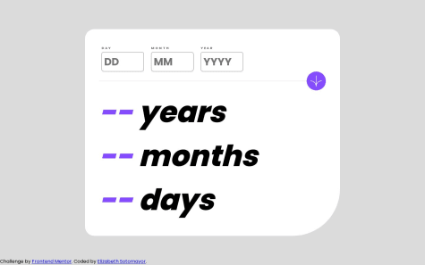
#accessibilitySubmitted almost 2 years agoResponsive age calculator app using vanilla JS and flexbox
#accessibilitySubmitted almost 2 years ago
Latest comments
- @elizabethrsotomayor
Your solution looks great! One suggestion I have would be self-hosting your fonts using google-webfonts-helper rather than downloading fonts, which will allow your site to be more stable in case the link doesn't work for whatever reason. Also, you can use an
aria-labelfor the h1 you have rather than making a whole separate class for it. One more thing, I think yourmainsection needs to have arole. See here. I hope this helps!Marked as helpful - @dupakarovsky@elizabethrsotomayor
Your solution looks nice! I like the hover effect for the links. I'm not familiar with SCSS but the only things I can think of would be to make the links at the top darker and the "new" link headings bolder. Also maybe make the "read more" link a little bit larger with less margin so everything lines up. Great work!


