


@CodexLoop
Latest solutions
Four Card Feature Section using CSS Grid
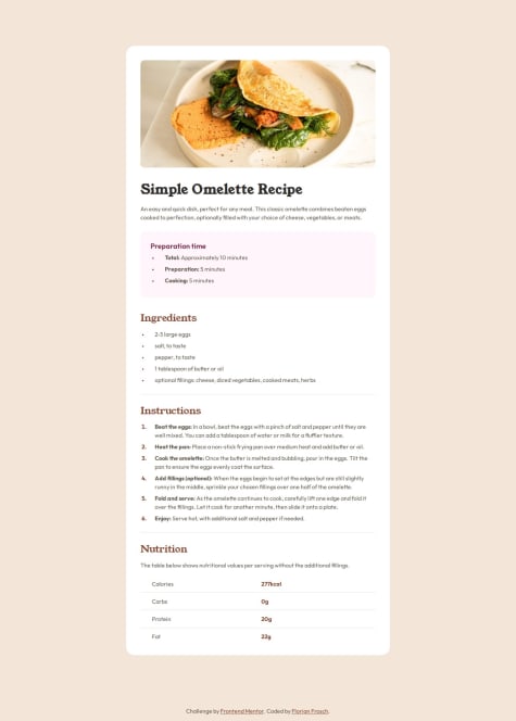
#typescript#vite#vue#tailwind-cssSubmitted about 1 month agoResponsive recipe page | vite, react, typescript, vanilla-extract
#vanilla-extract#vite#reactSubmitted about 1 year agoNothing specifically.
Social links profile | react, emotion, css custom properties
#emotion#react#vite#typescriptSubmitted about 1 year agoNothing specific right now.
Latest comments
- @ffrosch
Nicely done, your page flows well on every screen size! I like how you used
::beforeto add the line to your page numbers.Some things I noticed:
- normal text needs a bigger
line-height - on some sizes your pictures are unevenly distributed over to rows (3,1), fixing that would probably improve your page the most
- the space between number 01 and the pictures is too big
Good job overall, let me know if my feedback was helpful :-)
Marked as helpful - normal text needs a bigger
- P@faisalalmailWhat are you most proud of, and what would you do differently next time?
This project was really challenging with ideas that were not presented in the previous ones. I am proud that I figured how to do each part without using ready codes or libraries.
What challenges did you encounter, and how did you overcome them?Hero images positioning was the biggest challenge, I have done a lot of research, trial and error to reach the final desired results
What specific areas of your project would you like help with?my CSS code looks ugly, how would you refine it in the finalization phase?
@ffroschWell done, your design flows nicely!
Some things I noticed:
- your number-sections are not centered and their width and height is commented out, making the circles way to large
- the text of your hero section is not padded left and right, so that the images get to close to it on tablet sized viewports
Some thoughts concerning CSS:
- iterations help: do multiple small projects and try to improve on one thing each time, over the long run it gets easier to write cleaner and more maintainable CSS
- check out Andy Bell – Be the browser’s mentor, not its micromanag, his approach to styling makes tons of sense and leverages the cascading properties of CSS super nicely
- the basic idea is: define some general rules that enable the browser to do most of the heavy lifting. Add some broad classes (like card, article, etc.). Only focus on the big stuff until now, like display-mode, margin, padding, text sizes, max-width, etc. Your page should look pretty viewable already (everything is structured nicely and the general logic of the flow is obvious). Only now start to add more specific rules and styling where necessary.
- not sure whether you are already doing this, but it's usually good to start with the mobile design first and only after that is decent enough see how you can extend it to work well on desktop
- extend your usage of custom variables and try out a framework for utility classes. I really like using tailwind, because it helps me leverage my custom properties, too
- on more thing: Using CSS custom properties like this is a waste can help making your most specific classes more maintainable
Hope my thoughts on CSS are helpful, let me know if you would need more specific advise!
Marked as helpful - @CodexLoop@ffrosch
The link to your live preview is broken at the moment :-(
Marked as helpful - P@rizkicaandra@ffrosch
Well done! Your code looks clean and straightforward.
In the middle and largest screen sizes your layout is a bit stretched. You could add more media queries and a max width to fix that :-)
Marked as helpful - @mickael-o3oWhat are you most proud of, and what would you do differently next time?
I like to use css grid to build responsive layout.
@ffroschNice usage of the CSS BEM naming convention as well as your usage of semantic html elements.
Suggested improvements:
- replace your "section" element inside the card with a "p" element. According to W3C's HTML documentation: "A section is a thematic grouping of content, typically with a heading." (kind of similar to how an article would be used, but maybe with a broader scope)
- for the colored top of the card you can use the css "border-color" and "border-top-width" attributes on the card itself instead of creating an extra div
Marked as helpful - @codesigner-jmkWhat are you most proud of, and what would you do differently next time?
I am proud that I could write this code entirely with Tailwind, as this is my very first Tailwind project.
What challenges did you encounter, and how did you overcome them?Tailwind took a while to understand, but it became okay once I understood the order and how the breakpoints worked.
@ffroschGood job, you nailed the design and used tailwind well!
If you stick with tailwind and use it with a bundler, make sure to check out custom themes :)
Marked as helpful


