Skip to content
Explore
For companies
Unlock
Pro
Log in
with GitHub
Profile
Overview
Solutions
8
Comments
0
Francisco Prado
@franciscoprado4
Follow
All solutions
Social card rating kind of | CSS and a lot of work.
Francisco Prado
•
80
Submitted about 3 years ago
0 comments
1 like
profile card component main | css and media-queries
#bem
Francisco Prado
•
80
Submitted about 3 years ago
1 comment
3 likes
3-column card challenge - Grid & Flexbox involved.
Francisco Prado
•
80
Submitted about 3 years ago
2 comments
3 likes
Interactive card component made with css and js
Francisco Prado
•
80
Submitted about 3 years ago
1 comment
4 likes
Stats preview component - Flexbox , Grid , Media queries
Francisco Prado
•
80
Submitted about 3 years ago
1 comment
4 likes
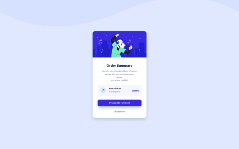
Order Summary challenge - Flexbox and Grid
Francisco Prado
•
80
Submitted about 3 years ago
5 comments
3 likes
Nft card component - challenge - Flexbox and some inspiration
Francisco Prado
•
80
Submitted over 3 years ago
1 comment
6 likes
Qr code component - First Challenge
Francisco Prado
•
80
Submitted over 3 years ago
1 comment
2 likes
Oops! 😬
You need to be logged in before you can do that.
Log in
with GitHub
Oops! 😬
You need to be logged in before you can do that.
Log in
with GitHub
Oops! 😬
You need to be logged in before you can do that.
Log in
with GitHub
Oops! 😬
You need to be logged in before you can do that.
Log in
with GitHub
Oops! 😬
You need to be logged in before you can do that.
Log in
with GitHub
Oops! 😬
You need to be logged in before you can do that.
Log in
with GitHub
Oops! 😬
You need to be logged in before you can do that.
Log in
with GitHub
Oops! 😬
You need to be logged in before you can do that.
Log in
with GitHub
Oops! 😬
You need to be logged in before you can do that.
Log in
with GitHub
Oops! 😬
You need to be logged in before you can do that.
Log in
with GitHub
Oops! 😬
You need to be logged in before you can do that.
Log in
with GitHub
Oops! 😬
You need to be logged in before you can do that.
Log in
with GitHub
Oops! 😬
You need to be logged in before you can do that.
Log in
with GitHub
Oops! 😬
You need to be logged in before you can do that.
Log in
with GitHub
Oops! 😬
You need to be logged in before you can do that.
Log in
with GitHub
Oops! 😬
You need to be logged in before you can do that.
Log in
with GitHub
Oops! 😬
You need to be logged in before you can do that.
Log in
with GitHub