


@dombrga
Latest solutions
Latest comments
- @gccavalheiro
Hello Dom, you can do it in an easy way using this way
<footer>
  <p>Text Here</p>
</footer>
footer { display: flex; align-items: center; justify-content: center; position: fixed; left: 0; bottom: 0; width: 100%; padding: 28px 0; text-align: center; line-height: 23px; } footer p { padding: 0 20px; }Marked as helpful - @catherineisonline@gccavalheiro
Good work! a fine tuning tip if you want to do it...
in your
<div class="container-image">add the following properties in css:border-radius: 5px;,overflow: hidden;andline-height: 0;you can remove the "border-radius" from your tag
<img class="main-image" />the code I indicated will make the children respect the format of the parent div(container-image) with this both its overlay and the image have rounded edges, the "line-height" will make its image and its overlay have a better framing, thus removing that difference in sizes that is at the bottom, "a small space"
- @atomia11@gccavalheiro
Here's an example, you could create an "overlay" div after the image and its initial state would be "opacity: 0" and when the user hovers over the container where the image is, you would apply the "opacity: 1"
- HTML
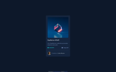
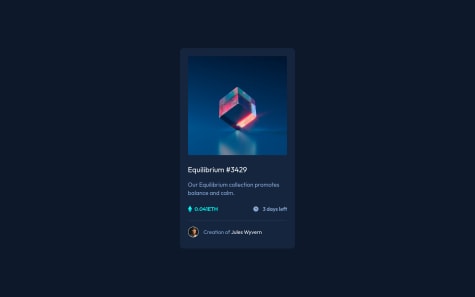
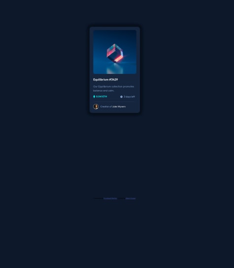
<div class="card-img"> <img src="./assets/images/image-equilibrium.jpg" alt="Image Equilibrium" /> <div class="card-image-overlay"> <img src="assets/images/icon-view.svg" alt="Icon View"> </div> </div>- CSS
.card-img { width: 100%; border-radius: 8px; overflow: hidden; line-height: 0; position: relative; } .card-img img{ object-fit: cover; } .card-image-overlay{ display: flex; align-items: center; justify-content: center; position: absolute; top: 0; bottom: 0; left: 0; right: 0; height: 100%; width: 100%; cursor: pointer; opacity: 0; background-color: hsl(178, 100%, 50%, .5); transition: .3s; } .card-image-overlay img { width: 48px; } .card-img:hover .card-image-overlay { opacity: 1; } - @Nishant-afk@gccavalheiro
Analyzing your code, in the part where you talk about coin and days, you could use the flex box,
Example:
- HTML
<div class="body-info"> <div class="coin"> <img src="./assets/images/icon-ethereum.svg" alt="Icon Ethereum"> 0.041 ETH </div> <div class="days-left"> <img src="./assets/images/icon-clock.svg" alt="Icon Clock"> 3 days left </div> </div>- CSS
This code will make the child divs next to each other on the same "line", position the children to the far edge of the parent div, and center the children on the Y axis.
.body-info {
    display: flex;
    flex-direction:row;
    align-items: center;
    justify-content: space-between;
}
This code will make the icons and text stay on the same "line" and centered on the Y axis, using "flex: 1" will make the divs take up all the remaining space, as we have 2 "coin" and "days" divs -left", both will have 50% occupation of the parent div
.body-info .days-left {
    display: flex;
    align-items: center;
    flex: 1 or width: 100%;
}
to perform the separation line I advise using an empty div or using the <hr/>
<hr class="divider"/>.divider { margin: 24px 0 16px; border-top: 2px solid #FFF; }*The code above is a short syntax that means:
margin-top: 24px;margin-right: 0;margin-bottom: 16px;margin-left: 0;To create the avatar, using the same flex box technique makes it simple
<div class="card-avatar">
    <div class="avatar-image">
        <img src="./assets/images/image-avatar.png" alt="Image Avatar" />
    </div>

    <div class="avatar-text">
        Creation of<a href="#">Jules Wyvern</a>
    </div>
</div>
.card-avatar { display: flex; align-items: center; width: 100%; } .card-avatar .avatar-image { width: 32px; min-width: 32px; height: 32px; min-height: 32px; border: 2px solid var(--white); border-radius: 50%; overflow: hidden; margin-right: 16px; } .card-avatar .avatar-image img { object-fit: cover; } .card-avatar .avatar-text { color: var(--primary-soft-blue); letter-spacing: .6px; }*To make a good avatar icon, I advise using a div and inside that div insert the user's image, with that you can use the css property
object-fit: cover, making the image fit according to the size of the div fatherMarked as helpful