Skip to content
  • Unlock Pro
  • Log in with GitHub
Profile
OverviewSolutions
13
Comments
8

Elevate

@i7ector220 points

Writing code one line at a time

Latest solutions

  • Four Card Layout Glassmorphism Edition


    Elevate•220
    Submitted over 2 years ago

    1 comment
  • Responsive Huddle Landing Page Solution


    Elevate•220
    Submitted over 2 years ago

    1 comment
  • Responsive Social Proof Section Solution


    Elevate•220
    Submitted over 2 years ago

    0 comments
  • Responsive Stats Preview Card Component Solution


    Elevate•220
    Submitted over 2 years ago

    0 comments
  • Responsive Profile Card Component Solution


    Elevate•220
    Submitted over 2 years ago

    0 comments
  • Responsive Order Summary Component Solution


    Elevate•220
    Submitted over 2 years ago

    0 comments
View more solutions

Latest comments

  • filecc•470
    @filecc
    Submitted over 2 years ago

    Four Feature Card (Bootstrap & Tailwind)

    #bootstrap#tailwind-css
    1
    Elevate•220
    @i7ector
    Posted over 2 years ago

    @filecc good job on completing the challenge!

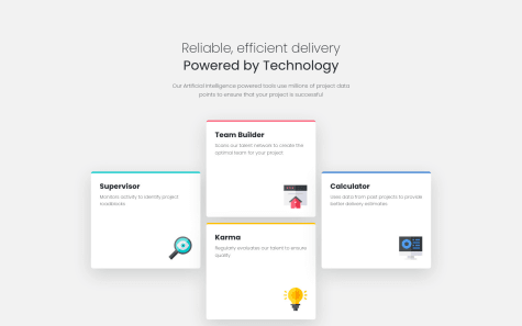
    Some things to consider to improve your solution for the desktop view:

    • increase the font size for the heading and sub heading
    • add some margin to the left and right on the first and fourth box
    • decrease the overall size of the boxes

    Hope this helps good luck and happy coding :)

    Marked as helpful
  • SachithKarunathilake•140
    @SachithKarunathilake
    Submitted over 2 years ago

    Product preview card component

    2
    Elevate•220
    @i7ector
    Posted over 2 years ago

    Good work @SachithKarunathilake!

    regarding your question above, the way you did works as there is many ways to achieve the same result when it comes to coding.

    things to consider...

    display: none;

    • removes the element from the page view
    • code for the hidden element is still present
    • element itself will not be displayed
    • will not take up any space
    .example-element {
      display: none;
    }
    

    visibility: hidden;

    • removes the element from the page view
    • element will still take up space on the page
    .example-element {
      visibility: hidden;
    }
    

    hope this helps! good luck and happy coding :)

    Marked as helpful
  • Atharva Gaikwad•70
    @Atharva-0710
    Submitted over 2 years ago

    Single Price Grid using pure HTML and CSS

    1
    Elevate•220
    @i7ector
    Posted over 2 years ago

    Great work @Atharva-0710!

    from looking at your design and code I can see that it's not responsive, so if you would like to improve on the work you have done then you can make it responsive using CSS media queries.

    you can checkout the link below to have a better understanding of it if you like.

    Media Queries / Responsive Design Examples

    also regarding the accessibility errors you can change the h3 to h2 and the font size and other properties in your css.

    hope you find this useful! good luck & happy coding :)

  • Ananda Putra Azril Al Kariko•230
    @putracode354
    Submitted over 2 years ago

    three column preview

    1
    Elevate•220
    @i7ector
    Posted over 2 years ago

    Good work @putracode354!

    here are few things you can do to make your design and code better.

    to fix the error with the divs you need to remove the href="#" from your code in your HTML. look at the examples below:

    <div href="#" class="example example1">
      example 1 - hrefs are not used in divs
    </div> 
    <div class="example example2">
     example 2 - how it should be
    </div> 
    <div id="exampleid" class="example example3">
     example 3 - you can have a id and a class in the div
    </div> 
    

    you can add a border radius to round the corners of the main card in your CSS. look at the example below:

    .main-card-example {
       border-radius: 15px;
    }
    

    you can also add a background color for this project in your CSS. look at example below:

    body {
      background-color: hsl(0, 0%, 95%);
    }
    

    hope this helps, good luck and happy coding :)

  • Mayck Luciano•220
    @MayckL2
    Submitted over 2 years ago

    Javascript and css to make it responsive and computable.

    #bootstrap#sass/scss
    1
    Elevate•220
    @i7ector
    Posted over 2 years ago

    Good try @MayckL2!

    here's something that will make your forms look much better.

    HTML example:

    <div class="insert-name">
    <label>Name</label>
      <input type="text" placeholder="e.g Stephen King" required />
    <label>Email Address</label>
      <input type="text" placeholder="e.g stephanking@lorem.com" required />
    <label>Phone Number</label>
      <input type="text" placeholder="e.g +1 234567890" required />
    </div>
    

    by adding the placeholder in the input tag you'll be able to display any text and when an user goes to type they don't need to get rid of the old text before being able to input info.

    then you can go into your css style file and target the placeholder and customise it to your liking.

    CSS Styles example:

    .insert-name input::placeholder {
      font-weight: bold;
      color: #000000;
      opacity: 0.5;
    }
    

    so you select the div and then you select the input tag in that div and then :placeholder in the above example you'll be able to style the placeholder, for example you'll be able to change the text color, font-size, weight and the main thing is the opacity which you can do 0.5 and or 50% to achieve the look and functionality in the design you built above.

    hope this helps! good luck and happy coding :)

    Marked as helpful
  • Tian•410
    @TianYeCal
    Submitted over 2 years ago

    results-summary

    2
    Elevate•220
    @i7ector
    Posted over 2 years ago

    Also, regarding the circle not working properly here are a few ways to fix the issue:

    you can try from some of the examples below:

    code that's required in html

    div class="insert-name"></div>
    

    or

    <span class="insert-name"></span>
    

    then in your css styles file use the following properties:

    .insert-name {
      width: 150px;
      height: 150px;
      background: linear-gradient(180deg, hsla(256, 72%, 46%, 1), hsla(241, 72%, 46%, 0));
      border-radius: 50%;
      display: inline-block;
    

    you can adjust some of the properties to your needs of course like the width, height and colors etc...

    let me know if this helped good luck and have fun :)

    Marked as helpful
View more comments
Frontend Mentor logo

Stay up to datewith new challenges, featured solutions, selected articles, and our latest news

Frontend Mentor

  • Unlock Pro
  • Contact us
  • FAQs
  • Become a partner

Explore

  • Learning paths
  • Challenges
  • Solutions
  • Articles

Community

  • Discord
  • Guidelines

For companies

  • Hire developers
  • Train developers
© Frontend Mentor 2019 - 2025
  • Terms
  • Cookie Policy
  • Privacy Policy
  • License

Oops! 😬

You need to be logged in before you can do that.

Log in with GitHub

Oops! 😬

You need to be logged in before you can do that.

Log in with GitHub

Oops! 😬

You need to be logged in before you can do that.

Log in with GitHub

Oops! 😬

You need to be logged in before you can do that.

Log in with GitHub

Oops! 😬

You need to be logged in before you can do that.

Log in with GitHub

Oops! 😬

You need to be logged in before you can do that.

Log in with GitHub

Oops! 😬

You need to be logged in before you can do that.

Log in with GitHub

Oops! 😬

You need to be logged in before you can do that.

Log in with GitHub

Oops! 😬

You need to be logged in before you can do that.

Log in with GitHub

Oops! 😬

You need to be logged in before you can do that.

Log in with GitHub

Oops! 😬

You need to be logged in before you can do that.

Log in with GitHub

Oops! 😬

You need to be logged in before you can do that.

Log in with GitHub

Oops! 😬

You need to be logged in before you can do that.

Log in with GitHub

Oops! 😬

You need to be logged in before you can do that.

Log in with GitHub

Oops! 😬

You need to be logged in before you can do that.

Log in with GitHub

Oops! 😬

You need to be logged in before you can do that.

Log in with GitHub

Oops! 😬

You need to be logged in before you can do that.

Log in with GitHub

Oops! 😬

You need to be logged in before you can do that.

Log in with GitHub

Oops! 😬

You need to be logged in before you can do that.

Log in with GitHub

Oops! 😬

You need to be logged in before you can do that.

Log in with GitHub

Oops! 😬

You need to be logged in before you can do that.

Log in with GitHub

Oops! 😬

You need to be logged in before you can do that.

Log in with GitHub

Oops! 😬

You need to be logged in before you can do that.

Log in with GitHub

Oops! 😬

You need to be logged in before you can do that.

Log in with GitHub

Oops! 😬

You need to be logged in before you can do that.

Log in with GitHub

Oops! 😬

You need to be logged in before you can do that.

Log in with GitHub

Oops! 😬

You need to be logged in before you can do that.

Log in with GitHub

Oops! 😬

You need to be logged in before you can do that.

Log in with GitHub

Oops! 😬

You need to be logged in before you can do that.

Log in with GitHub

Oops! 😬

You need to be logged in before you can do that.

Log in with GitHub

Oops! 😬

You need to be logged in before you can do that.

Log in with GitHub