Skip to content
  • Unlock Pro
  • Log in with GitHub
Profile
OverviewSolutions
8
Comments
7

Karen Robertson

@indigoroseLondon190 points

Hi, I am an aspiring developer, looking for new projects to work on.

Latest solutions

  • Testimonial Grid Section


    Karen Robertson•190
    Submitted 10 months ago

    In terms of styling, what I have struggled with is box shadowing. It may be due to my computer set up, but sometimes it hard to see from the design brief photos if you don't have the Figma files yet.

    As this challenge more focused on the ability for page to be responsive, it may be seen as minor detail but in the long run for web design it would be good to know how to gauge it on photos.


    1 comment
  • Four Card Feature Section using flexbox


    Karen Robertson•190
    Submitted 10 months ago

    No particular areas at the moment, if a major refactor is required, it maybe in finding a solution to have the middle cards in the column format without the need for a separate 'wrapper' around them.


    1 comment
  • Product preview card with responsive css


    Karen Robertson•190
    Submitted 10 months ago

    1 comment
  • Responsive recipe page


    Karen Robertson•190
    Submitted 10 months ago

    If there is a better solution to making the image element take the full width of the viewport for small screens without forcing the other elements up and behind the image.


    0 comments
  • Social Links Profile - Using React

    #react#vite

    Karen Robertson•190
    Submitted 11 months ago

    As stated, it looks a like a fairly straightforward design. I don't have access to the Figma files for this so it was by eye.

    If my css styling isn't DRY, please let me some refactoring tips.


    0 comments
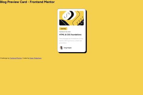
  • Blog Preview Card Solution


    Karen Robertson•190
    Submitted over 1 year ago

    0 comments
View more solutions

Latest comments

  • P
    Marcus•310
    @marcus-hill
    Submitted 10 months ago
    What are you most proud of, and what would you do differently next time?

    My use of CSS grid in order to create the design layout, easily switching between mobile and desktop.

    What challenges did you encounter, and how did you overcome them?

    Wasn't sure initially how to best structure the HTML, but I think it looks good.

    What specific areas of your project would you like help with?

    The responsive nature of my design and the use of CSS grid.

    Testimonials Grid - CSS Grid

    2
    Karen Robertson•190
    @indigorose
    Posted 10 months ago

    This a really good solution to the design brief.

    Even though you mention that you had some difficulty with the HTML structure, your code is clean with helpful comments making it easy to read and understand your design process.

    Maybe in future revisions of the challenge it may provide medium sized designs to help with the transition from smaller to larger desktop screen sizes.

    Look forward to seeing your other solutions from this site.

    Marked as helpful
  • Amneisa•230
    @AmneisaOB
    Submitted 10 months ago

    4 cards section using CSS grid & flexbox

    1
    Karen Robertson•190
    @indigorose
    Posted 10 months ago

    This a very nice solution to the challenge.

    The HTML code uses the correct semantics to help us read and navigate the flow of the page.

    It is accessible using the correct colours within the design brief.

    The use of CSS Grid is easy to read with dry and Block, Element, Modifier (BEM) focused class names allowing for the layout to look good on a variety of screens.

    For the beginner challenges, this is really good and hope to see your other solutions soon.

    Marked as helpful
  • Rafi Rachmawan•210
    @rafirachmawan
    Submitted 10 months ago
    What are you most proud of, and what would you do differently next time?

    learn more about responsive and improve my knowledge in the frontend field

    What challenges did you encounter, and how did you overcome them?

    the challenges I face are a little more difficult on the layout of text images and responsiveness

    What specific areas of your project would you like help with?

    in terms of distance and layout because I didn't get the figma design

    HTML,CSS,and text editor VSCODE

    2
    Karen Robertson•190
    @indigorose
    Posted 10 months ago

    This is a really nice solution to this challenge.

    The HTML is easy to read, however for the next challenge try to extend your use of semantics, such <main> or <section> rather than <div>.

    It helps us to see the flow of the page better and improve accessibility.

    Most use the cheat sheet from the Mozilla MDN site MDN Web Docs Cheat Sheet.

    For the text responsiveness, the clamp() css function has been helpful with sizing responsive text MDN description.

    There is also letter-spacing and line-height in css that will also help with the text design requirements.

    Even without the Figma files, the site is still impressive and meets the responsive requirements.

    Hope to see your other solutions soon.

    Marked as helpful
  • Dharmendra Rathod•260
    @rathoddharmendra
    Submitted 10 months ago
    What are you most proud of, and what would you do differently next time?

    I think sticking to the program helps grow skill step by step

    What challenges did you encounter, and how did you overcome them?
    • I used custom class for horizontal line instead on default element
    • Used css properties li::marker and left padding on list element to define color for list bullet points and spacing

    Built recipe page using HTML and CSS

    1
    Karen Robertson•190
    @indigorose
    Posted 10 months ago

    This is a nice solution and follows the design brief.

    Whilst accessible, the solution does not match the mobile styles.

    It is tricky as I struggled with the mobile styling, however using the body element selector in your css and changing the background-color property will help to remove the white border in your solution and modify with @media when required.

    The code is clear, efficient and reusable. I used the li::marker as well to access the li colour changes.

    As you keep trying other challenges, you will be able to return to this and refactor. Keep going and look forward to seeing your other solutions.

    Marked as helpful
  • Shivendra Parmar•80
    @shivendra-parmar
    Submitted about 1 year ago

    Responsive Social Profile Links using React

    #react#vite
    1
    Karen Robertson•190
    @indigorose
    Posted 10 months ago

    This is a really good solution to the challenge.

    The code is well-structured and readable.

    The use of the useState to map the links and components to manage the card containers allows the code to be efficient and reusable too.

    The styling is also good matching the design brief with the colours and font selection. The page is also responsive.

    Did you use the free images or the Figma file for the styling?

  • P
    clickglue•440
    @clickglue
    Submitted 11 months ago
    What are you most proud of, and what would you do differently next time?

    I'm happy to learn how to better analyze and prepare before I start coding. Also, CSS start to become more predictable if you structure it properly and do less trial-and-error.

    What challenges did you encounter, and how did you overcome them?

    Using flex is a challenge. Also, I'm not sure if I understand the concepts of 'responsive' correctly.

    What specific areas of your project would you like help with?

    How to implement responsive designs.

    Blog preview

    3
    Karen Robertson•190
    @indigorose
    Posted 11 months ago

    This a great solution to the challenge.

    It is clean, responsive to different screen sizes and does not differ to the design.

    The hardest part for me too is planning analysing and visualising your solution especially with grid and flex.

    As you said, good structure makes it easier to understand, and that is evident in your code using main, article and section rather than all div to section your code along with clear class names.

    Look forward to seeing your other solutions.

    Marked as helpful
View more comments

Stay up to datewith new challenges, featured solutions, selected articles, and our latest news

Frontend Mentor

  • Unlock Pro
  • Contact us
  • FAQs
  • Become a partner

Explore

  • Learning paths
  • Challenges
  • Solutions
  • Articles

Community

  • Discord
  • Guidelines

For companies

  • Hire developers
  • Train developers
© Frontend Mentor 2019 - 2025
  • Terms
  • Cookie Policy
  • Privacy Policy
  • License

Oops! 😬

You need to be logged in before you can do that.

Log in with GitHub

Oops! 😬

You need to be logged in before you can do that.

Log in with GitHub

Oops! 😬

You need to be logged in before you can do that.

Log in with GitHub

Oops! 😬

You need to be logged in before you can do that.

Log in with GitHub

Oops! 😬

You need to be logged in before you can do that.

Log in with GitHub

Oops! 😬

You need to be logged in before you can do that.

Log in with GitHub

Oops! 😬

You need to be logged in before you can do that.

Log in with GitHub

Oops! 😬

You need to be logged in before you can do that.

Log in with GitHub

Oops! 😬

You need to be logged in before you can do that.

Log in with GitHub

Oops! 😬

You need to be logged in before you can do that.

Log in with GitHub

Oops! 😬

You need to be logged in before you can do that.

Log in with GitHub

Oops! 😬

You need to be logged in before you can do that.

Log in with GitHub

Oops! 😬

You need to be logged in before you can do that.

Log in with GitHub

Oops! 😬

You need to be logged in before you can do that.

Log in with GitHub

Oops! 😬

You need to be logged in before you can do that.

Log in with GitHub

Oops! 😬

You need to be logged in before you can do that.

Log in with GitHub

Oops! 😬

You need to be logged in before you can do that.

Log in with GitHub

Oops! 😬

You need to be logged in before you can do that.

Log in with GitHub

Oops! 😬

You need to be logged in before you can do that.

Log in with GitHub

Oops! 😬

You need to be logged in before you can do that.

Log in with GitHub

Oops! 😬

You need to be logged in before you can do that.

Log in with GitHub

Oops! 😬

You need to be logged in before you can do that.

Log in with GitHub

Oops! 😬

You need to be logged in before you can do that.

Log in with GitHub

Oops! 😬

You need to be logged in before you can do that.

Log in with GitHub

Oops! 😬

You need to be logged in before you can do that.

Log in with GitHub

Oops! 😬

You need to be logged in before you can do that.

Log in with GitHub

Oops! 😬

You need to be logged in before you can do that.

Log in with GitHub

Oops! 😬

You need to be logged in before you can do that.

Log in with GitHub

Oops! 😬

You need to be logged in before you can do that.

Log in with GitHub

Oops! 😬

You need to be logged in before you can do that.

Log in with GitHub

Oops! 😬

You need to be logged in before you can do that.

Log in with GitHub