@iam-omer-mahdi
Latest solutions
Latest comments
- @jiroRi
Great work especially the animations! Looks really fluid 💖
I just found an issue though, if you refresh a page on a subpage, it returns an error. It would be great if you can find a solution to this.
Other than that, overall this is an excellent work! Keep it up 💪✨
- @manoj-jayapprakash@jiroRi
Hi Manoj!
You can add them as is(svg) or using a
divbut the most important part is to learn all about thepositionproperty in CSS. I also recommend you to look up and learn how to implementbox-shadowsin CSS.These are my preferred sources(the CSS
positionproperty topic):- Fun and Easy-to-learn from: Dev Ed
- Straightforward and Serious: Web Dev Simplified
- Learn from the CSS Master: Kevin Powell
You can also pick out a resource of your choice in the Frontend Mentor's Resources page. There are quite a lot to choose from 👌 Above mentioned are just my preferences.
Let me know if you need more help! Keep at it 💪
- @makarensalayog@jiroRi
Nice first challenge 😁😊
- @FranciscoFrontEndDeveloper@jiroRi
Hi, Great solution you have there! Especially on the responsiveness, it just needs a little bit of polishing(especially the image size on mobile) and you're good to go.
Suggestion:
- As for the image with the violet filter. One way to do it is to learn/use the
positionproperty (relativeandabsolute), I suggest you look this up if you haven't learned this yet.
Cheatsheet:
- The filter(violet) div will overlap your image element and it will have its opacity toned down a bit. Take a look at this example if you're using an
<img />element: https://codepen.io/JiroRi/pen/yLgGMwW
I also included a workaround using the
background-imageproperty instead.Again, great work and just keep at it! Let us know if you need further help! 💖
- As for the image with the violet filter. One way to do it is to learn/use the
- @Jonie23@jiroRi
Hi! A very neat solution you have there ✨ Especially on screens below 1440px.
I have a few tips, albeit minor, but would really help with the overall aesthetic and accuracy(?).
-
I suggest for you to set a max width inside your
.container. This can be a quick and temporary solution(until you figure out a better one) so you won't have any trouble with the elements'flex-wrapbehaviour in larger screens(more than 1440px) e.g:max-width: 1366px; -
As for the colors.. It is best for you to look thoroughly into the
styles-guide.mdfile(included within the Starter Pack) and identify which elements need to use which before doing everything else.
Overall, you really did a good job particularly on the ✨responsiveness ✨!! No issues too!
Keep at it bro! 💪
Edit: (I apologize if I don't know why I am being downvoted. I humbly ask someone to correct me or let me be aware of what I did wrong, so I can learn a very valueble lesson.)
-
- @san794@jiroRi
Hi! Great attempt/solution you have there!
As for your first question, I believe you are looking for the
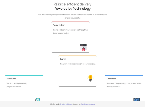
box-shadowshorthand property. Put this inside your.team-builder-containerclass selector:box-shadow: 0px 10px 20px rgba(40, 40, 40, 0.15);
learn more about the
box-shadowshorthand property from here- and you might as well remove your card's(.team-builder-container) bottom border by setting
border-bottom: 0;and removing this lineborder-bottom-width: 1px;
As for the footer, great idea on the workaround. But I strongly suggest for you to utilize
Flexboxor learn it if you haven't done so already. It will greatly improve your solution and especially your footer problem(you won't have to do it in a hacky way if ever). We have a lot of resources here where you can dive deeper intoFlexbox.Still, good job and keep at it bro! 💪