


@abdu-shakur
Latest solutions
Latest comments
- @jonatasolmartins
Congratulation for complete this challenge!
I have a few tips for you.
First, reset your elements by removing all margins and paddings from them. Also, tell Css to include the borders and paddings when setting the width of your elements by using box-sizing equal to border-box. I usually do like this:
*,
*:before,
*:after {
    margin: 0;
    padding: 0;
    box-sizing: border-box;
}
This will prevent any element to have a default margin and padding which difficulties a lot of our job when styling it.
You don't need to use height on your elements, just use the content size and the spaces between them to get the height you intend. So it's better to remove all height properties of the elements with the exception of the min-height: 100vh of the body.
If you use a padding-bottom: 1.5rem; on .body2, for example, the element will expand from the bottom giving your div a bigger height.
.body2 {
    padding-inline: 1.5rem;
    padding-bottom: 1.5rem;
    text-align: center;
}
Prefer to use rem instead of px, Rem is relative to the root element (HTML) generally it's 16px so 1rem is equivalent to 16px, for example, 300 / 16 = 18.75rem.
You can set the img element to have a width of 100% so it will use all available space in the div, then set the padding in your .body1 class to add a space in the edges.
The problem with the border-radius containing the QRcode was caused by the image padding-top, it was clipping the image. Move the padding to the .body1 class and this will solve the problem.
.body1 { padding: 0.5rem; padding-top: 0.75rem; } img { width: 100%; border-radius: 1rem; /* height: 80%; */ /* padding-left: 15px; */ /* padding-top: 10px; } - P@EmileeEversole@jonatasolmartins
It's looking amazing, Congratulations!
The way you did using Flex was really hard to do.
You can try using a grid instead and I can guarantee that starting with a mobile layout will be much easier.
I have two good examples of re-styling my layout based on the viewport using grid and media query you can check on my GitHub here and here.
Marked as helpful - @taylor003@jonatasolmartins
Congratulation for the good work!
I have a few tips to help you with your skills.
Change your HTML to be more semantic, and use the main tag instead a div to specify your main content.
<body>
  <main>
    <div class="container">
      <img src="image-qr-code.png" alt="qrcode" class="qr">
      <div class="bottom">
        <h1></h1>
        <p></p>
      </div>
  </div>
  </main>
</body>
You used margin to centralize your card but this is bad because your card will start to move when the viewport shrinks or grow. To fix that, move your display flex to the body tag so you can centralize your card and it will be consistent in any viewport.
body {
    display: flex;
    flex-direction: row;
    justify-content: center;
    align-items: center;
    min-height: 100vh;
    background-color: var(--Grayish-blue);
}
This is how the container class(I rename the main class to the container in this example) looks like without the margins you were using to centralize your elements.
.container {
    width: 310px;
    background-color: var(--White);
    border-radius: 15px;
    text-align: center;
    padding: 10px;
}

.container img {
    height: 310px;
    width: 284px;
    border-radius: 10px;
}
To align your h1 and p tag on the .bottom class you can use the padding-inline property to add a horizontal space around it, and add a padding-block to add a space on the top and bottom of it. You can remove the margins and the width from it as well.
.bottom { padding-inline: 1.5rem; padding-block: 0.7rem; } - @git-ritesh@jonatasolmartins
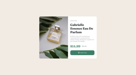
Congrats man! Feel tips, you can the picture element and change the image based on the media query.
  <picture>
        <source srcset="/images/image-product-desktop.jpg" media="(min-width: 600px)" />
        <img src="/images/image-product-mobile.jpg" alt="perfume ilustrasion">
   </picture>
In the example above the mobile image will be used until the screen get bigger than 600px and then the image is replaced with the image in the source element.
The last tip is to use the before or after pseudo classes to place a svg image on a element.
<button class="add-to-cart">Add to Cart</button>And then in the css file
button::before {
    content: url(/images/icon-cart.svg);
}
Before means that it will place a content (SVG image in this case) before the first child of the element (my text in this case) The result will be same as if I had put my SVG file/tag in my html but it makes my html more cleaner cause SVG tends to be very big.
My last tip is to look at someone else code after you finished your to get more insights on how to make things better, I do that and learn lots things that I can apply in my next challenge.
Congrats again and happy code!
Marked as helpful - @EduardoRodrigues123@jonatasolmartins
Congrats on the good work man! One tip the button element has a border by default setting the border: none on it solves the problem with the top border on the button.
- @SoopChiller@jonatasolmartins
Congratulation on your accomplishment! It seems like you start to build using a desktop-first approach, which is a bad idea. I start building for the desktop first and then when I change to the mobile mode it was looking very ugly LOL, I try to fix it but it was too hard so I decided to comment on everything and start it all over again from scratch and it works for me. Try not to use % unit cause it doesn't play well with responsiveness, probably that's why it doesn't fit well on the mobile, use rem or em(rem will be relative to the parent size and em relative to the root size) for fonts, padding, and margin instead. Hope my comment helps!


