Skip to content
  • Unlock Pro
  • Log in with GitHub
Profile
OverviewSolutions
3
Comments
2

Victor J

@juarezv90Dutchess County, NY90 points

Current LPN returning back to the programmer world. Currently working on learning front end development.

Latest solutions

  • Responsive using grid layout

    #accessibility#semantic-ui#lighthouse

    Victor J•90
    Submitted about 2 years ago

    0 comments
  • Calculator designed using grid and flexbox, Javascript

    #sass/scss

    Victor J•90
    Submitted about 2 years ago

    1 comment
  • Developed reponsiveness using SASS to design site

    #accessibility#sass/scss

    Victor J•90
    Submitted about 2 years ago

    0 comments

Latest comments

  • Satyapriya Mahato•400
    @SatyapriyaMahato
    Submitted about 2 years ago

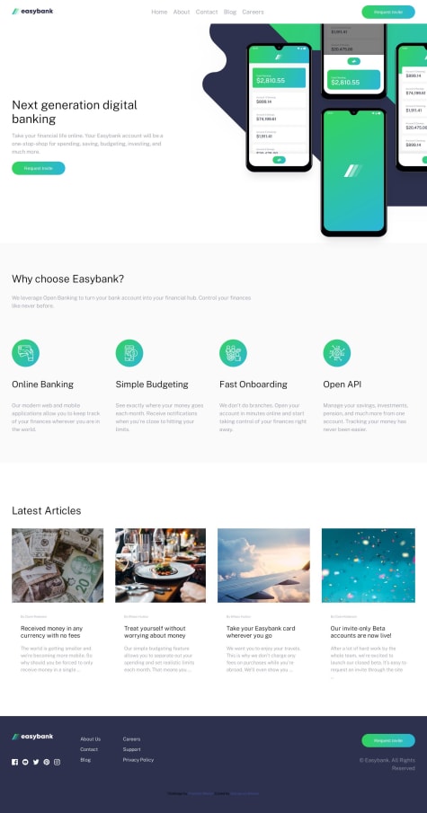
    Easybank landing page using HTML and CSS

    1
    Victor J•90
    @juarezv90
    Posted about 2 years ago
    • Your Burger SVG effect is excellent, and functions great
    • Your mobile menu though has an out of place margin that does not allow clean line up with the navbar.
    • Your container does not wrap the whole project evenly so the page display unportionately to design challenge.
    • Padding not even which causes a lot of elements to be out of place.
    • Opportunity lies for use of display:flex; design options

    Excellent use of semantic html elements

    Bonus Points: utilizing comments in your html

    Please check out mine and let me know where I can improve as well

  • stephenolajire•130
    @stephenolajire
    Submitted about 2 years ago

    responsive easybank landing page design with html, css and javascript

    1
    Victor J•90
    @juarezv90
    Posted about 2 years ago
    • Imaging sizing and position need work, in desktop mode you're sizings are uneven and your Hero image bleeds over and covers the next section.
    • Try using object-fit: cover in your CSS for maintaining images and not giving themm stretched appearance.
    • Scaling needs work for larger screen sizes, possibly putting the entire page in a container with a max-width: 1440px; margin: 0 auto; to keep it from oversizing your layout and have it centered on the page.
    • It looks like a lot of the hover effects are missing and the links do not have even demo function that shows that they are working links that could be programmed easily later on.

    Overall

    The site comes close to replicating the design but falls short on some structure aspects and CSS configurations.

Frontend Mentor logo

Stay up to datewith new challenges, featured solutions, selected articles, and our latest news

Frontend Mentor

  • Unlock Pro
  • Contact us
  • FAQs
  • Become a partner

Explore

  • Learning paths
  • Challenges
  • Solutions
  • Articles

Community

  • Discord
  • Guidelines

For companies

  • Hire developers
  • Train developers
© Frontend Mentor 2019 - 2025
  • Terms
  • Cookie Policy
  • Privacy Policy
  • License

Oops! 😬

You need to be logged in before you can do that.

Log in with GitHub

Oops! 😬

You need to be logged in before you can do that.

Log in with GitHub

Oops! 😬

You need to be logged in before you can do that.

Log in with GitHub

Oops! 😬

You need to be logged in before you can do that.

Log in with GitHub

Oops! 😬

You need to be logged in before you can do that.

Log in with GitHub

Oops! 😬

You need to be logged in before you can do that.

Log in with GitHub

Oops! 😬

You need to be logged in before you can do that.

Log in with GitHub

Oops! 😬

You need to be logged in before you can do that.

Log in with GitHub

Oops! 😬

You need to be logged in before you can do that.

Log in with GitHub

Oops! 😬

You need to be logged in before you can do that.

Log in with GitHub

Oops! 😬

You need to be logged in before you can do that.

Log in with GitHub

Oops! 😬

You need to be logged in before you can do that.

Log in with GitHub

Oops! 😬

You need to be logged in before you can do that.

Log in with GitHub