@brissboss

Sunetra Bhowmick
@kaiser-sbAll comments
- @kaiser-sb
Hey Theo,
Great job on completing the project! Your design is very good. Don't worry much about best practices in the beginning - overall your approach is good to me. Just some quick things that I wish to add -
- For CSS reset that you used at first - you may try
*selector and put something like -
* { margin : 0; padding : 0; box-sizing : border-box; /*Removes a lot of sizing issues while working with divs*/ }- Your
README.mdspecifies -The email address is not formatted correctly (i.e. a correct email address should have this structure: name@host.tld). The message for this error should say "Looks like this is not an email". I think you need to tweak your code a bit to get this. Now you're getting the HTML default message.
Great job and happy coding!
Marked as helpful - For CSS reset that you used at first - you may try
- @GiorgiChiaberashvili@kaiser-sb
Hey Giorgi,
Congratulations on completing the project! A few things that I find you may have a look at -
- The confirmation message is supposed to show the email ID that user entered and not a default ID.
- The
inputfield normally doesn't associate with pointer cursor, but that's your choice though. - The
Valid email requiredmessage is being displayed only when the field is left blank. In case of erroneous email input - the HTML default response is taking over.
Great job and happy coding!
Marked as helpful - @tushargola1@kaiser-sb
Hey Tushar,
Great job on this project! It seems your images are not getting displayed. Just correct the
imgtag'ssrcroute in the component section (also replace the backslashes) and you'll be good to go. Also, you may think of displaying some advice on load as well. Thanks and happy coding! - @Ryoshi1001@kaiser-sb
Hey Ryoshi,
Great job on completing this challenge! Just some minor things which I find you may have a look at -
- The confirmation message is supposed to show the Email ID that user entered in the field and not a default ID. A minor fix will achieve that.
- The
inputfield is normally not for a cursor pointer - although it's just your choice. - You can improve the validation by putting in a real-time validation while the user is entering their Email (just to be more realistic - it's totally fine just the way it is though)
Thanks and happy coding!
Marked as helpful - @PriyankaRC16@kaiser-sb
Hi Priyanka,
Nice job on completing the project! To solve this issue you faced - you can use a wrapping
divin which you can create two moredivs with 50% width. Also, you don't need to break the paragraph lines and style them individually. Just use one header for the heading, one paragraph for the text, and maybe somespantags wrapped indivs to get the lower part done. If you're using flexbox - all these will be even simpler with minimal styling. Knowing the default nature of different elements will help you to choose on which elements to choose in which situation, e.g. -div,petc are block elements whereasspanis inline element by default.I saw a fellow coder suggesting the use of ChatGPT. While this can be tempting and acknowledging the fact that this can be super helpful at times when you're really stuck - relying on it for your error correction can at times be frustrating. GPT can be really stupid at times and you need to know the concepts to identify its stupidity. I would suggest googling, referring to articles, going through stackoverflow solutions etc. This really helps to build up concepts. Hope this helps. Happy coding!
Marked as helpful - @rinoraj6@kaiser-sb
Great job on the project! If you're using css flexbox - you can align images using
justify-contentoralign-items- depending on the flex direction. if you're going without flexbox - you can set the parent containerposition : absoluteand the child container asposition : relativeand the set thetop,bottom,leftandrightalignment. If you're trying to centre a container horizontally,margin-left : autoandmargin-right : autowill do your job. Alignment is always hard thing - just learn the concepts and keep experimenting. Hope this helps. Happy coding!Marked as helpful - @NihalP01@kaiser-sb
Hey, Nice job completing the project! Just a minor thought - being able to view the entire page contents without scrolling (in PC or laptop view) will give a more pleasant viewing experience to the user. Great job on mobile layout!
Marked as helpful - @emlew@kaiser-sb
Hey Emily,
Great job completing your first project! Regarding best practices - it all depends on the context and layout in which you're using it. E.g. - for font sizes, it's better if you could use
rem. This helps in case you change the root font size in thehtmlpart - you get the proportionate change in whole layout. For margins, you can use percentage orpx- depending on whether you want a proportionately changing layout or a fixed measurement.For width and heights, you can combine both by using percentage values and setting a
max-width,max-height,min-widthormin-heightto get a fine layout. Also, you can usevworvh- to size your elements according to viewport width or height. So it's all about mix and match and using them depending on where and how you wish them to place. Hope this helps. Happy coding!Marked as helpful - @yoobezxc@kaiser-sb
Congratulations on completion of your project. Excellent job! For responsive web designing - you can use the viewport meta tag -
<meta name="viewport" content="width=device-width, initial-scale=1.0">. Also, to make your design user-friendly for different screen sizes - you can use media queries in your CSS file. You can refer to MDN Web docs or different articles in internet to learn more about these and apply them. You can use Chrome or Firefox dev tools to inspect elements and check how your project looks on different devices. Hope this helps. Happy coding!Marked as helpful - @saddamjon1@kaiser-sb
Hi Saddam,
Great job on completion! Just a quick note - you added the
font-familyasOutfitbut forgot to link the Google font connect vialinktag. Just do that and you'll be good to go. Wonderful and keep it up!Marked as helpful - @zebozebo1@kaiser-sb
Hi Zebuniso,
Great job on your project! A quick note - you can include the
font-familyproperty to get the Outfit font working. Thanks and happy coding! - @aliyabatoolalvi@kaiser-sb
Hi Aliya,
Congratulations on completing your first project here! Just a few things I think you can include or explore -
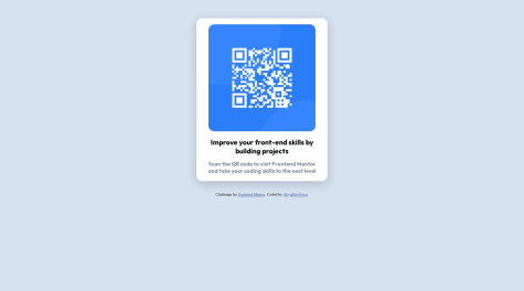
- The QR Code image is there in the
imagesfolder (in the zip folder they provided) which you can include in your HTML and style it accordingly. - You can save your styles in different CSS file and link it with the
index.htmlfile. - You have mentioned the font correctly but haven't linked the Google font with your HTML and that's why it's falling back to
sans-serif.
Thanks and happy coding!
- The QR Code image is there in the
- @soumyru@kaiser-sb
Hi Soumya,
Congratulations on completing your first project! I explored your source code and live site and there are a couple of things I think that you might explore on -
-
They have given a style guide to help the developer with the required specifications. So you can use that to include the specified colours and fonts to make your project look just like the desired one.
-
To put the card in the center, you can use
margin : auto;to centre the container horizontally. For vertical centering, you may try using CSS flexbox.
I am not an expert of course but just expressed my ideas. Thanks and happy coding!
-