Skip to content
  • Unlock Pro
  • Log in with GitHub
Profile
OverviewSolutions
6
Comments
1

kristi

@kristiingcosan francisco130 points

currently in quality assurance, with aspirations in front end and creative coding

I’m currently learning...

- redux - react native - hasura graphql

Latest solutions

  • Dictionary web app using React and Semantic UI

    #react#semantic-ui#react-router

    kristi•130
    Submitted almost 2 years ago

    0 comments
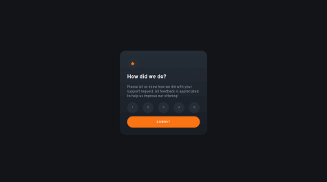
  • Interactive rating component with Flexbox


    kristi•130
    Submitted almost 3 years ago

    1 comment
  • FAQ Accordian Card with Flexbox and Vanilla JS


    kristi•130
    Submitted almost 3 years ago

    0 comments
  • Entertainment web app w/ Next.js, Tailwind CSS, and Firebase

    #firebase#motion#next#react#tailwind-css

    kristi•130
    Submitted almost 3 years ago

    0 comments
  • Planets fact site w/ React and SCSS

    #react#react-router#sass/scss#motion

    kristi•130
    Submitted over 3 years ago

    1 comment
  • Preview card component challenge hub with HTML and vanilla CSS

    #sass/scss

    kristi•130
    Submitted over 3 years ago

    0 comments

Latest comments

  • Kate•170
    @YayoKB
    Submitted almost 3 years ago

    NFT Preview Card Component using Vanilla CSS and Flex

    2
    kristi•130
    @kristiingco
    Posted almost 3 years ago

    Hey there! First off, great solution.

    Using flex on the parent divs (your divs with the class of ".price" and ".time") will allow you to align the text and their respective images.

    .price {
      color: var(--cyan);
      font-size: 1rem;
      font-weight: 400;
      display: flex;
    }
    
    .time {
      color: var(--soft-blue);
      font-size: 1rem;
      font-weight: 300;
      display: flex;
    }
    

    This, however, will result in the icons being "squished", due to the default alignment of the items being set to stretch. Thus, you have to add the "align-self" property to the CSS declarations you did for the icons.

    .time img,
    .price img {
      margin-right: 0.25rem;
      align-self: center;
    }
    

    I cloned your repo and added the above changes and it should look like this!

Frontend Mentor logo

Stay up to datewith new challenges, featured solutions, selected articles, and our latest news

Frontend Mentor

  • Unlock Pro
  • Contact us
  • FAQs
  • Become a partner

Explore

  • Learning paths
  • Challenges
  • Solutions
  • Articles

Community

  • Discord
  • Guidelines

For companies

  • Hire developers
  • Train developers
© Frontend Mentor 2019 - 2025
  • Terms
  • Cookie Policy
  • Privacy Policy
  • License

Oops! 😬

You need to be logged in before you can do that.

Log in with GitHub

Oops! 😬

You need to be logged in before you can do that.

Log in with GitHub

Oops! 😬

You need to be logged in before you can do that.

Log in with GitHub

Oops! 😬

You need to be logged in before you can do that.

Log in with GitHub

Oops! 😬

You need to be logged in before you can do that.

Log in with GitHub

Oops! 😬

You need to be logged in before you can do that.

Log in with GitHub

Oops! 😬

You need to be logged in before you can do that.

Log in with GitHub

Oops! 😬

You need to be logged in before you can do that.

Log in with GitHub

Oops! 😬

You need to be logged in before you can do that.

Log in with GitHub

Oops! 😬

You need to be logged in before you can do that.

Log in with GitHub

Oops! 😬

You need to be logged in before you can do that.

Log in with GitHub

Oops! 😬

You need to be logged in before you can do that.

Log in with GitHub

Oops! 😬

You need to be logged in before you can do that.

Log in with GitHub

Oops! 😬

You need to be logged in before you can do that.

Log in with GitHub

Oops! 😬

You need to be logged in before you can do that.

Log in with GitHub

Oops! 😬

You need to be logged in before you can do that.

Log in with GitHub