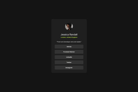
Need help with media queries for responsive layout.
Latest solutions
Social Media Card
Submitted 6 months agoWriting CSS with responsiveness best practice. I want to be so good at naturally making my layouts responsive with the built-in tools CSS offers without deferring to media queries, and only using media queries when absolutely necessary.
Blog card
Submitted 7 months agogetting EXACT measurements for designs. I'm currently using photoshop and its ruler tool to measure pixels, but that's not always accurate I've come to learn.
Latest comments
- @KoushikVijjiWhat specific areas of your project would you like help with?@larsenwald
Looking good! Only thing is I think you made the font-size within the buttons a bit larger and their font-weight smaller than the design specs ask for.
- P@mu7ammad1951What are you most proud of, and what would you do differently next time?
I'm most proud of my improvement in organizing my CSS. I used to be very messy with my CSS and I feel like I have become a bit better. Still, there is a lot of repetition and I would hope to find ways to improve the structure to make it more readable for others.
What challenges did you encounter, and how did you overcome them?I wasn't sure what html semantic tag to use, I ended up using article after reading up on the documentation on MDN.
What specific areas of your project would you like help with?I would welcome any advice on how I can improve the structure and I hope you can point out any errors or mistakes I might have missed. Thank you!
@larsenwaldJust wow. You managed to get the size of everything more or less down to a tee. Yours is way better than mine. Could I ask how you were able to get exact measurements of everything?
- @Kauanny-cmd@larsenwald
The font-size of the first text element seems a bit lighter than the one shown in the design. You want to explicitly set it to 700.


