


Iván García• 185
@IvanGH4
Submitted
I wasn't sure on how to make the form validation, so any advice will be really appreciated! Thank you!
Looking to hire developers?
@limtedtorni000
@IvanGH4
Submitted
I wasn't sure on how to make the form validation, so any advice will be really appreciated! Thank you!
@limtedtorni000
Posted
Hi Ivan i like your solution it's responsive and looking great.
@MishaHernandez
Submitted
This challenge has taken me a little longer than usual but I think it has helped me reinforce some knowledge. I appreciate any suggestions 🙂
Bonus:
@limtedtorni000
Posted
Hi Mijail you did very well it's responsive and looking great.
@iivanov-2
Submitted
Any feedback is welcome.
@limtedtorni000
Posted
Hi Iivanov you did very well it's responsive and looking great you just need to change the background color of third-container to make it look exactly like the provider design.
@Hikmahx
Submitted
Any feedback would be appreciated. Thanks
@limtedtorni000
Posted
Hi Hikmahx you did very well it's responsive and looking great.
@BWezka
Submitted
Did I do it right?
@limtedtorni000
Posted
Hi Nekles, yeah you did right your solution look great in desktop you should also work on it more to make it responsive and look great in phones.
@Yuniac
Submitted
Any feedback/criticism is welcome, also I'm not sure whether I had to make it max-width of 1440px or not so I went with a max-width of 1440px as the guide indicated, but now I think it won't look perfect on bigger than that screens.
@limtedtorni000
Posted
Hi Yuniac your solution its looking great to make it look better in screens bigger than 1440px i suggest to change your margin in htm, body from 0 to 0 auto.
@Pharm-ack
Submitted
I would love you guys response on this
@limtedtorni000
Posted
Hi Pharmack, your solution its look great in screen size of (1440x800), i suggest to use PX or REMs for the width and use grid-template-columns: repeat(4, 250px); justify-content: center; rather than grid-template-columns: repeat(4, 1fr);.
@Kmolina009
Submitted
Hello, this is my first challenge. I have the elements placed in the right position for the desktop requirement, but I'm having issues with the mobile media-query. Will be refactoring in the meantime.
Any feedback is very much appreciated, Thank You.
@limtedtorni000
Posted
Hi Kevin i have nothing to say Milton Chung already said the important thing overall you great and keep coding
@sarahc-dev
Submitted
Would welcome any feedback :)
@limtedtorni000
Posted
Very good Sarah is 100% identical to provider design
@SamyrOR
Submitted
Any feedback will be welcome!
In love doing these challenges!
@limtedtorni000
Posted
Hi Samyr your solution look great and responsive for the stars icon i suggest using width: 2rem rather using percentage. keep contributing these awesome solutions
@florinpavel22
Submitted
This looked simpler than it actually was. Gave me a few headaches but in the end I am happy with the result.
@limtedtorni000
Posted
Hi Florin your solution very good Its look great and very responsive.
@nicole-tuznik
Submitted
Any feedback on how I could improve my code is always appreciated! Thanks!
@limtedtorni000
Posted
Hi Nicole your solution very good Its look great and very responsive keep contributing these awesome solutions.
@dianailan
Submitted
If you have any feedback on how can I make my code better feel free to leave a comment.
@limtedtorni000
Posted
Hi Diana your solution very good Its look great and very responsive keep contributing these awesome solutions
@mdsalahuddin2001
Submitted
Hey Gyz, I have completed fylo-dark-theme challenge . I am hunker after your valuable feedback. Please suggest me where I need to improve. Your feedback is like a gem to me.
@limtedtorni000
Posted
Hi MD your solution look great and responsive, just one thing i suggest to add background-size: contain; for the bg-curvy it will make it look fantastic.
Also, as your solution report suggests, it's considered a best practice to only use one <h1> tag per page and use less important heading tags for the rest of the headings on the page (for both SEO and semantic reasons). Doing so will clear up your solution report and make more sense in the context of the importance of the different headings on the page.
Happy Coding.
@hafizhudin
Submitted
Hello, this is my first time submitting my project. Any feedback would be nice. Thank you.
@limtedtorni000
Posted
HI Didin firstly welcome to this amazing community of learners, and congratulations on submitting your first solution. Your solution seems great , keep contributing these awesome solutions
@gllader
Submitted
Any feedback will welcome
@limtedtorni000
Posted
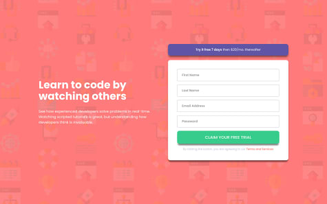
Hi GLL your solution seems fantastic just try to fix the mockups image for mobiles overall keep contributing these awesome solutions
@otatame
Submitted
I'm still a bit rough at handling images for background, as you can see the pattern at the top is not responsive when you shrink it into mobile size, any tips would be appreciated Thank you
@limtedtorni000
Posted
Hi Willie your solution its great its very very similar to the original design, i have nothing to say just keep contributing these awesome solutions
@LuisDGracia
Submitted
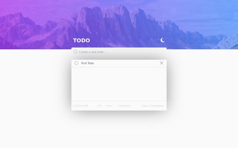
Is there anything else i could do better?
@limtedtorni000
Posted
Looks good Luis, there is just one problem when i press Enter to add a new TODO it dosent work try to fix it will make it cool and i suggest to change the cursor of the moon/sun icon from default to pointer. Overall you did great and keep contributing these awesome solutions
@NiteArie
Submitted
I would love some feedbacks. I don't know if I used BEM principle correctly, correct me if I am not. Is there anything I could do to improve the website anymore? Really appreciate the feedback. Thanks
@limtedtorni000
Posted
Looks great for me NEIT, i like your animation if you just added also to cards it will be great.
@janegca
Submitted
Before starting on the Junior projects decided to re-visit some earlier challenges and refactor the code in light of what I think I have learned. This is my first refactor.
Any and all suggestions welcome.
@limtedtorni000
Posted
Great work Jane i have nothing to say just keep contributing these awesome solutions
@NightClover-code
Submitted
Any feedback on the code is welcome !
@limtedtorni000
Posted
Batal; tbarklah 3lk
@awexli
Submitted
@limtedtorni000
Posted
Hi Alex your solution it's look great and responsive for me , you just need to solve your html issue keep contributing these awesome solutions
@Peterklink
Submitted
I used Grid for the Layout. I am still a little bit confused with the grid-rows. I feel like the way i did it is not good practice. If you have any recommendations please let me know! :)
@limtedtorni000
Posted
Hi Nupur nyour solution it's look great and responsive for me keep contributing these awesome solutions
@DezineWings
Submitted
How to reduce code size? Please guide.
@limtedtorni000
Posted
Hi Nupur nyour solution it's look great and responsive for me keep contributing these awesome solutions