


@0drad3kk
Aspiring Front-end Developer looking to get hired with plans to eventually go fullstack. Current Front-End stack: ReactJS, Styled-Components w/ Framer-Motion. Other skills: CCNA, CompTIA A+, CompTIA N+
I’m currently learning...NextJS, TailwindCSS, Mongo, Prisma
Latest solutions
Tic_Tac_Toe_App - NEXTJS13/REACTJS/TS/TAILWINDCSS/ZUSTAND
#next#tailwind-css#typescript#zustand#reactSubmitted almost 2 years agoDictionary_App - NEXTJS13/REACTJS/TS/TAILWINDCSS/ZUSTAND
#next#react#tailwind-css#typescript#zustandSubmitted about 2 years agoGithub User Search App - NEXTJS13/REACTJS/TS/TAILWINDCSS/ZUSTAND
#next#react#tailwind-css#typescript#zustandSubmitted about 2 years agoProduct Preview Card Component - REACTJS/TAILWINDCSS/TYPESCRIPT/VITE
#react#tailwind-css#typescript#viteSubmitted about 2 years agoResults Summary Component - TailWindCSS/REACTJS/TYPESCRIPT/VITE
#react#tailwind-css#vite#typescriptSubmitted about 2 years ago
Latest comments
- @lorenzoaniel
Hey meursualt88 its okay as long as you are learning, a few pointers:
for DRY code, and I am basing this off of your tech stack of html and css:
- take a look at importing in css, this way you can have one 'main' css file and have several other smaller css files that you import into the main file (you can then just have this main file in your header element), this could also help if you have commonly used styling like center-ing an element.
- you can also have a seperate css file for css variables
For responsive css you already have a basic grasp of grid and flexbox, a good way to go about developing designs is to start with the mobile version first, this will be your base css style then work your way up the bigger resolutions, as you go up in resolution you will be using media-queries (I urge you to look into container-queries) and you can add the styling for that specific resolution (keep in mind this will be easier to do if you have seperate css files for each component/section), this way it is easy to keep track of different break point styling.
Good luck with your front-end journey
- @ahmetwithat@lorenzoaniel
Gj on the styling Ahmet,
-
Great effort on the validation, noticed there is an issue with date validations where i can put 99 99 999 and it would still accept the credit card. If you need help with this refer to my solution for age calculator check under: age_calculator_app/src/lib/isValidDate.ts result returns booleans(true/false) for day/mm/year in object form
-
easier way to do form validations would be to include a validation library here are some: Yup/Zod, these libraries work by having the required attributes (card number, email password etc.) and describing how they should be validated in a json object or commonly referred to in this case as a 'schema'.
Good luck on your development journey
-
- @p4bloxx@lorenzoaniel
Good job Pablo,
-
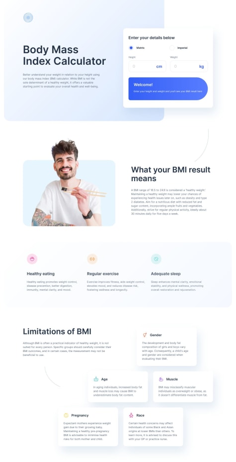
A little issue with the BMI Limitations section where it is not getting the desired pyramid/ brick effect in full desktop screen, noticed that there is a translate effect and depending on which resolution you developed at (currently looking at the site in 1920 x 1080) the static value of transform: translateX(-11.4rem); will not dynamically adjust which is why I am seeing it differently (also tried it on my main 2k resolution monitor and although it is better the layout is not as expected). Possible fix is to increase number of columns as it will be easier to create a tiled effect without having the need to translate anything.
-
regarding your issues with JS eventually you will come upon front end frameworks like react/vue/angular/svelte which are essential for modern front end development and will manipulate DOM (html elements) easier, but you can practice JS logic and syntax using leetcode or hackerrank as JS will still very much be an integral part of your front end journey. If you are interested in testing your hand at these frameworks easiest ones to jump into would be react or svelte; react is industry standard and has a bigger community but svelte has a very good tutorial built into their website (online terminal) and has alot of the features needed for near full stack web development built into it (sveltekit).
Good luck on your journey
Marked as helpful -
- @kurtbuset@lorenzoaniel
Great job, regarding your question about adding borders: border: [border-width] [border-style] [border-color]; you can find more info using MDN docs or this handy css reference: https://cssreference.io/ (although MDN docs is better as it is the most up to date).
A few pointers:
- To get into the habit of modularity in your code try to separate your css into bite sized files for each section/part/component in your project ex: score section should have its own css file. You can then import every modular css file into a main css file and have that file into your html headers.
as you progress with your front end journey you will come upon front-end frameworks or libraries that will strongly abide by this 'modular' model of development, but for now focus on developing your code modularly.
Good luck on your journey.
Marked as helpful - @nitroadam1233@lorenzoaniel
Hi Adam thanks for reaching out,
Looks like you have a bit more experience in terms of using component libraries and react to complete this project and so I will have to be a little more detailed with my analysis for your solution.
-
When making components in react try to make things as modular as possible, I noticed you decided to summarize the skills section all under 'skill', if we look at the design file notice how the skills are separated into noticeable components: icon, skill name, skill score as well as the corresponding color scheme for that particular skill. Instead of combining the individual skills with its parent grid container it is best to separate it as its own sub component, this way incase there are new design changes it will be easy to isolate or say client wants new functionality that is drastically different from original design you can simply remove that sub component and plug in a different one into your
{mainSkillItems.map((item, index) => (providing the same data but different look or possible different data coming from hypothetical API into new component, either way makes for easier development for you and other developers looking to add to your code. -
kudos for using theme provider. If you have not experimented on this, for your next project try multiple theme providers, one main one for general styles and maybe one for a subcomponent, for this solution an example would be if you turned skill items into its own subcomponent and passed a theme provider which applies the proper color scheme to a particular skill, advantages to this is that incase client wants to change color scheme of subcomponent ex: purple, pink, gradient cyan, gradient <insert color here> it will be as simple as adding or removing additional stying in your theme object, which leads me to another point please separate your theme object into its own style folder, more of a minor thing but a good habit. In fact separate similar components into their own folders instead of just under one umbrella folder ex: 'RightContainer','LeftContainer','ParentContainer' could all be under components/containers, this will also get you into the habit of refactoring your code and making button/header/logo/etc. components with their own folders instead of packing all components within containers. I had the same habit but now as annoying as it is I try to break down components as much as I can so that my app is truly modular.
-
Seems like you are well on your way so I will suggest you practice with one component ui library at a time (looks like materialUI in your case), and then try and learn other tech like css-in-js or css preprocessors like SASS/Stylus. The reason being is that while component UI libraries are great for fast deployment and prototyping, when you have to tackle more complex or custom styling/animations the opinionated nature of these libraries will be a drawback. Arm yourself with atleast one way to make highly complex/custom styling.
Good luck fellow student.
Marked as helpful -
- @Wali1209@lorenzoaniel
Good job on the project:
-
The images not loading when you statically insert the source to your img element is because of the different out put folder called 'dist' as you pointed out. The reason why now your imgs show up if you use import is because vite will consolidate all imports and change the path according to the new output build folder, in this case 'dist' (this will be different depending on which tooling you use: create-react-app, nextjs, etc.). You can tweak this by adding configurations to your vite config, i personally just put all my static assets in the public folder using this structure: /public/assets/imgs, but to each their own.
-
Can't comment on the live server but vite already has a built in live preview, simply type 'npm run dev' (in my case i use yarn so 'yarn dev') and it will run the NON BUILT version of your project, if you would like to see the PRDOUCTION version(dist) it is 'npm run preview' after the build. Double check the 'scripts' section on your package.json. It is recommended to use these as vite already has HMR feature (Hot module replacement) which lets you update your app without a full refresh or restart of the development server, no need for third party, just copy paste or click the localhost url link provided by vite.
Goodluck on your journey fellow student.
Marked as helpful -