


Elisavet• 500
@elisavet12
Submitted
Any comments or suggestions are welcome... especially for the backgrounds!! :p
Looking to hire developers?
@mauro1998
@elisavet12
Submitted
Any comments or suggestions are welcome... especially for the backgrounds!! :p
@mauro1998
Posted
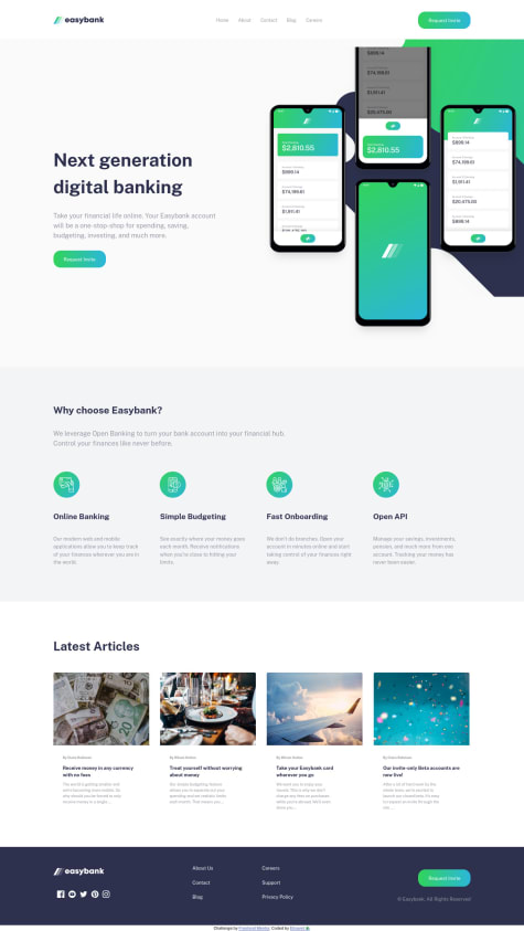
I think you can achieve that background (in desktop mode) by playing with the background-size and background-position properties but you'd need to change your layout a little bit in some layers:
First, I'd make that header a fixed element:
.header {
    position: fixed;
    top: 0;
    background: #fff;
    height: 5rem;
    width: 100%;
    z-index: 1000;
    ...
}
Next, I'd limit the height of the first section:
.section--next {
    background-color: var(--Very-Light-Gray);
    height: 60vh;
    position: relative;
}
Then, I'd start laying out the background images, removing the <img> and using ::before and ::after pseudo elements to render the images:
.section--next__img {
    position: relative;
    width: 100%;
    height: 100%;
}

.section--next__img::before {
    content: '';
    position: absolute;
    top: 0;
    right: 0; // align to the right
    width: 35rem; // set a fixed width to work with
    height: 100%;
    background-image: url(./images/bg-intro-desktop.svg);
    background-size: 60rem; // play around til you get the desired size
    background-position: -50px -115px; // play around til you get the desired position
    background-repeat: no-repeat;
}

.section--next__img::after {
    content: "";
    position: absolute;
    top: 0;
    right: 0; // align to the right
    width: 35rem; // set the same width as ::before
    height: 120%; // add 20% of additional height on this one
    background-image: url(./images/image-mockups.png);
    background-repeat: no-repeat;
    background-size: 35rem; // play around til you get the desired size
    background-position: 95px 0px; // play around til you get the desired position
}
and lastly I'd put the text of the first section on top of the background images:
.section--next__info {
    display: flex;
    flex-direction: column;
    align-items: flex-start;
    gap: 1.77rem;
    justify-content: center;
    position: absolute;
    z-index: 20;
    padding-top: 5rem;  // padding-top same height as the header
    padding-left: 9.16rem;
    width: 100%;
    height: 100%;
}
Marked as helpful
@elisavet12
Submitted
Any comments or suggestions are welcome... especially for the backgrounds!! :p
@mauro1998
Posted
Well done!
You can center the green underline of the links no matter the size of the link by doing this:
.nav__link:hover::before {
    ...
    right: 0;
    left: 0;
    margin: auto;
}
Marked as helpful
I solved all of my problems thanks to Mauro Aguliar and my page finally works as it should.
@mauro1998
Posted
I also noticed that your rounded avatar image is not displaying correctly when setting the background-image property.
Try adding the following properties to .main__pic class:
.main__pic {
    ...
    background-position: center;
    background-size: cover;
    background-repeat: no-repeat;
}
Other than that I think you did a very nice job, the component is looking so beautiful. Congrats!
Marked as helpful
I solved all of my problems thanks to Mauro Aguliar and my page finally works as it should.
@mauro1998
Posted
Hi @Hanka8
It doesn't work because the nullity checks you are using in Javascript are not strong enough to take into account different scenarios where the response could be empty or falsy. Falsy values in javascript are those values that when evaluated the result is false (in an if condition for example).
So values like "null", "undefined", an empty string (""), the number "0", "NaN", and the boolean value "false" are falsy values and may need to take them into account when writing conditions depending on the situation.
This is your current code:
//check if there is a blog
if (data.blog == null) {                  // !! data.blog could be any of the falsy values, not just "null"
        website.textContent = "Not Avaílable";
        website.classList.add("not--available");
} else {
        website.textContent = data.blog;
        website.classList.remove("not--available");
}
The easiest and more generic way to check if a value is falsy in javascript is by negating it:
if (!bar) {
  // bar is falsy
} else {
  // bar contains something
}
So you could solve this bug doing something similar:
if (!data.blog) {                  // now it will check if data.blog is "falsy" and not just "null"
        website.textContent = "Not Avaílable";
        website.classList.add("not--available");
} else {
        website.textContent = data.blog;
        website.classList.remove("not--available");
}
But be careful with this approach, there might be situations where you'd like to be more specific, for example if you are expecting a number but the number is 0 (a valid number) then a condition like if (!num) { ... } might end up doing unexpected behaviors.
Marked as helpful
@Christone007
Submitted
I found it difficult to have total control over the positioning of my divs. Making it responsive was quite a challenge.
Been a while since i completed any frontend project and i'm really rusty.
I would like to see how someone else solved the challenge
@mauro1998
Posted
Hey Christian, congrats on completing the challenge. Here is a quick suggestion about how to define the dimensions of your container elements thinking on responsiveness and other good practices:
I noticed that your div.content-card has the following styles:
.content-card {
    border-radius: 15px;
    position: absolute;
    top: 50%;
    left: 50%;
    margin-right: 50%;
    transform: translate(-50%, -50%);
    width: 35%;
    height: 55%;
    background-color: #fff;
}
1- Try not to use % for dimensions (widths and heights). If you want this element to be responsive, a better approach could be:
.content-card {
    width: 100%;
    max-width: 400px; // set a desired max-width in px or even better in em/rem unit
}
This way even if the screen size is bigger than 400px your element will always have a consistent width of 400px. Otherwise if the screen size is less than 400px it will adapt to the 100% of the space available because the max-width condition won't apply anymore which will make it responsive. This strategy is really easy to implement and you may not even need media queries.
2- (optional) a good practice would be to separate the positioning styles (centering) from the other styles in a different class. This way you could easily:
// this is just another approach for centering stuff using absolute positioning and margin: auto;
.element-xy-centered {
    position: absolute;
    top: 0;
    left: 0;
    right: 0;
    bottom: 0;
    margin: auto;
}
Marked as helpful