
@Gerson77

Victor Eleanya
@mrvicthorAll comments
- @mrvicthor
Hi @Gerson77, I've just looked at the live solution. Excellent work.
However, in the latest article section, just above your footer, I think the design is a bit different from your solution.
You may want to take a look at it.
- @TetianaAleksWhat are you most proud of, and what would you do differently next time?
I'm proud of how clean and responsive the layout turned out, especially the animated share section which adds a nice interactive touch. Next time, I’d focus more on accessibility and consider using CSS transitions with better timing for smoother animations.
What challenges did you encounter, and how did you overcome them?One challenge was positioning the share popup so it worked well on both mobile and desktop without breaking the layout. I resolved it by carefully adjusting position, transform, and overflow properties, and testing responsiveness at different screen sizes.
What specific areas of your project would you like help with?I'd appreciate feedback on the responsiveness of the share popup, especially how it behaves at larger screen widths. Also, I’m curious if there’s a cleaner way to handle the show/hide logic and transitions for the share section using only CSS without JavaScript.
Article Preview Component with SCSS styling and share animation
#animation#sass/scss#typescript#angular@mrvicthorHi @TetianaAleks,
I have just had a look at your code and the design. Excellent work. It looks awesome.
- @samuel-adu@mrvicthor
@samuel-adu Fantastic work with the layout. Looks good.
- @jdrodriguez2707What are you most proud of, and what would you do differently next time?
It was great to use the useState hook in React to manage different states of the component and perform conditional rendering based on them. I also used it to manage errors, display them to the user, save information, and share it between components. This helped me practice and understand the various applications of this hook.
What challenges did you encounter, and how did you overcome them?It was challenging to figure out how to use React's state to make the site interactive and dynamic. However, thanks to AI tools like GitHub Copilot, I was able to succeed. I want to continue learning about React and its hooks to improve my skills and build more complex applications.
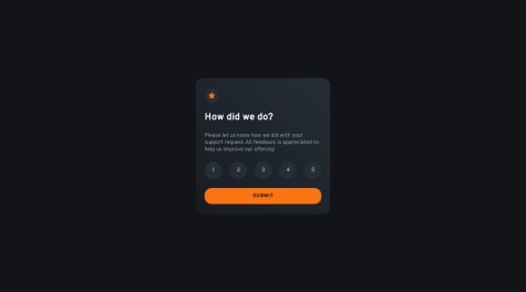
@mrvicthorHi Riquez, excellent work here. However, the keyboard navigation does not work on the rating. Also, after I selected a rating, the state did not update/show any thank you message.
- @RiscloverWhat are you most proud of, and what would you do differently next time?
Whew - I put a bit of effort into this one! Some of the things I did or paid attention to during the development of Hangman:
- Added some subtle animations to make the app a little more lively/fun. Nothing major. For example, on the 'How to Play' page, each of the 'How to Play' steps zooms onto the page on load, and on the main game page, when the player loses a life, the life meter animates instead of jumping lives.
- Added keyboard accessibility: Users are able to completely use their keyboard if they wish, including pressing
Escto open the Pause menu, pressingEnterto start the game, and pressing letter keys to play a letter. I had to use a menu focus package to ensure that, when the user tabs through the pause menu, the tab focus stays on the menu buttons only (rather than going off into the rest of the app behind the menu). - Error message when category is out of words: When the current category runs out of words and the player tries to play that category again (i.e. by pressing 'Play Again' or by clicking that category's button), a message appears telling the player that the category is out of words, and to either choose a different category or to refresh the game to start fresh. When the player presses the 'Ok' button, they are taken to the Categories page to choose a new one.
- Replaced 2 categories: 'Sports' and 'Animals' were just a little too boring for me. I replaced them with 'Difficult Words' (which has words that are notoriously difficult to play in Hangman), and 'Wizarding World' (which is a Harry Potter-themed category that includes names, quotes, and phrases).
- Close design match: I had access to the Figma design files, and I put them to good use, getting the designs as close as possible across all 3 screen sizes.
- Word duplication rules: The winning word/phrase doesn't get played again if a) the word/phrase was just played, or b) the player has already won with that word/phrase.
- Line separations: I utilized a function to ensure that the winning word/phrase fits, no matter the screen size, by splitting the words up under certain conditions.
- Tests: I added automated tests for all of my components and hooks.
- CSS Variables: I utilized CSS variables to assist with colors that were used multiple times.
I also did my best to pay attention to best practices, including utilizing 'Separation of Concerns' by separating logic into custom hooks, adhering to 'DRY' and 'Single Responsibility Principle', using barrel imports, organizing my files with a folder structure, and more.
Feel free to check out my code and critique it - I'm always down to hear how I can improve!
@mrvicthorHi @Risclover, brilliant work here. However, while testing the app, all letters appear to be hidden. Hence, no hint on what the actual word/phrase may be. Can you investigate this. Thanks
- @samuel-adu@mrvicthor
Fantastic work here Samuel. Looks really good and it's also mobile responsive.
- @saul-gustavoWhat are you most proud of, and what would you do differently next time?
I am very happy to have finished this project, it is the first landing page I have made with the mobile first method.
Estoy muy feliz de haber terminado este proyecto, es la primera página de aterrizaje que hago con el método mobile first.
What challenges did you encounter, and how did you overcome them?The mobile first method
What specific areas of your project would you like help with?I have to improve on adapting it to mobile devices.
Tengo que mejorar en adaptarlos a dispositivos mobiles, responsive desing
@mrvicthorI have just had a look at your solution and it looks awesome. It's also mobile responsive.
Marked as helpful - @samuel-adu@mrvicthor
Fantastic work here. Well done
- @karthick12122000@mrvicthor
Hi @karthick, nice work. I love the drag and drop effect. However, I noticed that when a new todo is added to the page it does not update the list of todos unless the user refreshes the page. I also noticed that there is no way for a user to delete a todo. Finally, you may want to adjust width of the input field so it is the same size as the todo list.
- @BrunoSousaWD@mrvicthor
You may want to review your solution, tried to open it on my iPhone but I couldn’t access the input field. I think you should check the positioning
Marked as helpful - @SlothSan@mrvicthor
Well done. Your solution looks cool
- @eewa-SANJ@mrvicthor
Well done. Looks clean. I just think it would be nice if clicking the links with the icons could redirect users to your social media page.
- @Tobiovie@mrvicthor
Hi Tobi, Well done on attempting and completing this challenge. After viewing it, here are my thoughts;
- The design is not responsive as it breaks when viewed on tablet (the search field and the filter field).
Finally, I recommend using flex box to align the search field and filter element. 👍🏿
Marked as helpful - @Yazdun@mrvicthor
Thanks for your help. If you do not mind can you tell me what the problem was?
- @Yazdun@mrvicthor
1 | import type { NextPage } from "next"; 2 | import Head from "next/head";
3 | import Countries from "./countries"; | ^ 4 | import { useContext } from "react"; 5 | import { ThemeContext } from "./../components/Layout"; 6 | Build error occurred Error: Call retries were exceeded at ChildProcessWorker.initialize (/vercel/path0/node_modules/next/dist/compiled/jest-worker/index.js:1:11661) at ChildProcessWorker._onExit (/vercel/path0/node_modules/next/dist/compiled/jest-worker/index.js:1:12599) at ChildProcess.emit (node:events:527:28) at Process.ChildProcess._handle.onexit (node:internal/child_process:291:12) { type: 'WorkerError' } Error! Command "npm run build" exited with 1 Error: Command "vercel build" exited with 1
- @Yazdun@mrvicthor
Type error: Cannot find module './countries' or its corresponding type declarations.
- @Yazdun@mrvicthor
Well done. Great job. I recently completed the rest countries API challenge using typescript and nextjs but I have been having problems deploying it in vercel. Any chance you can help me?
- @catherineisonline@mrvicthor
Well done. Design looks as great as the sample design.