I'm having a hard time putting the dice button on the border of the advice "card", any tips?
I was thinking of setting its position to absolute, but this way it wouldn't be able to re-position itself when the card resizes when there is a change in the advice text.
Thanks
You can put position: absolute; on the img, and then position: relative; on the main div.
You need to delete the containing div of the image for this, add a bit of padding-bottom to the parent div(the main div, the one with padding-bottom: 30px)(I really believe that 2.5rem or 3rem is good, as I've tested already) and add background and padding to the image, border-radius, and it will still be good.
You can also add a cursor: pointer; on it.
You give bottom: 0; to the image and transform: translateY(...rem).
If you didn't understand what I've said, you can also see my solution, basically what I've explained is what I've did in my project.
You should work a bit on the mobile version. It's not that hard, you just have to give to the div a min and a max height, and that should be fine, or at least, it should fix some things in the page.
Which is better to use the image, as background-image and set the height or normal size of the image? Which do you prefer image with a parent of div or pure img?
I hope you gonna share also your ideas to me. It's a huge help for my career. Thank you..
First of all, I see that you didn't use the colors that were given and the weights. This things gives to the users who acces your websites a cool feeling about your website. You should work on this. Also, you can add a margin-top to the title(to the h3).
But what you've done it's good, only to change the colors to some texts and the weights and it's all cool, good luck.
The best way you can make the font size responsive is to use the calc() function in CSS. You can try fontsize: calc(1vh + .5rem); to see how it works when you use the website on diferent resolutions.
body {
display:grid;
place-items:center;
min-height: 100vh;
}
Also, you put the image last, but it will be more easy if you put the image first, and you use the row-reverse property of flexbox. But your method it's not wrong.
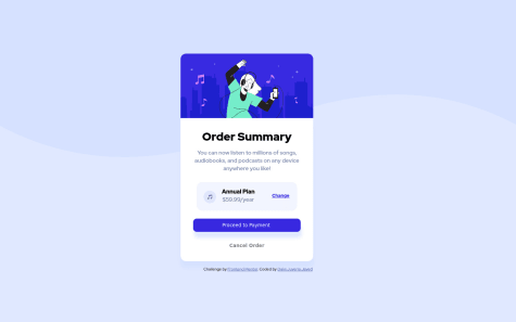
Hi, Hameesha Rantharu.<br> I see that you use for media queries a resolution a bit bigger, i suggest to use maybe 900px max-width, because peoples with small resolutions on PC will see the mobile alternative, not the desktop one. Congrats with your work, in rest all of the things work well, maybe you can find another way to place the images for the card, you can find an easier one.
This is my first time using SCSS so it might be a little sloppy, and I am a baby when it comes to github repositories so excuse my sloppy solution to HTML directory links not working
Hi, TiredQuan.
After a look at your code, I recommend you a trick to make things easier when comes to center a card and to set the position of footer. You should use display: grid; place-items: center; and min-height: 100vh; in the body tag in css, this trick save a lot of time and work. Also, your code is well-written, maybe there are some minor issues or just 'hard way code' to say, that can be written more simple, but for the first time with SCSS you've done a good work, congrats and good luck.
Hi, I take a look at your code and first of all, i recommend you to use display:grid, place-items:center and min-height:100vh in body tag in css, to solve the footer problem and center the card perfectly. Also, you can simplify the css code, from 200 lines you can easily come to 150, or even less, even if this is only a challenge, but if you keep in mind the fact that you can try to simplify the css code and even the html one, you will work more clean and the websites will also be more optimized, especialy when you work with JS or JS frameworks. I hope that the grid thing helped you. Congrats for the work.

