
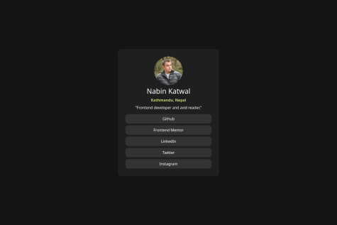

@raistmere
Latest solutions
Newsletter Signup form using React, Vite and Tailwind
#react#tailwind-css#vite#react-routerSubmitted over 1 year ago
Latest comments
- @nabinkatwal7
You can implement mobile design by simply adding breakpoints at require width or heights. Here is an example:
/* Mobile devices */
@media only screen and (max-width: 767px) {
  /* Styles for mobile devices */
}

/* Tablets and small laptops */
@media only screen and (min-width: 768px) and (max-width: 1023px) {
  /* Styles for tablets and small laptops */
}

/* Laptops and desktops */
@media only screen and (min-width: 1024px) {
  /* Styles for laptops and desktops */
}