Skip to content
  • Unlock Pro
  • Log in with GitHub
Profile
OverviewSolutions
7
Comments
16
spyder
@ratan17

All comments

  • anna•340
    @annab6
    Submitted almost 4 years ago

    Responsive card solution using Flexbox and CSS variables

    2
    spyder•315
    @ratan17
    Posted almost 4 years ago

    I see that you've used flexbox to center the card container which is a right approach. Your flexbox is only horizontally centered but not vertically. That's because you have to set height to the flex container which is your
    body element and then use another flexbox property align-items: center. This will center your card container both horizontally and vertically.

    It would look like this:

    body{
        min-height: 100vh;
          display: flex;
          justify-content: center;
       align-items: center;
    } 
    

    use min-height instead of just height.

    If you want to get a good grip on flexbox I would suggest you to play this game: Flexbox Zombies Game

    Marked as helpful
  • Lucky•30
    @anupamthe99
    Submitted almost 4 years ago

    HTML/CSS (error to be fixed)

    4
    spyder•315
    @ratan17
    Posted almost 4 years ago

    you have used vh units everywhere, unnecessary divs to wrap content. avoid setting height use instead padding property with rem values eg ) button{ padding: 1rem; }

    Marked as helpful
  • Mehul Verma•50
    @VerMeh
    Submitted almost 4 years ago

    flexbox

    1
    spyder•315
    @ratan17
    Posted almost 4 years ago

    dude nice work. i would like to give you a notice about scrolling to your site.

    and one interesting part (🤔) in your code i noticed is that you have used margin:auto to your #mainContainer

  • Yassine•35
    @yassinelk2020
    Submitted almost 4 years ago

    Stats Card

    1
    spyder•315
    @ratan17
    Posted almost 4 years ago

    congratulations on completing your first challenge on frontendmentor 👏👏

    I would like to give you a notice about responsiveness. The code is not fully responsive. And one more thing about the background-image. In design the background-image is styled differently and in your preview its different. Was that intentional or you couldn't find the way to do it?

    Marked as helpful
  • nauski•80
    @nauski
    Submitted almost 4 years ago

    Basic HTML and CSS

    1
    spyder•315
    @ratan17
    Posted almost 4 years ago

    the problem with your image size is because you have used a pixel value. you have set the conatiner's size to 450px so it will ALWAYS TAKE 450px width of the screen no matter which device you are using

    pixel value is an absolute value.

    to overcome your problem you may use a relative unit like %, em, rem, vh, vw etc.

    I would suggest you to read this article about absolute units and relative units :

    https://developer.mozilla.org/en-US/docs/Learn/CSS/Building_blocks/Values_and_units

    Marked as helpful
  • Shardul Mulay•70
    @sh4rdu1-git
    Submitted almost 4 years ago

    Stats Preview Card Component

    1
    spyder•315
    @ratan17
    Posted almost 4 years ago
    1. avoid using pixel values

    2. and while using flex there's no need to everytime to enclose the flex-items in a div... when you set a div parent to display:flex the children inside it will be set to flex-items

    3. margins, padding are part of BOX MODEL. so read about that on MDN's website and also read about 'box-sizing' css property

    4. get used to getting frustrated while coding 😁

    If you have more questions ,I'd be really glad to answer them

    Marked as helpful
  • Jessa Mae Alcantara•30
    @EpikSkeptik
    Submitted almost 4 years ago

    Stats preview card component attempt

    1
    spyder•315
    @ratan17
    Posted almost 4 years ago

    there's overflowing issue with the text content

  • Nadya Mumtazah•245
    @NadyaMumtazah
    Submitted almost 4 years ago

    Loopstudios using Bootstrap 4

    1
    spyder•315
    @ratan17
    Posted almost 4 years ago

    between 992px to 1200px device width the text-content below OUR CREATIONS is overflowing

  • MaryF•350
    @Janselin
    Submitted almost 4 years ago

    Flexbox Column, Pure CSS, background blending mode

    1
    spyder•315
    @ratan17
    Posted almost 4 years ago

    avoid using pixel values for sizing the elements, use relative values such as vh,vw, %, em,rem

    link for relative units : https://developer.mozilla.org/en-US/docs/Learn/CSS/Building_blocks/Values_and_units

    if you update the following values your .row container will be exactly centered on the screen :

    1. body element :

    a ) remove these properties align-items: center; align-content: center;

    these properties don't have any effect in your code since they work only when you have set the element to display:flex

     b) set height to 100%
     c) lastly set flex properties to center the content 
    

    this is what it would look like if you update body element as above :

    body { background-color: hsl(233, 47%, 7%); width: 100%; height: 100%; display: flex; flex-direction: column; justify-content: center; align-items: center; }

    1. .row container - a) remove margin and padding b) update width to 65%

    this is what it would look like if you update .row conatiner as above :

    .row{ display: flex; align-items: center; align-content: center; width: 65%; }

    And if you are struggling to understand flexbox , play this flexbox zombie game by mastery games. It helped me alot to understand flexbox

    link: https://mastery.games/flexboxzombies/

    Marked as helpful
  • Rachana Hegde•155
    @rachanahegde
    Submitted almost 4 years ago

    3 column card using CSS Flexbox and Media Queries

    3
    spyder•315
    @ratan17
    Posted almost 4 years ago

    may i know why you didn't go flex properties to center your .cards container ?

  • spyder•315
    @ratan17
    Submitted almost 4 years ago

    sunnyside-agency-landing-page using HTML,CSS,JS and Bootstrap4.5

    3
    spyder•315
    @ratan17
    Posted almost 4 years ago

    IGNORE the HTML and ACCESSIBILITY ISSUES . I will fix it myself.

    Give feedback apart from the above mentioned issues

  • spyder•315
    @ratan17
    Submitted about 5 years ago

    Single price grid component

    1
    spyder•315
    @ratan17
    Posted almost 4 years ago

    Update : flex properties used for the bottom content

  • Fadi•145
    @nofear1985
    Submitted about 4 years ago

    3-column preview card component Using HTML & CSS

    2
    spyder•315
    @ratan17
    Posted about 4 years ago

    you could have used flexbox for centering your cards

    Marked as helpful
  • Shannell Assem•30
    @shannellassem
    Submitted about 4 years ago

    Mobile First with Sass and Flex 3 column

    2
    spyder•315
    @ratan17
    Posted about 4 years ago

    About centering issue :

    1. to center the content using flexbox you have to first set parent's width and height . I can see that you've set only width but not height.

    2. you have not used correct flex properties to center the content/children

    Marked as helpful
  • spyder•315
    @ratan17
    Submitted about 4 years ago

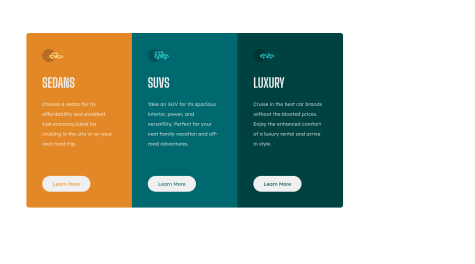
    3 Column Preview Card Component using FlexBox

    4
    spyder•315
    @ratan17
    Posted about 4 years ago

    I have UPDATED MY SOLUTION GUYS !! PLEASE HAVE A LOOK

  • Rishabh Verma•30
    @r0ck1n70sh
    Submitted about 4 years ago

    HTML, CSS

    1
    spyder•315
    @ratan17
    Posted about 4 years ago

    looks like you are also facing issue with svg element position

Stay up to datewith new challenges, featured solutions, selected articles, and our latest news

Frontend Mentor

  • Unlock Pro
  • Contact us
  • FAQs
  • Become a partner

Explore

  • Learning paths
  • Challenges
  • Solutions
  • Articles

Community

  • Discord
  • Guidelines

For companies

  • Hire developers
  • Train developers
© Frontend Mentor 2019 - 2025
  • Terms
  • Cookie Policy
  • Privacy Policy
  • License

Oops! 😬

You need to be logged in before you can do that.

Log in with GitHub

Oops! 😬

You need to be logged in before you can do that.

Log in with GitHub

Oops! 😬

You need to be logged in before you can do that.

Log in with GitHub

Oops! 😬

You need to be logged in before you can do that.

Log in with GitHub

Oops! 😬

You need to be logged in before you can do that.

Log in with GitHub

Oops! 😬

You need to be logged in before you can do that.

Log in with GitHub

Oops! 😬

You need to be logged in before you can do that.

Log in with GitHub

Oops! 😬

You need to be logged in before you can do that.

Log in with GitHub

Oops! 😬

You need to be logged in before you can do that.

Log in with GitHub

Oops! 😬

You need to be logged in before you can do that.

Log in with GitHub

Oops! 😬

You need to be logged in before you can do that.

Log in with GitHub

Oops! 😬

You need to be logged in before you can do that.

Log in with GitHub

Oops! 😬

You need to be logged in before you can do that.

Log in with GitHub

Oops! 😬

You need to be logged in before you can do that.

Log in with GitHub

Oops! 😬

You need to be logged in before you can do that.

Log in with GitHub

Oops! 😬

You need to be logged in before you can do that.

Log in with GitHub

Oops! 😬

You need to be logged in before you can do that.

Log in with GitHub

Oops! 😬

You need to be logged in before you can do that.

Log in with GitHub

Oops! 😬

You need to be logged in before you can do that.

Log in with GitHub

Oops! 😬

You need to be logged in before you can do that.

Log in with GitHub

Oops! 😬

You need to be logged in before you can do that.

Log in with GitHub

Oops! 😬

You need to be logged in before you can do that.

Log in with GitHub

Oops! 😬

You need to be logged in before you can do that.

Log in with GitHub

Oops! 😬

You need to be logged in before you can do that.

Log in with GitHub

Oops! 😬

You need to be logged in before you can do that.

Log in with GitHub

Oops! 😬

You need to be logged in before you can do that.

Log in with GitHub

Oops! 😬

You need to be logged in before you can do that.

Log in with GitHub

Oops! 😬

You need to be logged in before you can do that.

Log in with GitHub

Oops! 😬

You need to be logged in before you can do that.

Log in with GitHub

Oops! 😬

You need to be logged in before you can do that.

Log in with GitHub

Oops! 😬

You need to be logged in before you can do that.

Log in with GitHub

Oops! 😬

You need to be logged in before you can do that.

Log in with GitHub

Oops! 😬

You need to be logged in before you can do that.

Log in with GitHub

Oops! 😬

You need to be logged in before you can do that.

Log in with GitHub

Oops! 😬

You need to be logged in before you can do that.

Log in with GitHub

Oops! 😬

You need to be logged in before you can do that.

Log in with GitHub

Oops! 😬

You need to be logged in before you can do that.

Log in with GitHub

Oops! 😬

You need to be logged in before you can do that.

Log in with GitHub

Oops! 😬

You need to be logged in before you can do that.

Log in with GitHub

Oops! 😬

You need to be logged in before you can do that.

Log in with GitHub

Oops! 😬

You need to be logged in before you can do that.

Log in with GitHub

Oops! 😬

You need to be logged in before you can do that.

Log in with GitHub

Oops! 😬

You need to be logged in before you can do that.

Log in with GitHub

Oops! 😬

You need to be logged in before you can do that.

Log in with GitHub

Oops! 😬

You need to be logged in before you can do that.

Log in with GitHub

Oops! 😬

You need to be logged in before you can do that.

Log in with GitHub

Oops! 😬

You need to be logged in before you can do that.

Log in with GitHub

Oops! 😬

You need to be logged in before you can do that.

Log in with GitHub

Oops! 😬

You need to be logged in before you can do that.

Log in with GitHub