
@Shivayshiva

Rajaul Islam Ratul
@ratul0407All comments
- @ratul0407
@Shivayshiva congrats on completing this challenge🎉🎉
To center the card just do this,
body {
    min-height: 100vh;
    margin: 0;
    display: grid;
}
.main {
    /* max-width: 1440px; */
    /* height: 120vh; */
    background-color: hsl(47, 88%, 63%);
    display: flex;
    flex-direction: column;
    justify-content: center;
    align-items: center;
}
There is a default margin of 8px around the body that is causing the white spaces all around the corners. That's why you need to set
margin: 0. And to make the solution properly work you need to comment out the height and width property from yourmain.I hope you found this helpful👍👍
Have a nice day and happy coding🙂
- @Djole-zr@ratul0407
@Djole-zr congrats on completing this challenge🎉🎉
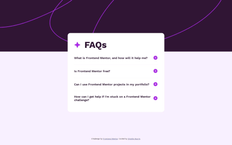
There are quite a few ways to add transition on accordions. e.g.
- You can use plain css to animate accordions first, create a new animation using
@keyframes
@keyframes fade-in {
  from {
    opacity: 0;
  }
  to {
    opacity: 100;
  }
}
Before you add the transition you should use a class add it on your
ptag which doesn't have any class by default. It get's a.showtag when.questionis clicked. We need to change it!. Add the following classes to it (answer, hidden)..answer { opacity: 0; animation: fade-in 200ms ease 0ms 1 alternate forwards; } .hidden { display: hidden; }Then in js just toggle between
hiddenclass whenever thequestiondiv is clicked- Another way is to use
max-heightas height is not an animatable property. W3schools have a very good tutorial on it you can check it out here How to create an animatable accordion
I hope you found this helpful👍👍
Have a nice day and happy coding my friend😄
- You can use plain css to animate accordions first, create a new animation using
- @ValperDev@ratul0407
@ValperGT congratulations on completing this challenge🎉🎉
Your solution looks pretty decent but you need some code improvements:
- Every page should have a
maintag. So Wrap you entire.card-containerinside of amaintag. - You've used pixels, rems and ems on your site. But using px on paddings doesn't seem a good idea to me. And if you want to decide between rems , ems, and pixels here's an article deep diving into it. should you use px vs rem vs em
I hope you found this helpful👍👍
Have a nice day and happy coding🙂
Marked as helpful - Every page should have a
- @Surya-Thiruvengadam@ratul0407
@Surya-Thiruvengadam congratulations on completing this challenge🎉🎉
Your solution looks pretty good. But there are room for some changes.
- Always try to use relative css units instead of absolute ones. Pixel(px) is an absolute css unit. And I'd recommend you to avoid this unit completely. Using Pixel for font-sizes is a really bad idea. And I'd suggest not use it for width, height ,margin and padding also. Use rems or ems instead of pixel. If you use pixel in the future while doing large pages with complex section it'll cause a lot of problems and it is also not good for the responsiveness of the page. And if you are wondering why does it matter so much here's an article to explain you more on this topic Why font-sizes should never be in Pixels😄
That was the only nick pick that I found while viewing your solution🙂. Apart from that your solution looks decent
I hope you found this helpful👍👍
Keep up the good work and have a very nice day😄
Marked as helpful - @lalitkarthik@ratul0407
@lalitkarthik congrats on completing this challenge 🎉🎉
You're solution is amazing. But you should consider changing some of your code. You've used pixels for margins which is not good and using pixel for font sizes is the last thing you want to do. You should always try to avoid pixels as they are absolute units always use relative units like (rems or ems). If you are wondering what is so bad about using pixels here are some articles deep diving into this topic
Apart from this your solution looks great✨
I hope you found this helpful👍👍
Keep up the good work and have a very nice day😄😄
Marked as helpful - @eosook@ratul0407
@eosook congrats on completing this challenge🎉🎉
You're solution looks pretty good👍. Generally when I find myself into the issue you've described. I'll never go to media queries for the solution of such a problem. Most likely I'll use
max-widthif the content is overflowing orclampif thefont-sizeof the property is causing issues. Most of the time I find myself using max-width so the content doesn't bleed or overflow. I exactly don't know what element caused you the issue. But looking at your solution I'm guessing that the image might caused you some problem. 'Cause you haven't setmax-width: 100%on to your image. Always reset your images using these properties,img, svg, canvas { max-width: 100%; display: block; }I hope you found this helpful👍👍
Keep up the good work and have a very nice day😄
Marked as helpful - @frankgomezdev@ratul0407
@frankgomezdev congrats on completing this challenge🎉🎉
You've done a really great job. There's not a lot to complain about👍. But,
- the padding you've set to
.containerof2remis actually shrinking your container. You can just remove it and it looks more like the design. - It's such a small challenge and there wasn't a lot of space to add landmarks but you've done enough. The footer you've added is good but you've commented out the
.attribute😅. I know this mistake 'cause I've also done a couple of times. Uncomment it and remove the.attributediv as you are using afooter - And the last nick pick that I can say, and it's completely my personal opinion that there are too many
divelement on the page. You can consider making thetop boxaarticle.
I hope you found this helpful👍👍
Happy coding and have a very nice day😄
Marked as helpful - the padding you've set to
- @0xmaxx1@ratul0407
@0xmaxx1 congrats on completing this challenge 🎉🎉
You've done a great job. But you might consider changing some code :)
- Always use rems instead of pixels. Pixels are absolute units and rems are relative units. And this relative rem units are way better than pixels in terms of responsiveness. And if you want to learn more about this topic here's an article deep diving into it Stop using pixels unit in css
I hope you found this helpful👍👍
Keep up the good work and have a very nice day😄
- @khalid225@ratul0407
@khalid225 congrats on completing this solution🎉🎉
You've tried really well. But you can make it better.
- the body element get's some default styling which is implemented differently by different browsers. You should always get rid of them first and then start your own styling. And for that you can use some css resets. Because of those default styling of the
bodythecontainer-bodyhas shrunk a little bit and to fix that just do this
body { margin: 0; padding: 0; }- Also remove
.accordion-body { width: 80%}andimg { width: 100% /* by default it's always 100%*/}. And on the accordion remove the width of 50% and apply this.
/* for mobile screens */ .accordion { max-width: 45rem; margin: 1rem; } /* for desktop */ @media(min-width: 45em) { .accordion { margin: auto; } }- I'd recommend you to use rems instead of pixels. And if you want to know why Here's an article deep diving into this topic. Stop Using Pixels!
I hope you found this helpful👍👍
Keep up the good work and have a very nice day🙂😄
Marked as helpful - the body element get's some default styling which is implemented differently by different browsers. You should always get rid of them first and then start your own styling. And for that you can use some css resets. Because of those default styling of the
- @nmrtsnh@ratul0407
Namaste Namrata congratulations on completing this challenge🎉🎉
Your solution looks pretty good. But you can improve your code a little bit
body {
display: grid;
place-content: center;
min-height: 100vh;
}
This will center your newsletter perfectly and then you can remove
.sign-up-form, thank-you-form {
/*   width: 100%;  by default it will get a width of 100% so you don't need it  */
 /*   margin: 6rem auto 0;   We've centered the body so you don't need to use margins anymore🙂*/
}
And I'd also recommend to use the
formtag instead of a.formdiv this will give you some additional keyboard functionality and will help with the pages accessibility.I hope you found this helpful👍
Keep up the good work and have a very nice day🙂😄
Marked as helpful - @JGabriel19@ratul0407
@JGabriel19 Your solution is really great🎉🎉
There is not a lot to complain about. But you should remove
.attributediv that you commented out. And also I would recommend you to start using pixels more. Of course you've used pixels for font size but, padding, border-radiuses and also in a lot of other stuff you should use rems or any relative unit. Relative units are always a better option over absolute units for various reasons.I hope you found this helpful👍
Keep up the good work and have a very nice day😄
- @Ovicky@ratul0407
@Ovicky congrats on completing this challenge🎉🎉
You've done a really great job👍. And on to your question, It doesn't stays centered because you've set
widthandheighton you.first-gridremove it and it solves the problem a little bit. A little bit cause you also need to change your code morebody { min-height: 100vh; display: grid; place-content: center; }Remove everything from your
.first-gridthey are of no use to you. And also remove all the properties from.grid-allas well except thewidthand I'd recommend you to usemax-widthinstead ofwidth..first-grid { border-radius: 1rem; padding: 0.5rem; background-color: white;And now your solution is a little bit better.
I hope you found this helpful👍👍
Have a very nice day and happy coding my friend😄
- @JEWebDev@ratul0407
@LaxusWebDev congrats on completing your very first challenge on the site🎉🎉
You've got a little bit problems with it, but you can fix them easily😄😄. So let's start
- first change the
.component-container.
.component-container { */ width: 13.5% */ max-width: 400px; padding: 1rem; }- and then on to your questions, You don't need media queries for this challenge. So don't even try to use it 'cause mobile and desktop designs are the same for this challenge. And you can know when to use a breakpoint by seeing when you design breaks or you can use predefined ones that bootstrap or tailwind provide (for example). And finally the 1440px breakpoint is something that frontend mentor advises to use as desktop breakpoint but it is not a standard
I hope you found this helpful👍👍
Have a nice day and best of luck for your journey on this site😄😄
Marked as helpful - first change the
- @ThornenSan@ratul0407
@ThornenSan congrats on completing this challenge🎉🎉
You've done a really great job✨. The solution is really great but one thing that caught my eye is that you've used a
divtag for almost everything. Whenever you needed a container you used adiv. There is nothing wrong withdivsthey are ideal container. But you should work a little bit on landmarks as they provide a great value for accessibility. You could've used amainas a background container. You could've used afooterfor the.attributediv. This will help you to cope with accessibility along the way.These are little nick picks and instead of that the solution is great👍
Have a very nice day and keep up the good work🎉😄😄
Marked as helpful - @LouaiKhodary13What are you most proud of, and what would you do differently next time?
Maybe start designing using the mobile approach
What challenges did you encounter, and how did you overcome them?No challenges encountered
What specific areas of your project would you like help with?not a thing
@ratul0407@LouaiKhodary13 congrats on completing this challenge🎉🎉
You've done a really great job👍🚀. Answering to your question, The issue of border radius on
.item-1is not only limited on mobile screens it occurs for all screen sizes smaller than 1440px. And the reason is on your.containeryou've set abackground-color: white. So the.item-1has inherited the background and because of the border-radius the content has shrink so it's visible.Just remove the
background: whitefrom the.containerand add it to the.item-2;I hope it was helpful for you👍👍
Have a very nice day and happy coding😄
Marked as helpful - @OmarZaghlouleh@ratul0407
@OmarZaghlouleh Hey there coder🚀🚀, congrats on completing another frontend mentor challenge🎉🎉
The solution looks really great, The animation is also nice. But you might consider changing some of your code :)
The only Thing that grab my attention was your usage of media query, it's not that your solution isn't responsive. It is responsive but the way you've used your media query's looked a little odd to me. Because everyone prefers using min-width so that we can start from mobile to desktop. But if you prefer using max-width that's also completely fine. Everyone has there own preference. But you might consider doing a little bit of research on how to use media query a little bit more efficiently. This article from free code camp.org might help you😄.
I hope you found this helpful👍👍
Have a very nice day and keep up the good work🌝🌝
Marked as helpful - @GermanGuerreroR@ratul0407
@GermanGuerrero95 congratulations on completing this challenge🎉🎉
You've done a really great job but you can do better :)
The fact that you've chosen to use background image for the main image on this challenge, is somewhat inconvenient for a lot of situations. You've set the height 80rem for the 1440px screen sizes which works pretty well. But the image crops itself in screen sizes under 1440px so in order to fix it you can manually set height to the image for all of the screen sizes manually or you just use an
imgtag if I were you I would pick the second option🌝. Next, all three of the.footer_lielements look good on the 1440px screen but the don't scale pretty well for the other screens. To fix it you can change the height and width for screen sizes below 1440px.footer_li { height: 5rem; width: 5.5rem; //with all the other properties you've set }This looks good on my opinion but you can tweak with it and see which matches the design better.🚀🚀
I hope you found this helpful👍👍
Have a very nice day and happy coding my friend🌝🌝
- @ThornenSan@ratul0407
@ThornenSan Hey there my coder🎉🎉
You're solution is just too good😍😍. There's really not that to change seriously!! But in the mobile design the entire container div (card ) it keeps on stretching until it hits the medium breakpoint which really doesn't makes it look good for screen sizes between (400px - 768px). To fix this issue you can simply just do this on the card
{max-width: 450px //or anything that you feel looks better}and setw-fullafter md screen sizes. Instead of that it's really good😄.I hope you found this helpful👍👍
Have a very nice day🌝 and happy coding my friend🚀🚀
Marked as helpful