Not Found
Not Found
Not Found
Not Found
Not Found
Not Found
Not Found
Not Found
Not Found
Not Found
Not Found
Not Found
Not Found
Not Found
Not Found
Not Found
Not Found
Not Found
Not Found
Not Found

All comments

  • P
    Arianna Choza• 220

    @unachoza

    Submitted

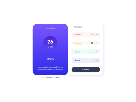
    Any ideas why the summary section begins off screen on mobile? I thought about adding a massive margin, there must be another way.

    Is there a concise way to make the inverse boarder radiuses? Is making a second background container the only way??

    P
    Fabian• 150

    @slowjo

    Posted

    Hey, I looked at your code and there is a cool trick you can use to get rid of your overflowing-content-issue!

    The purple div with class 'section' and id 'result' is breaking out of the container because it has 100% width AND 20px padding. By default, these 20px are added to the 100% width, so now the div has width 100% + 20px (left) + 20px (right).

    There is an easy fix to this: At the very top of your css file, add this:

    * {
        box-sizing: border-box;
    }
    

    With box-sizing set to border box, the padding is now taken into account regarding the element width. So the actual width is 100% now. There is a great interactive example that makes this easy to grasp in the MDN docs: https://developer.mozilla.org/en-US/docs/Web/CSS/box-sizing

    Marked as helpful

    1
  • Alex• 60

    @GrowingHermit44

    Submitted

    I tried to center my attribution content to the center of the desktop layout, but know my [display:grid] columns were conflicting with my usual approach. If you have any suggestions on how you'd have done this, I'm all ears. Thanks.

    P
    Fabian• 150

    @slowjo

    Posted

    I understand that you wrote 'grid-columns: 1fr 1fr' for your card, so the card is fixed to two equal columns. Because there are three containers in it, the third one (.attribution) goes in the next row. All you have to do is add this:

    .attribution { grid-column: 1 / 3; width: 100%; text-align: center; }

    This way, the attribution element will go across both columns in the second row and it is easy to center the content.

    Marked as helpful

    1