Taqib
@taqhAll comments
- @Ken-Takahashi-Q@taqh
Hello ken 👋.
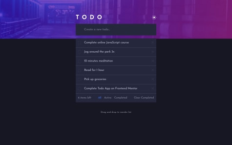
I'm assuming you're talking about the gradient background on the chekbox.
I went through your CSS and couldn't find where you tried to use it but you can try this
.check-box:checked {
   background: url('../images/icon-check.svg'),
      linear-gradient(to bottom right, hsl(192, 100%, 67%), hsl(280, 87%, 65%));
   background-repeat: no-repeat;
   background-position: center;
   outline: 0;
   transition: background 0ms;
}
I also noticed you're trying to set a gradient border to the checkbox on hover
.check-box:hover {
  border-color: var(--check-bg);
  cursor: pointer;
}
This wont work as you cant set gradients to borders. To do that you can use the border-image property however it does not work very well with a border radius. So the easiest way to achieve something close would be to do this:
.check-box:hover {
   border-top: solid .1rem hsl(192, 100%, 70%);
   border-left: solid .1rem hsl(192, 100%, 70%);
   border-right: solid .1rem hsl(280, 87%, 80%);
   border-bottom: solid .1rem hsl(280, 87%, 80%);
   outline: 0;
}
You can click here for more alternatives on setting gradient borders in css
Hope you find this helpful 😄
- @juliancamprr@taqh
Hello djulian 👋
You’re getting some accessibility errors
Here’s how you can fix them:-
-
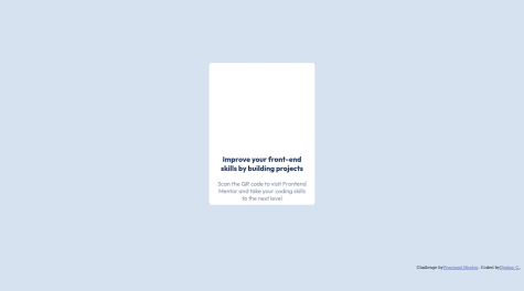
You should replace <div class="container"> with the main tag to fix the accessibility issue.
-
Also replace or put the <div class=“attribution”> inside a footer tag to fix the accessibility issue.
-
You should make the bold text on the card a h1 to fix the ‘“level one heading error”
click here for more on web-accessibility and semantic html
I hope this helps.
Congratulations on completing this challenge
Happy coding 😀
-
- @Desiremadeitt@taqh
Hi chinelo 👋, it seems you need to make a few changes
⚫️ The div wrapping the UL is not necessary you can put the navbar-link class on the UL itself.
⚫️ It seems you’re trying to display the mobile Nav on click of the toggle button by adding the ‘active’ class but you don’t actually have a style to hide it for mobile devices.
You can try this:-
@media (max-width: 400px) {
      .navbar-link {
          Transform: translateX(100%);
          Display: flex;
          Flex-direction: column;
          Background: white;
     }
 };
This will slide the navbar links out of view on mobile devices
⚫️. You currently have this
      navbar-link.active{
          display: flex;
      }
You should try this instead :-
      navbar-link.active{
          Transform: translateX(0)
      };
This will slide the mobile nav into view when the button is clicked.
⚫️. Your JavaScript has some issues, you’re adding a class to show the Nav you also need to remove the class when it’s clicked again.
Here’s what you can try instead of what you have written down
- first you should use a queryselector to target your elements:-
const navToggle = document.querySelector(".toggle-button"); const nav = document.querySelector(".navbar-link");- Then this would be the proper way to add a class to you your UL element/Div
toggleButton.addEventListener('click', () => { nav.classList.add('active') });- Then you can use an if statement to check if it has the active class buy using the
.contains()method
You can remove a class by using the
.remove()method
I hope this helps :)


