What are you most proud of, and what would you do differently next time?
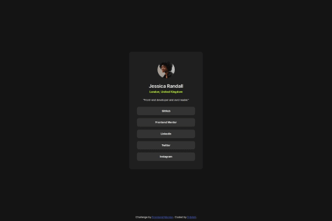
I’m most proud of how I structured my code to be clean, semantic, and responsive, using tools like Flexbox, CSS Grid, and Sass effectively. Incorporating accessibility features like ARIA labels and ensuring responsive typography with clamp() were significant achievements. Next time, I would focus on further optimizing my workflow by experimenting with utility-first frameworks like Tailwind CSS and exploring advanced accessibility practices to make the design even more inclusive.
What challenges did you encounter, and how did you overcome them?
One of the main challenges I faced was getting the element sizes and positions to closely match the design specifications. It required a lot of trial and error, particularly in fine-tuning padding, margins, and grid configurations. I overcame this by carefully analyzing the design, using developer tools for precise measurements, and leveraging CSS features like clamp() and mixins in Sass to achieve better responsiveness and alignment across screen sizes. This iterative process helped me improve my attention to detail and refine my layout skills.
What specific areas of your project would you like help with?
I would like help with further optimizing my layout and responsiveness, particularly in ensuring pixel-perfect alignment with the design across all screen sizes. Additionally, I’d appreciate guidance on improving the accessibility of my project, such as refining ARIA roles or handling focus states more effectively. Lastly, I’d love feedback on my Sass structure and mixins to see if there are ways to make my code even more modular and maintainable.


