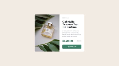
Skip to content
  • Unlock Pro
  • Log in with GitHub
Profile
OverviewSolutions
8
Comments
8
P
Tom Winskell
@tomwinskell

All comments

  • P
    Marcus•310
    @marcus-hill
    Submitted 8 months ago
    What are you most proud of, and what would you do differently next time?

    My use of JavaScript, having only learnt some of it today with limited experience using it in the past.

    What challenges did you encounter, and how did you overcome them?

    The social pop up (on button press) for desktop was very challenging, especially with the pointer at the bottom of it. I don't think it has been done the best way possible, but it seems to work and I would definitely like to improve it.

    What specific areas of your project would you like help with?

    Improving the way I have positioned the desktop social part (with the pointer) once the button is pressed. Using position: relative with top and bottom doesn't seem the most effective way.

    Article Preview Component

    1
    P
    Tom Winskell•180
    @tomwinskell
    Posted 8 months ago

    Nice work! You completed the challenge and your solution looks awesome. You also said this is the first time you are using JavaScript which makes the achievement even more impressive.

    It's cool how you made the triangle or pointer. I didn't think to do it like that. You can actually make just a triangle using CSS. See the code here and a short article about it:

    .preview__footer__share__arrow-down {
      width: 0;
      height: 0;
      border-left: 12px solid transparent;
      border-right: 12px solid transparent;
      border-top: 12px solid var(--dark-blue);
    }
    

    CSS Triangle

    Personally I positioned my share callout using position: absolute;. The parent div then has the property position: relative. Like this:

      .preview__relative__container {
        position: relative;
      }
    
      .preview__footer__share {
        position: absolute;
        top: 150px;
        left: 280px;
      }
    

    What you have done works though so I wouldn't stress about that. However, if you're interested in a good article about positioning elements using absolute or relative I've put a link here. Positioning absolute, relative to parent

    The one thing I think would make a big difference to your solution is that the elements jump around on transitions. Functionally it's not a big deal, it's just annoying. I had an issue with this as well. I believe it's happening here because the elements your hiding or showing are different sizes. The solution I found worked was to contain my footer in a div that had a consistent height. The height of the tallest element. That way, when the smallest element was shown and largest hidden, the container remains the same height. You could try re-factoring your code to include this small change, it would make a big difference I'm sure!

    I hope this helps, if it does, I'd appreciate if you can mark my comment as helpful!

    Good luck with your next project! Tom

    Marked as helpful
  • justine1607•140
    @justine1607
    Submitted 8 months ago

    REsponsive Landing Page

    #sass/scss
    1
    P
    Tom Winskell•180
    @tomwinskell
    Posted 8 months ago

    🤩🤩 Nice work! Your solution looks awesome. 🤩🤩

    • Responsive.
    • Different layouts as per the design for desktop, tablet and mobile.
    • Colours, fonts, spacing and buttons are spot on.

    🤔 Here's something to consider. I hope my explanation is clear. Sorry if you already know this.

    • Your reset may of actually caused you some difficulty when applying the styles you wanted. For example, on the design the header or hero image is full width and actually the page.
    • Your reset provides every image with the css property: max-width: 100%. However, for your hero image you ideally want it to be width: 110vw or similar.
    • It would be difficult to apply this custom style with your current setup.

    Why?

    • Ideally a css reset should be linked before your custom css styles. Css is a cascade meaning that properties lower in the stylesheet override those above. That's why media queries for breakpoints typically go at the bottom of the stylesheet.
    • There's a good explanation by Shay Howe here.
    • Your link in index.html to the reset is below your custom stylesheet. I'd switch it around or even @import the reset at the top of your custom stylesheet. See here.
  • juan-mentor•330
    @juan-mentor
    Submitted 9 months ago
    What are you most proud of, and what would you do differently next time?
    • Estoy orgulloso de poder acabar el proyecto, colocando todos los items en su lugar y además alinear verticalmente los textos.

    • Debería de poder hacer que el Css grd sea mas responsivo y utilizar menos consultas de medios.

    What challenges did you encounter, and how did you overcome them?
    • La mayor dificultad que me he encontrado ha sido la de alinear textos de distinta longitud.

    • La solución que he encontrado ha sido utilizar flexbox y a sus items darle un justify-content: space-between.

    What specific areas of your project would you like help with?
    • Me gustaría profundizar en el alineamiento vertical de Css grid.

    Tarjetas Testimoniales con Css grid y flexbox

    #bem#pure-css
    1
    P
    Tom Winskell•180
    @tomwinskell
    Posted 9 months ago

    ##Nice work, it looks great 👍##

    • 💜 I'm seeing BEM everywhere on this platform. Nice use of __ and -- to indicate elements and modifiers.
    • 💜 It's easy for me to see how your organized your CSS. Some comments as headers could help as well.
    • 🙋🏽 Consider hosting your own fonts. Here's the link.

    😀 Keep up the great work!

    Marked as helpful
  • Ololade•110
    @zololade
    Submitted 9 months ago

    Responsive landing page using css

    #vite#sass/scss
    1
    P
    Tom Winskell•180
    @tomwinskell
    Posted 9 months ago

    NICE work completing the challenge 🤙🏻

    • 💜 that your design looks good on all screen sizes and you added your own layout for screen sizes between mobile and full desktop!

    • 💜 you've made use of tons of sass specific features such as @mixin

    • 💜 sweet use of grid for creating all of your templates

    • 🙋🏽 something you could checkout is the clamp. It's used to make things responsive to the browser window. For example, if you look carefully the design has a different size font for the h1 in mobile and desktop. It would make a great place to use clamp.

    Keep it up! ⚽️

    Marked as helpful
  • P
    Robert Forbes•70
    @RoboticDinosaur
    Submitted 9 months ago
    What are you most proud of, and what would you do differently next time?

    I decided to use a static site generator for this one along with SCSS to create a better workflow and cleaner code.

    I would probably change some of the elements for the next challenge instead of sticking to the ease of divs.

    What challenges did you encounter, and how did you overcome them?

    The Figma file provided was useless so I made some executive decisions with sizing and spacing to make the end be close as possible to the design images provided.

    Product Preview Card Component

    #eleventy#sass/scss
    1
    P
    Tom Winskell•180
    @tomwinskell
    Posted 9 months ago

    ##Looks awesome!##

    Here's some suggestions:

    • I just tried hosting my own fonts. Check out the documentation here https://gwfh.mranftl.com/fonts.
    • I see you used SASS. I just started learning this too. So, I'm definitely no expert. I seem to have followed a slightly different process to you though.
    • I would say it is a little hard to follow what's going on with your project. Have you considered breaking your scss into different files. I.e. fonts, colours, breakpoints, etc...
    • Also, keeping unnecessary files out of your project by deleting the design files and by using .gitignore might keep things more organized.
  • P
    Ricarddo96•100
    @Ricarddo96
    Submitted 9 months ago

    Qr using basic CSS and HTML

    2
    P
    Tom Winskell•180
    @tomwinskell
    Posted 9 months ago

    Here's some suggestions that I though might help.

    • One of the biggest issues I can see if the alignment of your component. It should be centred on the screen. It's worth learning how your can create layouts using flexbox. Flexbox makes it really easy to center something on the screen. Check out https://css-tricks.com/snippets/css/a-guide-to-flexbox/.
    • Nice reset with the use of * in your css. There are also pre-prepared CSS resets which you can use https://meyerweb.com/eric/tools/css/reset/.
    • Organizing your CSS into sections with comments as headers can help. This project is small but as your CSS files getter bigger and longer, sections and comments can really help. I find it has been useful to practise this with smaller projects first. For example:
    // Font-styles
    h1{
        font-size: 21px;
    }
    
    p{
        font-size: 15px;
        color: hsl(216, 15%, 48%);
    }
    
  • Mudasir Nadeem•430
    @mudasirNadeem
    Submitted 9 months ago
    What are you most proud of, and what would you do differently next time?

    I’m most proud of successfully completing a challenging project where I led a team, overcame obstacles, and delivered results that exceeded expectations.

    What challenges did you encounter, and how did you overcome them?

    I encountered challenges with tight deadlines and differing team opinions during a project. To overcome these, I prioritized open communication and facilitated regular check-ins, ensuring everyone was heard and we could collaboratively find solutions. This approach helped us stay on track and ultimately deliver the project successfully.

    What specific areas of your project would you like help with?

    Code Efficiency: Are there any parts of my code that could be optimized for better performance, especially in the data-fetching functions?

    UI/UX Design: I’d like input on the user interface layout. Does it provide a good user experience, or are there aspects that could be improved for better accessibility?

    Responsive Design: How well does my application respond to different screen sizes? Are there specific elements that break or look unprofessional on mobile devices?

    Error Handling: I want to ensure robust error handling throughout the application. Are there any areas where my error handling could be improved or made more user-friendly?

    A mobile-first approach showcasing responsive design using only CSS

    2
    P
    Tom Winskell•180
    @tomwinskell
    Posted 9 months ago

    Nice work!

    Here's some suggestions that might help.

    • It's helpful for those looking at your code to call your css file style.css, standard.css or default.css. It can also be helpful to put your stylesheet into a folder called stylesheets.
    • Nice reset with the use of * in your css. There are also pre-prepared CSS resets https://meyerweb.com/eric/tools/css/reset/.
    • Organizing your CSS into sections with comments as headers can help. For example:
    // Font-styles
    h1{
        font-size: 21px;
    }
    
    p{
        font-size: 15px;
        color: hsl(216, 15%, 48%);
    }
    
    • Using the !important tag isn't usually the best way to apply a CSS property. Style sheets are cascading and so there are many ways to apply the style without using the important tag. Read more here https://learn.shayhowe.com/html-css/getting-to-know-css/.

    Happy coding!

  • jevcenkokozlovska•150
    @jevcenkokozlovska
    Submitted 9 months ago

    qr code page with HTML and CSS

    2
    P
    Tom Winskell•180
    @tomwinskell
    Posted 9 months ago

    The solution looks very similar to the design but I would say that the code could be easier to follow and re-usable.

    The text in the html could be differentiated with different tags. h1 for the larger bold heading.

    The CSS file could have comments to identify sections to the reader. Variables used for colours is smart. Fonts could also be defined in the CSS file so they could be reused.

    I don't think the spacing is quite right at the bottom.

    Creating reusable code could be helpful if this was part of a larger project.

Frontend Mentor logo

Stay up to datewith new challenges, featured solutions, selected articles, and our latest news

Frontend Mentor

  • Unlock Pro
  • Contact us
  • FAQs
  • Become a partner

Explore

  • Learning paths
  • Challenges
  • Solutions
  • Articles

Community

  • Discord
  • Guidelines

For companies

  • Hire developers
  • Train developers
© Frontend Mentor 2019 - 2025
  • Terms
  • Cookie Policy
  • Privacy Policy
  • License

Oops! 😬

You need to be logged in before you can do that.

Log in with GitHub

Oops! 😬

You need to be logged in before you can do that.

Log in with GitHub

Oops! 😬

You need to be logged in before you can do that.

Log in with GitHub

Oops! 😬

You need to be logged in before you can do that.

Log in with GitHub

Oops! 😬

You need to be logged in before you can do that.

Log in with GitHub

Oops! 😬

You need to be logged in before you can do that.

Log in with GitHub

Oops! 😬

You need to be logged in before you can do that.

Log in with GitHub

Oops! 😬

You need to be logged in before you can do that.

Log in with GitHub

Oops! 😬

You need to be logged in before you can do that.

Log in with GitHub

Oops! 😬

You need to be logged in before you can do that.

Log in with GitHub

Oops! 😬

You need to be logged in before you can do that.

Log in with GitHub

Oops! 😬

You need to be logged in before you can do that.

Log in with GitHub

Oops! 😬

You need to be logged in before you can do that.

Log in with GitHub

Oops! 😬

You need to be logged in before you can do that.

Log in with GitHub

Oops! 😬

You need to be logged in before you can do that.

Log in with GitHub

Oops! 😬

You need to be logged in before you can do that.

Log in with GitHub

Oops! 😬

You need to be logged in before you can do that.

Log in with GitHub

Oops! 😬

You need to be logged in before you can do that.

Log in with GitHub

Oops! 😬

You need to be logged in before you can do that.

Log in with GitHub

Oops! 😬

You need to be logged in before you can do that.

Log in with GitHub

Oops! 😬

You need to be logged in before you can do that.

Log in with GitHub

Oops! 😬

You need to be logged in before you can do that.

Log in with GitHub

Oops! 😬

You need to be logged in before you can do that.

Log in with GitHub

Oops! 😬

You need to be logged in before you can do that.

Log in with GitHub

Oops! 😬

You need to be logged in before you can do that.

Log in with GitHub