Skip to content
  • Unlock Pro
  • Log in with GitHub
Profile
OverviewSolutions
9
Comments
10
Sam
@wotanut

All comments

  • Sameer Mehta•170
    @Sameer1003
    Submitted 2 months ago
    What specific areas of your project would you like help with?

    Please Please Please someone review my code and help me in re-structuring it.

    1. I had, at many places, used "overflow: visible;" just to make the share-popup be visible outside my main container. Please advice some improvement as I know that this is not the best practice.
    2. I don't know somehow my main image (the .card-img) is misbehaving. In one of the previous challenge i had already implemented same thing but this time I was unable to correct it. The issue is that the height and width of the card-img div is not getting applied in reference to the container div. This makes me forced to manipulate the values just so that I can get the site same as design.
    3. Any other suggestions that can help me understand the best practices are also welcomed.

    I would really really appreciate anyone who can help me improve these things. As a beginner I would appreciate any kind of review. Please try to be specific with which part the improvement is possible.

    Thank you.

    Article Preview Component Solution

    1
    Sam•170
    @wotanut
    Posted 2 months ago

    Hey Sameer. Good job, here's how you can improve:

    • Use more semantic labels such as article instead of div, otherwise your semantics look great
    • You're repeating a LOT of CSS, try using roots and variables
    • for your overflow:visible issue, I think you should only need it on your .author styles and apply position:relative to it becase your popup is positioned relative to this.
    • for your javascript don't use anonymous inner functions, call them by reference instead
    shareBtn.addEventListener('click',test);
    
    function test() {
    sharePopup.style.display = (sharePopup.style.display === "flex" ? "none" : "flex");
    };
    
    Marked as helpful
  • Vincenzo Marcovecchio•1,195
    @VincenzoMarcovecchio
    Submitted 6 months ago
    What are you most proud of, and what would you do differently next time?

    I would do different the tablet version

    What specific areas of your project would you like help with?

    I made a lot of errors but the overall solution looks decent

    Time tracking dashboard

    #vue#animation
    1
    Sam•170
    @wotanut
    Posted 6 months ago

    This is an amazing solution, well done. The animated fly-in's are awesome. Here's a few tips to improve:

    • Try putting your javascript in a seperate file to make your code easier to read
    • Add more of a border radius around the report for card to be consistent with the rest of the border radiuses
    • It isn't clear what the active state is (weekly, monthly, daily), try adding a hover effect so that it's clearer

    Overall, this is an exemplary solution, well done.

  • Abuzer•30
    @abuzerexe
    Submitted about 1 year ago

    Responsive Testimonial landing page using CSS grid,flexbox

    #pure-css
    1
    Sam•170
    @wotanut
    Posted 9 months ago

    An excellent attempt, here's how you can improve:

    • Add a bit of padding between the outside of the boxes and your content by adding
    display: grid;
    place-items: center;
    

    To your body, it will also deal with centering your content.

    • Try to use git more to version control your code instead of just having one commit.
    • Your CSS has inconsistent spacing, try using a formatter such as prettier.

    It may be of interest to you but Kevin Powell has a good tutorial on this solution. Other than these minor things, you did an excellent job, well done. :)

  • Sam•170
    @wotanut
    Submitted 9 months ago
    What are you most proud of, and what would you do differently next time?

    Most proud of the fact that I completed this challenge in under an hour, although I was aiming for 30 minutes. My emmet usage and skills has improved significantly which pleases me and i'm nearly there on remembering how to use favicons

    What specific areas of your project would you like help with?

    Writing the box shadows and how I can use pseudo elements like ::before for the box shadows

    Responsive Four Card design

    #vanilla-extract#pure-css
    2
    Sam•170
    @wotanut
    Posted 9 months ago

    Can you please leave some useful feedback @AVARUSJOSE , I don't think you've understood the point of the site and the feedback function. Everytime you finish a challenge you're supposed to leave some constructive feedback about how the other person can improve instead of post good job etc so that you can move on in the learning paths.

  • alshimaa mohamed•240
    @alshimaa-mhmd
    Submitted 10 months ago

    four card feature section with grid

    #pure-css
    1
    Sam•170
    @wotanut
    Posted 9 months ago

    An excellent attempt, well done. Here's how to improve your solution:

    • Consider using an alternative to <div> such as <article> to improve semantics and accessibility.
    • You can centre the whole block text inside your HTML like so
    html,
    body {
      margin: 0;
      width: 100%;
      height: 100%;
      display: grid;
      place-items: center;
    }
    

    This also includes some resets that you should be performing

    • Consider using CSS variables to reuduce repetitive code and to make variables easier to modify. CSS Variables Tutorial
    • Consider adding six grid areas instead of what you have now to make it easier to align such as grid-template-areas: "one two three" "four five six"; then add grid-row: span 2; to your rows that need to span two or more rows and change the grid-area to be of this syntax grid-area: one / four;. This works as the text doesn't need to follow the same grid shape as the cards.

    Well done though, an excellent attempt :)

    Marked as helpful
  • Oscar Anillo•840
    @OscarAnillo
    Submitted almost 3 years ago

    Product preview card component

    #react#vanilla-extract#webpack
    1
    Sam•170
    @wotanut
    Posted 10 months ago

    An excellent attempt, well done. Here's how you can do better:

    • Align the card itself to the centre of the screen. You can do this by adding this snippet to either your App class or HTML/Body
    display: flex;
    align-items: center;
    justify-content: center;
    
    • Try not to use div's and prefer other semantic elements like <Section> or <Article> and include a <Main> as well for every document. Here's a couple of useful articles as to why it's important. Dev.to FreeCodeCamp
    • Your media query needs adjusting to have effect on a slightly bigger screen or you need to increase your padding on your product text so it does not flow off the card.
    • I think you can benefit from using a naming convention like BEM (Block, Element, Modifier) is beneficial because it makes your CSS more organized, readable, and easier to maintain. BEM helps you clearly understand the purpose of each class, avoid naming conflicts, and create reusable components, leading to a more scalable codebase. For more details.

    Your media query's are very well written, and the attempt extremely polished, well done :)

  • iruburu•100
    @Iruburu
    Submitted 10 months ago
    What are you most proud of, and what would you do differently next time?

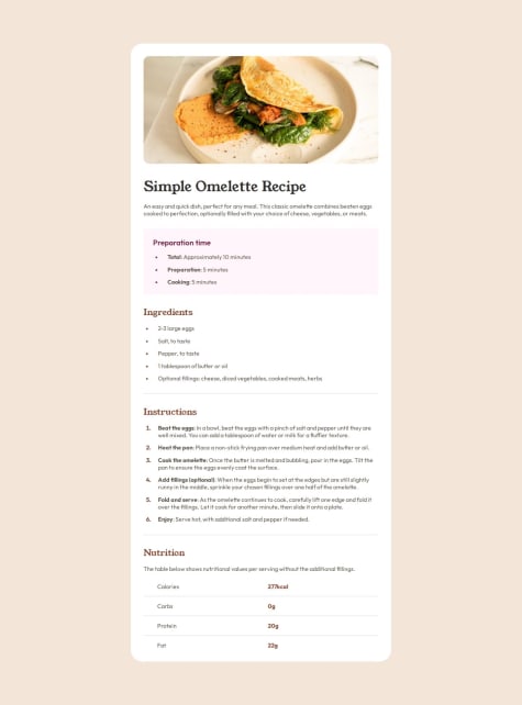
    Eu me orgulho de conseguir ter feito de forma que ficasse igual/quase igual, e também por ter ficado bonito. Tentaria fazer de outras comidas e usar variedade de cores.

    What challenges did you encounter, and how did you overcome them?

    Quase não encontrei desafio. Porem tive uma quebra de cabeça com umas das folhas de estilo que criei que estava atrapalhando a responsividade da página.

    Página responsiva usando tamanhos relativos e @media screen`s

    #pure-css
    1
    Sam•170
    @wotanut
    Posted 10 months ago

    An excellent attempt, just a couple of small tweaks:

    1. Your github repo is private (show it off, it'll look good on your CV)
    2. You missed a border radius on the preparation time section

    Other than that, well done

    Marked as helpful
  • Mohamed•320
    @ameencoding
    Submitted about 1 year ago
    What are you most proud of, and what would you do differently next time?

    I loved the images and the style guides that frontendmentor provided. That makes my progress very smooth.

    What challenges did you encounter, and how did you overcome them?

    Once i finished the project, the first idea comes into my mind was to add social media icons, but i changed my mind and i replaced a better hover animation.

    What specific areas of your project would you like help with?

    Once i finished the project i deleted all pre-installed fonts, assets and all un-wanted things, so i would like to know if that was a mistake!

    Social links profile With HTML and CSS

    #pure-css
    1
    Sam•170
    @wotanut
    Posted 10 months ago

    First off, excellent job, your site and animations look amazing.

    Deleting unused assets and fonts is absolutely valid. If they're not going to be used by the browser, why keep them?

    Social media icons would be an excellent idea however your hover animation is already amazing, don't let the enemy be the perfection of good.

    <img src="./assets/images/avatar-jessica.jpeg" alt="">
    

    Try to always inhclude alt's for every picture you include. Sometimes images won't load and then users will be staring at nothing, not knowing what the image should show.

    For your links, you've written a lot of CSS code, it could've been achieved using the same effects using a grid/flexbox. For example:

    .media {
      display: grid;
      grid-auto-columns: 1fr;
      gap: 20px;
      width: 100%;
    }
    

    Would have achieved mostly the same thing

  • Julio César García Rodríguez•130
    @IuliusCaesarGR
    Submitted 11 months ago

    CSS flex, Semantic HTML

    #accessibility#pure-css
    2
    Sam•170
    @wotanut
    Posted 10 months ago

    An excellent attempt at the challenge, good semantics and CSS, only criticism is the difference in word wrapping (assuming you're going for picture perfection)

    The button also appears to have some left and bottom padding in the original screenshot wheras your design does not account for this.

  • vancorreia04•10
    @vancorreia04
    Submitted 10 months ago

    Apliquei boas práticas de CSS. Uso de estrutura do código HTML e CSS

    #accessibility#pure-css
    1
    Sam•170
    @wotanut
    Posted 10 months ago

    an interesting way to use this challenge

Stay up to datewith new challenges, featured solutions, selected articles, and our latest news

Frontend Mentor

  • Unlock Pro
  • Contact us
  • FAQs
  • Become a partner

Explore

  • Learning paths
  • Challenges
  • Solutions
  • Articles

Community

  • Discord
  • Guidelines

For companies

  • Hire developers
  • Train developers
© Frontend Mentor 2019 - 2025
  • Terms
  • Cookie Policy
  • Privacy Policy
  • License

Oops! 😬

You need to be logged in before you can do that.

Log in with GitHub

Oops! 😬

You need to be logged in before you can do that.

Log in with GitHub

Oops! 😬

You need to be logged in before you can do that.

Log in with GitHub

Oops! 😬

You need to be logged in before you can do that.

Log in with GitHub

Oops! 😬

You need to be logged in before you can do that.

Log in with GitHub

Oops! 😬

You need to be logged in before you can do that.

Log in with GitHub

Oops! 😬

You need to be logged in before you can do that.

Log in with GitHub

Oops! 😬

You need to be logged in before you can do that.

Log in with GitHub

Oops! 😬

You need to be logged in before you can do that.

Log in with GitHub

Oops! 😬

You need to be logged in before you can do that.

Log in with GitHub

Oops! 😬

You need to be logged in before you can do that.

Log in with GitHub

Oops! 😬

You need to be logged in before you can do that.

Log in with GitHub

Oops! 😬

You need to be logged in before you can do that.

Log in with GitHub

Oops! 😬

You need to be logged in before you can do that.

Log in with GitHub

Oops! 😬

You need to be logged in before you can do that.

Log in with GitHub

Oops! 😬

You need to be logged in before you can do that.

Log in with GitHub

Oops! 😬

You need to be logged in before you can do that.

Log in with GitHub

Oops! 😬

You need to be logged in before you can do that.

Log in with GitHub

Oops! 😬

You need to be logged in before you can do that.

Log in with GitHub

Oops! 😬

You need to be logged in before you can do that.

Log in with GitHub

Oops! 😬

You need to be logged in before you can do that.

Log in with GitHub

Oops! 😬

You need to be logged in before you can do that.

Log in with GitHub

Oops! 😬

You need to be logged in before you can do that.

Log in with GitHub

Oops! 😬

You need to be logged in before you can do that.

Log in with GitHub

Oops! 😬

You need to be logged in before you can do that.

Log in with GitHub

Oops! 😬

You need to be logged in before you can do that.

Log in with GitHub

Oops! 😬

You need to be logged in before you can do that.

Log in with GitHub

Oops! 😬

You need to be logged in before you can do that.

Log in with GitHub

Oops! 😬

You need to be logged in before you can do that.

Log in with GitHub

Oops! 😬

You need to be logged in before you can do that.

Log in with GitHub

Oops! 😬

You need to be logged in before you can do that.

Log in with GitHub