Latest solutions
Latest comments
- @yazanMhussein@yazanMhussein
look at the live code it's different from the one you seeing
- @pushback45@yazanMhussein
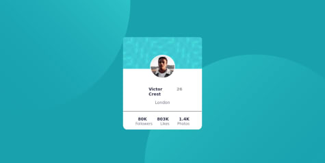
hi there first thing is you are using flex layout but this design require a grid layout. so here is the code that I use to fix your problem with
body{ /add display: grid and grid-template-columns: repeat(1,2fr);/ display: grid; grid-template-columns: repeat(1,2fr); } .container{ /remove display: flex; and flex-direction: column/ display: grid; align-items: center; justify-content: center; } .card{ /* added display: grid; grid-column: span 1; */ display: grid; grid-column: span 1; } .third-card h1{ /*change margin-top to padding-top */ padding-top: 20px;}
inside the media query .container{ /add display: grid and grid-template-columns: repeat(2,2fr);/ display: grid; grid-template-columns: repeat(2,2fr); } .card{ /* added display: grid; and grid-column: span 2; / display: grid; grid-column: span 2; } .seccard-title{ /remove margin-top and margin-left/ margin-top: 0px; margin-left: 0px; } .third-card{ / change values of width: 21.5%; margin-left: 380px; margin-top: -274px; padding-left: 20px; background: contain; to new values that is down / width: 20%; margin-left: 25%; margin-top: -24.3%; padding-left: 20px; } .container{ / add container and inside put the display to block*/ display: block; }
- @yazanMhussein@yazanMhussein
look at the preview to see the design update
- @yazanMhussein@yazanMhussein
any feedback would be good. thanks
- @yazanMhussein@yazanMhussein
forget to made the mobile version. I you look at the (live site/preview site) you would see the difference.


