Skip to content
  • Unlock Pro
  • Log in with GitHub
Profile
OverviewSolutions
18
Comments
5
Nader
@youtubbeh

All comments

  • mohammed abdo•220
    @Hazard-58
    Submitted almost 3 years ago

    four card component

    1
    Nader•300
    @youtubbeh
    Posted almost 3 years ago

    Hi Mohammed, On first impression, looks good to me! There are some things you can improve, though:

    • There are some typos on your text: MOnitors, avaluate, taent.
    • Using semantic html tags. I would suggest you use <main> instead of <div class="container"> for your main container. <main> is a semantic html tag that better informs the browser what the content is about.
    • Use h2 instead of h3 because you shouldn't skip h tag orders. This is also a semantic html best practice.
    • Be careful to include <alt> tags for accessibility on your images.
    • On mobile, your boxes look a bit squeezed, I would suggest you make the main container's width a bit smaller when screen width gets to 400px or lower. You can do this by adding a media query and in there setting a width for the main container: @media all and (max-width: 400px)...
    Marked as helpful
  • michel•150
    @michelgx21
    Submitted almost 3 years ago

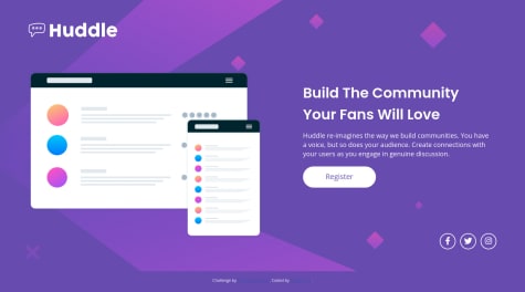
    Huddle landing page with a single introductory section

    1
    Nader•300
    @youtubbeh
    Posted almost 3 years ago

    Hi Michel, I would suggest a couple of things:

    • Be sure to add some padding to your <main> tag because your content is right on the border, which makes for not such a good user experience.
    • You have an accessibility issue with the links on the attribution footer. The color doesn't contrast well with the background, so people can't read the text well. You can just add a color property to your <a> 's on CSS
    • You're using 2 divs with 2 different id's to structure sections 1 and 2. There's a better way to do this, using the <section> tag with a class or id. And you can ditch the divs. Why is this better? It's good practice to use semantic tags whenever possible, as these tags tell the browser what the content is about, and also is easier to read by collaborator coders (example: <section>, <footer>, <main>, <header>, etc. instead of divs). You can apply this concept to other divs you have, when possible.
    • The social media logos are not centered in their circles. For a better aesthetic, I would either center them or remove their circle borders (much easier).

    Nice form btw!

    Marked as helpful
  • Nader•300
    @youtubbeh
    Submitted almost 3 years ago

    Responsive price page using flex box and media queries

    2
    Nader•300
    @youtubbeh
    Posted almost 3 years ago

    Thanks!

  • Nader•300
    @youtubbeh
    Submitted almost 3 years ago

    Responsive stats preview card using flexbox and media queries

    2
    Nader•300
    @youtubbeh
    Posted almost 3 years ago

    Thanks a lot Alan!

  • Nader•300
    @youtubbeh
    Submitted about 3 years ago

    E-commerce Order Summary using HTML and CSS

    2
    Nader•300
    @youtubbeh
    Posted about 3 years ago

    Thanks Favour! About making it responsive, I don't think I need to because the main element is smaller than a phone screen, centered vertically and horizontally, and positioned as absolute, so it will always fit. Although I haven't tried it on a horizontal mobile device. Is it best practice to always use @media-queries in CSS regardless of this? Let's say, as a caution measure.

Frontend Mentor logo

Stay up to datewith new challenges, featured solutions, selected articles, and our latest news

Frontend Mentor

  • Unlock Pro
  • Contact us
  • FAQs
  • Become a partner

Explore

  • Learning paths
  • Challenges
  • Solutions
  • Articles

Community

  • Discord
  • Guidelines

For companies

  • Hire developers
  • Train developers
© Frontend Mentor 2019 - 2025
  • Terms
  • Cookie Policy
  • Privacy Policy
  • License

Oops! 😬

You need to be logged in before you can do that.

Log in with GitHub

Oops! 😬

You need to be logged in before you can do that.

Log in with GitHub

Oops! 😬

You need to be logged in before you can do that.

Log in with GitHub

Oops! 😬

You need to be logged in before you can do that.

Log in with GitHub

Oops! 😬

You need to be logged in before you can do that.

Log in with GitHub

Oops! 😬

You need to be logged in before you can do that.

Log in with GitHub

Oops! 😬

You need to be logged in before you can do that.

Log in with GitHub

Oops! 😬

You need to be logged in before you can do that.

Log in with GitHub

Oops! 😬

You need to be logged in before you can do that.

Log in with GitHub

Oops! 😬

You need to be logged in before you can do that.

Log in with GitHub

Oops! 😬

You need to be logged in before you can do that.

Log in with GitHub

Oops! 😬

You need to be logged in before you can do that.

Log in with GitHub

Oops! 😬

You need to be logged in before you can do that.

Log in with GitHub

Oops! 😬

You need to be logged in before you can do that.

Log in with GitHub

Oops! 😬

You need to be logged in before you can do that.

Log in with GitHub

Oops! 😬

You need to be logged in before you can do that.

Log in with GitHub