
ysagohh
@ysagohhAll solutions
Input validation and calculations using Javascript
Submitted 3 months agoHow should I fix the layout such that it still looks good even if the user enters large numbers (e.g. 1000000000000). Right now, since the layout is responsive, it breaks when the input is large.
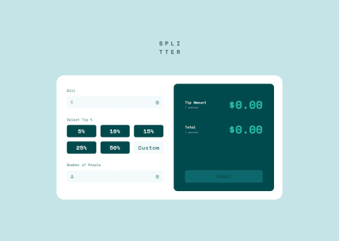
Responsive Grid with JSON Data
Submitted 3 months agoIs my Javascript code optimized and easy to understand? Is my CSS organized and readable?
Mobile-first page using CUBE CSS concepts
#cube-cssSubmitted 4 months agoDid I apply CUBE CSS well? I was following the methodology at the start, but at some point, I had a lot of exceptions. Is my code optimized?
Newsletter signup form with email validation
Submitted 4 months agoIs my Javascript code optimized and easy to read?
Responsive landing page using CSS Grid and Flexbox
Submitted 4 months agoWhich is best practice to lay out first: desktop or mobile?
Responsive social proof section using CSS Grid
Submitted 4 months agoI don't understand why the grid items were not shrinking together with the grid container. Any ideas?
Responsive Preview Card using CSS Grid
Submitted 4 months agoIs there a better way to align the container at the center of the screen while the footer is at the bottom? I'm using Grid to do it in this project, and I have used Flexbox combined with
margin-top: autoin the past.Responsive car preview card
Submitted 5 months agoWhy doesn't the bottom margin of my footer show on mobile?
Simple social card using FlexBox
Submitted 5 months agoCurious if my code is readable and organized well.
Responsive preview card using FlexBox
Submitted 5 months agoI'm curious if there are better ways to structure the HTML. Also whether "wrapper" and "container" are okay to use as class names or if there are best practices.
Responsive page using FlexBox
Submitted 5 months agoWould this have been easier with Grid instead of FlexBox?
First time using flexbox
Submitted 5 months agoI positioned the
.attributionclass at the bottom of the page usingposition: absolute, which looks fine on devices with enough height. But if I resize the browser to make it shorter, it then overlaps with the card. I want to make it inline so that it stays under the profile card.I've tried different things but I haven't found the answer. I think I'm supposed to add a media query:
@media only screen and (max-height: 580px) { .attribution { } }First webpage using HTML and CSS
Submitted 5 months agoI don't know how to change the layout to remove the colored background and enlarge the photo on mobile view. I'm also not sure whether I should be using 'class' or 'id' on the HTML elements.