Jerry Reis• 190
@Jerry-Reis
Submitted
Feedback about code will be very appreciated. :)
Looking to hire developers?
@zitescody
@Jerry-Reis
Submitted
Feedback about code will be very appreciated. :)
@zitescody
Posted
Hello, @Jerry-Reis! Wow, nearly identical to the sample. Excellent job!
@developython14
Submitted
thank you for your suggetions and advices in adnaces
@zitescody
Posted
Hello, @developython14. Below is my feedback and suggestions:
1.) Change <div class="parent-container" to <main class="parent container"> . Whenever possible, you should contain the content of your page in landmarks (header, main, footer, section, article, aside, etc.). Landmarks give your page semantic meaning AND make it easier for screen readers to parse your webpage. I have linked a helpful article here .
2.) I noticed your page does not have an h1 tag. You should always include in your webpage at least one h1 tag. I would replace your <h2 class="first-heading"> with <h1 class="first-heading> . This tells your reader THIS is the start of my content. This is especially important for those who rely on headings to know where they are at on your webpage. I have attached an article here to help you out.
.cart1 {
    background-image: url(../images/icon-supervisor.svg);
    background-repeat: no-repeat;
    background-position: 260px 135px;
    background-size: 50px;
    width: 340px;
    height: 200px;
    border-top: 3px solid;
    border-color: hsl(180, 62%, 55%);
    margin: 10px;
    background-color: hsl(0, 0%, 98%);
}

.cart1 {
    border-radius:5px;
    box-shadow: rgba(0, 0, 0, 0.35) 0px 5px 15px;
}
Overall, wonderfully done. I challenge you to include CSS custom properties in your next project. I makes your code much more easier to read and are awesome since they allow you to reuse certain CSS code by declaring them in variables. Take a look at this article to get started.
Please mark this as helpful if you benefitted from my feedback! Happy coding.
Marked as helpful
@gmcodes20
Submitted
I'll appreciate your honest and brutal opinion on this design. Thank you
@zitescody
Posted
Hello, @gmcodes20. Wonderfully done! Here is a quick fix.
1.) Be sure to label your <input type="email" required> . I would do `<input type="email" aria-label="email input" required>. This is important because "effective form labels are required to make forms accessible... Screen readers users require useful form labels to identify form fields. Adding a label to all form elements eliminates ambiguity and contributes to a more accessible product."
Check out the article below! It explains in detail why this matters. Please mark this as helpful if you benefitted from this feedback!
https://dequeuniversity.com/rules/axe/4.3/label?application=axeAPI
Marked as helpful
@NewCoderEx
Submitted
I am sure there are codes that are much better than mine but any feedback will be highly appreciated. Thank you!
@zitescody
Posted
Hello, @NewCoderEx! Welcome to the Frontend Mentor community! Good job on this. Below is my feedback.
1.) Be sure to nest your content within landmarks. I would place a <main> landmark before your <img> logo tag and after the closing `</div>' element that surrounds all of your main content. This gives your code semantic meaning and allows for screen readers to parse your code easier. It is a simple yet profound fix!
2.) I wouldn't nest your <button> tag inside an <a> tag. Ideally, the <button> tag will be nested within the <form> element that will redirect to another url when the button is pressed. For the purposes of this project, you do not have to worry about that. I have attached an article below to help you clarify how to use buttons.
That's it! Keep up the good work. I challenge you to incorporate CSS custom properties into your CSS on your next project. I have also linked an article that explains how to use them. They are so helpful; making your css much more simple.
Buttons: Check out Buttons Here
CSS Custom Properties: Check out CSS Custom Properties here
Marked as helpful
@omarmohy98
Submitted
Hi everyone! I just completed this four card feature section challenge desktop, and mobile responsive. Feel free to give feedback and suggestions on what to improve. Thanks
@zitescody
Posted
Good morning @omarmohy22, wonderfully done! The code is remarkably responsive. Below is my feedback on potential improvements!
1.) Instead of <section class="container"> , let's replace that with <main class="container"> . Doing so will give your code more semantic meaning and will allow screen readers to know THIS is your main content.
2.) Careful with your headings. You should only use heading tags when the content is actually a heading. For example, I would replace your <h3> and <h5> tags with <p> tags. <p> tags would make more sense here since that information is your content, not necessarily a heading.
3.) All of your images should have alt tags with content within the quotations, regardless if whether or not they are purely decorative or not. You can put the aria-hidden="true"property in the <img> element to denote that the image is purely decorative (as is the case with your icons). Your light bulb icon would look like <img src="images/icon-karma.svg" alt="light bulb" aria-hidden="true"> .
If you found my feedback helpful, please mark this comment as helpful. Wonderfully done. Happy coding!
Marked as helpful
@LuizAPJunior
Submitted
Hi everyone, any feedback about the code(especially css) is appreciated but more specifically:
How would you improve the responsiveness of that site?
What should I improve about the code ? what best practices should I use?
@zitescody
Posted
Good evening, Luiz. Welcome to Frontend Mentor! Below is my feedback:
1.) It seems you do not include any hover states in your code. Please take a look at the article I have linked below! It'll get you started on how to incorporate it. The big idea here is that we want people to know what elements of the page are clickable and what are not. For example, the image on your project should have a transparent cyan hue with an eye icon overlayed when you hover on the image.
2.) Change your <div class="card"> to <main class="card">. When possible, your content should be contained by landmarks (main, header, footer, section, aside, article, etc.). These give your page semantic meaning. It tells the screen reader where you are at on a web page. For example, your card contains the main content of your webpage, so using <main> is best practice here.
That should clear up most of your accessibility issues outlined in your report. Here is my challenge to you. Try using CSS custom properties in your next project, as well as incorporating hover states. Custom properties allow you to efficiently reuse CSS elements by storing them into variables. I have linked helpful articles on both subjects below.
If you found my feedback helpful, please mark my comment as helpful! Again, welcome to the community. I hope you truly enjoy learning frontend.
Hover States: https://developer.mozilla.org/en-US/docs/Web/CSS/:hover
CSS custom properties: https://developer.mozilla.org/en-US/docs/Web/CSS/Using_CSS_custom_properties
Marked as helpful
@UDsGitHub
Submitted
I might have made mine a bit too big... any tips to manage the sizes better? Once again thanks for the challenge. This is really helping me practice more with grid display.
@zitescody
Posted
Hello, @UDsGitHub. Below is my advice on optimizing your project.
css:
main { display: grid; grid-template-columns: [first] 100% [end]; grid-template-rows: repeat(4, 1fr); grid-template-areas: "one" "two" "three" "four" ; }
.item1 { grid-column-start: first; grid-column-end: end; grid-area: one; }
.item2 { grid-column-start: first; grid-column-end: end; grid-area: two; }
.item3 { grid-column-start: first; grid-column-end: end; grid-area: three; }
.item4 { grid-column-start: first; grid-column-end: end; grid-area: four; }
@media only screen and (min-width: 768px) { main { display: grid; grid-template-columns: [first] 33% [second] 33% [third] 33% [end]; grid-template-rows: [first] 50% [second] 50% [end]; grid-template-areas: "one" "two " "four" "one" "three " "four" ; } item1 { grid-column-start: first; grid-column-end: second; grid-row-start: first; grid-row-end: end; grid-area: one; }
item2 { grid-column-start: second; grid-column-end: third; grid-row-start: first; grid-row-end: second; grid-area: two; }
item3 { grid-column-start: second; grid-column-end: third; grid-row-start: second; grid-row-end: end; grid-area: three; }
item4 { grid-column-start: third; grid-column-end: end; grid-row-start: first; grid-row-end: end; grid-area: four; } }
I will leave the positioning of the boxes up to you, but this should set your grid in the right spot for both a mobile and desktop variant of your content. This is a rather visual way of solving CSS Grid. It is not the most intuitive, but is great for beginners.
2.) Instead of using h3, switch them to h2. your headings should only increase by 1. This gives your page a hierarchical structure for screen readers to navigate your page easier.
I hope this helps. I know the code is long. Play around with it, see how it works in your project.
Please mark this as helpful if you benefitted from my feedback. Happy coding!!
@zitescody
Submitted
This is my first Frontend Mentor project incorporating Bootstrap as a framework. Wow! So much more efficient. Please leave valued feedback below. Thanks!
@zitescody
Posted
Whoops! My IDs caused a ton of HTML issues. I am currently fixing that now!
@DejanSheki
Submitted
Hello, please feel free to give me any feedback and suggestion on this project. Thanks
@zitescody
Posted
Hello, @DejanSheki. I hope you are doing well. Let's take a look at that one accessibility issue in your report!
1.) Looks like you do not have a level-one heading (h1) on your page. I recommend placing one where your <h2>Equilibrium #3429</h2> code is. You should always start your webpage content with an <h1> heading. I have attached a COOL article below that further elaborates on my point. I'd take a look at that, specifically the "Why it Matters" section.
That's it, your report will look squeaky clean after this simple fix. Wonderfully done with the CSS custom properties. It's one of my favorite CSS features by far. Welcome to the Frontend Mentor community!
Please mark this as helpful if you benefitted from my feedback. Happy coding!
Level-one Headings: https://dequeuniversity.com/rules/axe/4.3/page-has-heading-one?application=axeAPI
Marked as helpful
@bradwishart
Submitted
Any feedback and constructive criticism is welcome! This is my first HTML and CSS project so I'm always looking for ways to improve, Thank you in advance!
@zitescody
Posted
Hello, @bradwishart. Good job on your first project with Frontend Mentor! Welcome to the community. Let's take a look at your report and eliminate those accessibility issues! My feedback is below:
1.) Change <div id="container"> to <main id="container">. When possible, you should define the content of your page by landmarks (main, header, footer, section, article, aside, etc.). <main> says THIS is the main content of my webpage. This makes it easier for screen readers to parse your code and bolsters readability and accessibility.
2.) This is me being picky, but the code I have pasted below is a bit awkward. I would make it all one line like this: <img id="cube_img" src="./images/image-equilibrium.jpg" alt="Image Of A Cube"/>.
     <img
        id="cube_img"
        src="./images/image-equilibrium.jpg"
        alt="Image Of A Cube"
      />
3.) CSS, looks good. Moving forward, I challenge you with taking on CSS custom properties. This will allow you to reuse properties more efficiently and will clean up your CSS to make it look even more AWESOME. I have attached a link below that describes what CSS custom properties are and how to use them. They are SO helpful!
Welcome to the community, Brad. Frontend Mentor has been so helpful in developing my frontend skills. The community challenges and encourages me, as I am sure they will for you. Please, mark this comment as helpful if you benefitted from my feedback!
Custom Properties: https://developer.mozilla.org/en-US/docs/Web/CSS/--*
Marked as helpful
@jakub-ozog
Submitted
Please let me know if the structure of the GitHub Repo/index.html file is readable enough, if not I would be grateful for any advice in this field. Thanks!
@zitescody
Posted
Hello, @jacobharraldson. Wonderfully done! The structure is readable and fluid (at least to me). But we can improve the readability further! Here is how:
1.) Change that <div class="wrapper"> element to <main class="wrapper">. Whenever possible, use landmarks (<main> <section> <article> <aside> <footer> <header>) in your html to bolster accessibility and readability on your webpage. This makes it easier for screen readers to crawl through your webpage and lets those who use accessibility features to know exactly what part of the page they are on.
That's it! This simple fix and your index.html file is much more readable! Excellent job on the custom properties in CSS. It's by far my favorite feature.
Please mark this as helpful if you benefitted from my feedback. Happy coding!
Marked as helpful
@reya3183
Submitted
Hey, this is another newbie project. If you have any suggestions, please feel free to tell me. happy Coding :)
@zitescody
Posted
Hello. @reya3183. Wonderfully done. There are no accessibility issues outlined in your report! Let's take a look at those HTML validations though:
It appears your srcset attributes are empty. I have attached an article below to explain further the uses of it, but there should be some value in srcset. srcset allows browsers to pick from a set of images given a certain screen size. This is mostly used for responsive web design, which this project helps you learn. Try reading the article and incorporate some of the examples into this project.
https://developer.mozilla.org/en-US/docs/Learn/HTML/Multimedia_and_embedding/Responsive_images
Please mark this as helpful if you benefitted from my feedback! Happy coding!
Marked as helpful
@thalesmaiaa
Submitted
First project, i'd appreciate any feedback!
@zitescody
Posted
Hello, @thalesmaiaa. Welcome to Frontend Mentor! Below is my feedback:
1.) It appears you only use H3 and p for your content. I would use H1 and p respectively. When writing HTML, it is best your headings follow a logical order. The purpose of heading tags is to give your page structure. Starting with H3 may confuse screen readers, as they may think "did I miss another heading somewhere?"
2.) <div class="main"> should be <main class="main">. <main> indicates the nested content is the, well, main content of your webpage. In this instance, all of the content on your card would be the main content of this project.
3.) <div class="attribution"> should be <footer class="attribution">. The same logic from above follows here. However, <footer> indicates this content isn't my main content, but is still relevant content.
Wonderfully done on your first project. Welcome to the Frontend Mentor community. I love this platform and I hope you feel welcomed here.
Please mark my feedback as helpful if you benefitted from my response. Happy coding!
@Nellymakks
Submitted
I'm still learning Any corrections would be appreciated
@zitescody
Posted
Hello, @Nellymakks! Great work on this. Your HTML is neatly organized. Below is my feedback:
1.) I would change <div class="site-wrapper"> to <main class="site-wrapper">. I assume the content within you site-wrapper class is your main content for the page, so using the landmark <main> further specifies your code and makes it more accessible to screen readers. This simple change will eliminate about half of your accessibility issues outlined in your report. Awesome!
2.) I think <class="attribution"> Coded by <a href="#">Chiamaka Onyemuwa</a>. </class> should be <div class="attribution">. To my knowledge, <class> is not a valid element in HTML.
3.) <navbar> is not a valid html element. I would replace that with <nav> instead.
Overall, wonderfully done. Just a few semantic errors to work on and your code will be in tip top shape. Your code is neatly marked up and thorough; which is something I struggle with myself.
Please mark this as helpful if you benefitted from my feedback. Happy coding!
Marked as helpful
@Sachkeerat2802
Submitted
Any feedback on the challenge is much welcome and appreciated!
@zitescody
Posted
Excellent work! Very neat job on the CSS and positioning along with the responsive element to this project.
Keep up the great work, and happy coding!
@Jerry-Reis
Submitted
Opinions will be highly appreciated.
@zitescody
Posted
Hello, @Jerry-Reis. Excellent job! Your HTML is neatly organized. Nice.
Let's eliminate those accessibility issues shall we..
This is a simple one. I would replace the <div class="cards"> tag with <main class="cards">. The article below explains this better than I would. This change makes "navigating a web page far simpler for screen reader users."
https://dequeuniversity.com/rules/axe/4.3/region?application=axeAPI
Please mark this as helpful if you benefitted from my feedback! Happy coding!
Marked as helpful
@amakaogujiofor
Submitted
Here's my challenge submission. I'll appreciate feedback. Thanks
@zitescody
Posted
Amaka, great work on this. I like the custom properties you declared in your CSS. It is one of my favorite features.
Let's eliminate some of those accessibility issues outlined in your report...
I noticed you used both <h1> and <h3> tags, but not <h2>. The tag that should follow <h1> is <h2>. It is a pretty simple fix!
I would replace <section class="container"> with <main class="container">, as the container contains the main content of this project.
Also, instead of <div class="attribution">, use <footer class="attribution">. When possible, your HTML should be contained by landmarks <main>, <section>, <footer>, etc.
Here are some AWESOME articles that help clarify the use of these tags!
Heading Levels: https://dequeuniversity.com/rules/axe/4.3/heading-order?application=axeAPI
Landmarks: https://dequeuniversity.com/rules/axe/4.3/region?application=axeAPI
Please mark my feedback as helpful if you benefitted from it. Happy coding! And good work.
Marked as helpful
@ltc870
Submitted
This project I used grid. If you have any suggestions on how to better implement Grid, I'd greatly appreciate the advice. Thanks a bunch!
@zitescody
Posted
Hello, @ltc870. Wonderfully done! Your HTML is beautiful.
I must simply applaud your work on this project. You seem to have a firm grasp on CSS grid. Keep up the excellent work.
Happy coding!
Marked as helpful
@th3Ryo
Submitted
quite interesting the project
@zitescody
Posted
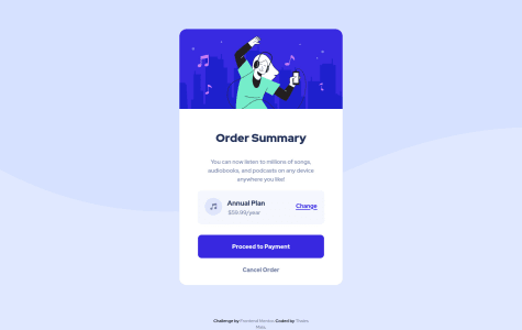
Hello, @th3Ryo, excellent work on this!
My only suggestion would be to replace the <section> element for a <main> element. <main> is the more accurate tag for defining the container that marks the main content of your webpage (in this instance, the entire card). I would move the <section> element to your <div class="img_hero">, <div class="annual_plan"> and <div class="payment">.
Please mark this as helpful if you benefitted from my feedback. Happy coding! Best of luck on your frontend journey.
Marked as helpful
Hi! Suggestions are welcome :)
@zitescody
Posted
Hi @iamcgs. Below is my suggestion!
I would replace <div class="card"> and <div class="image"> with <article> elements. It makes your code much easier to read and more accessible! Article elements help divide your individual, self-contained content into distinguishable pieces.
Your card and image <div> elements are two distinguishable pieces of your <main> content, so it'd best to include <article> instead of the <div> elements.
Here is a great article I got my feedback from. I hope you find it helpful to!
https://www.smashingmagazine.com/2020/01/html5-article-section/
Please mark this as helpful if you benefitted from my feedback! Happy coding!
Marked as helpful
@Netlighter
Submitted
there were problems with the positioning of elements in that little area where the music icon is located. i would like to know how to do it more correctly and cleaner
@zitescody
Posted
Hello @Netlighter. Nicely done formatting your CSS. It is very organized. Below are my suggestions:
The positioning looks great on my end. You used a flex container and space-around and it seems to have worked. I would argue that is the correct way of doing such. try playing around with padding and margin on the specific elements to adjust the layout in the container match your preferences.
On the HTML side, I noticed a few things. First, I would change <div class="summary"> to <main class="summary">. Try to limit your use of <div> elements if HTML has a landmark to replace it (such as main). This makes code accessible and easy to read. <main> elements show THIS is your main content.
I hope this helps, and great job! Please mark this as helpful if you benefitted from my feedback. Happy coding!
Marked as helpful
@aldhairescobar
Submitted
I'm trying to write clean HTML and CSS code, so any feedback will be appreciated :)
@zitescody
Posted
Hello, @aldhairescobar. Below are some suggestions on how to clean up your code!
First, I noticed a lot of <div> elements being used, primarily in locations where other landmarks could be used. For example, your <div class="container container-flex> element can be replaced with <main class="container container-flex">. Using <main> makes your code more accessible by stating THIS is your main content.
Next, instead of <div class="col-main-img">, <div class="main-content">, use <section class="col-main-img"> and <section class="main-content">. Again, the <section> element is used to divide your HTML code into easy to read, accessible parts.
Let me know what you think! And mark this as helpful if you benefitted from my feedback. Best wishes on your web dev journey ahead!
@eginugrahas
Submitted
@zitescody
Posted
Hello Egi! Wonderfully done.
Let's eliminate some of those accessibility issues in your report.
First off, great job marking up your images with alt text and really considering making your code accessible.
Instead of <div class="main-section>, use <main class="container">. using a <main> element tells the screen reader THIS is where your main content will be nested. Generic div elements lack specificity.
Instead of <div class="left"> and <div class="right>, use <section class="left"> and <section class="right">. Again, <section> elements clearly define these are different sections nested within the main content of your page. Generic div elements lack that specificity.
Finally, I would nest your <h1>, <img>, and <p> tags inside a container (could be a <div> element here). All page content should be contained by landmarks like <section> elements or <div> elements.
I hope this helps! Please mark as helpful if you found this feedback helpful. Thanks!
@AshashashR
Submitted
Hello !
This is my second attempt for this challenge. If you have any feedback, please kindly let me know ! :)
Thank you
@zitescody
Posted
Hello Ashley! Great work.
Let's eliminate those accessibility and HTML issues.
I took a look at your code and it seems you already fixed the accessibility issue with the <main> element, so good job.
I am noticing your images do not include alt tags or have the incorrect alt labels. It is a simple fix. In all of your <img> elements, include the alt="" tag (write between the quotes something descriptive so the screen reader can reas off the image to those with impairments). Also, instead of alt_class="", I would stick to the regular alt tags.
My only other suggestion would to use the <section> element instead of <div> for containers nested inside of the <main> element. For example, instead of <div class="order">, use <section class="order">. Its more specific than general <div> elements and gives your page clearer structure.
If this was helpful, please mark as helpful. Thanks!
Marked as helpful