
@YevgS

jul_julham
@zulhamsyAll comments
- @zulhamsy
man! that's so identical to original design, great work!, maybe it needs a little bit 'centering' :D, anyway it still awesome
Marked as helpful - @chiroro-jr@zulhamsy
Hi @chiroro-jr, I'm using TailwindCSS too! :D, I've some tips, maybe it can make writing Tailwind classes more easier and increase readability,
-
starts with 'layout classes' like
margin,paddingetc example<div class="px-2 py-3" /> -
second, 'position classes' or 'display classes' like
flex,absolute -
third layer is 'text styling, color and text related classes' like
font-sanstext-2xl -
last layer is the rest...
that's it! :D, hope it helps
Marked as helpful -
- @suatcg@zulhamsy
great work!, its so close to original design! I've some notes for you :D
-
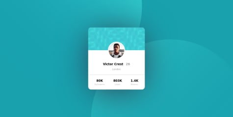
I think banner-image's height is a little bit shorter, it will be nice if you could increase it a little
-
price info (0.041 ETH) should be a little bolder, I think its semibold (600 Weight) or so
-
for 'author' section, I think you could use 'justify-self: start' for avatar image or 'justify-content: start' in author container, hope it helps
btw it still great work! keep it up!
Marked as helpful -
- @kefer16@zulhamsy
Hi! Great Work!
On the mobile view, I see that the SVG is somewhat less centered. a little solution from me maybe you can add the viewBox property to the svg value "15 0 266 96", hope it helps :D
- @hliosdja@zulhamsy
Hi! Great work!
I'm newbie too xD, but maybe some advice would help :D
I think whether you using 'background' props via css or directly using img tag on html, the result will still be good and still a valid html, but for me I prefer using img tag since it would be easier to 'position' it using absolute props
btw keep your great work!
- @eskenaman@zulhamsy
Hi! it's amazing to know that you are just learning and jump right into this challenge, great job :D
just newbie advice, I thought it would be better if you made 'body' width responsive to the viewport, (ex: width 100vw) rather than making it a fixed size, also if you wanna center the content vertically and horizontally relative to the screen, you could use flexbox / flex, its so simple but powerful
anyway keep up your spirit and keep learning 💪
- @anand-kashyap@zulhamsy
Hi! great work man!
little advice from newbie :D, maybe you could add some blur and spread in box shadow so it doesn't look like a border, and centering card component would be good using flex, also about positioning background images I think it will be better if you use image tag and use absolute position rather than using background-images,
anyway, keep your great work :D
- @Abdul-coder-maker@zulhamsy
So far, I think your work is the closest to the original design, congrats !!
A little detail on the mobile display, you can give the line-height of the hero title a little tight, the rest is amazing!
- @GaldinoMat@zulhamsy
Hi! First of all, I really appreciate your work. The mobile and desktop looks are very similar to the design! wow.
but when I tried to activate desktop mode on a mobile browser, I found a layout that didn't seem like it was in the original design. maybe if you wish, in my opinion the original mobile view should be preserved until the desktop viewport (maybe 1080 pixels wide), so use a fixed width while in the mobile view just switch layouts when the desktop view.
btw, I'm also working on this project haha, so thank you for the idea :D