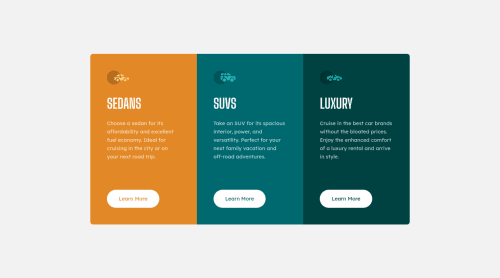
Not Found
Not Found
Not Found
Not Found
Not Found
Not Found
Not Found
Not Found
Not Found
Not Found
Not Found
Not Found
Not Found
Not Found
Not Found
Not Found
Not Found
Not Found
Not Found
Not Found

Submitted

Responsive 3 Column Card Component (No Media Queries)

#accessibility#bem#lighthouse
Vanza Setiaβ€’ 27,855

@vanzasetia

Desktop design screenshot for the 3-column preview card component coding challenge

This is a solution for...

  • HTML
  • CSS
1newbie
View challenge

Design comparison


SolutionDesign

Solution retrospective


Hello Everyone! πŸ‘‹

I manage to make this website responsive without media queries. Feel free to take a look!

Of course, any feedback is appreciated!

That's it! Happy coding everyone!

Community feedback

Smitaβ€’ 375

@Smita-14

Posted

It's surprising to know that you coded this on a phone so well!✨✨ It is brilliantly done! πŸ‘πŸ‘

Marked as helpful

0

Vanza Setiaβ€’ 27,855

@vanzasetia

Posted

@Smita-14 Thanks!πŸ‘πŸ˜‰

1
buneeβ€’ 2,060

@buneeIsSlo

Posted

@Vanza, Perfect! as usual.

2

Vanza Setiaβ€’ 27,855

@vanzasetia

Posted

@buneeIsSlo Thanks!

1
Shashree Samuelβ€’ 9,260

@shashreesamuel

Posted

That is quite commendable that you coded from a mobile device. Keep up the awesome work and great job using the ch css unit

1

Vanza Setiaβ€’ 27,855

@vanzasetia

Posted

@TheCoderGuru

Thank you for the comment! πŸ‘

When the first time I submitted the solution, I was using my mobile device to create this website. πŸ˜…

Now, I have coded and refactored this fully on a desktop device (and with modern CSS 😊).

0

@Clement1kalu-okereke

Posted

@vanzasetia What mobile phone app did you code it with

0
P
j5β€’ 2,290

@jmnyarega

Posted

Impressive πŸ‘

1

Vanza Setiaβ€’ 27,855

@vanzasetia

Posted

@jmnyarega Thanks!

0

Account Deleted

Hello vanzasetia, πŸ‘‹

Congratulations on completing this challenge.

Your solution looks good and responsive also.

Coding on phone πŸ“± is very hard Hats off ! for that

One question I have (how do you manage to make it responsive on all viewports)

Great work by the way.😊

2

Vanza Setiaβ€’ 27,855

@vanzasetia

Posted

@Nik-web12 Thanks! The way I manage it as follows:

  1. I use Chrome for Android for the mobile and also to see the desktop version, I checked the desktop site.
  2. To see the tablet, I simply make my phone to landscape.
  3. Sometimes I use Firefox to change the font-size to see the my project on different viewport.

Note: The way I do that on Firefox, by go to Setting > Accessibility, then change the font-size however I like.

Yeah, you are right coding a responsive website on Android Phone is πŸ”₯πŸ”₯so hard and very challenging!πŸ”₯πŸ”₯ But, currently that's the only way I can do for now.

That's it! And as always Happy Coding!

2
Mehdiβ€’ 990

@siavhnz

Posted

@vanzasetia

Hello Vanza Setia

I have 2 questions, first, don't you use Device Toolbar on Chrome Developer tools (More tools -> Developer tools or right click -> inspect) or Responsive Design Mode on Firefox (right click -> inspect) for checking your work on different sizes? and second I can't find Setting > Accessibility on the Firefox I search for that but I got nothing. Can you provide detail for that?

0
Mehdiβ€’ 990

@siavhnz

Posted

@vanzasetia

Oh, I saw your work on the finished project channel 10 minutes ago in the slack app, I didn't check the time of this comment so my first question may seem irrelevant now.

0
Vanza Setiaβ€’ 27,855

@vanzasetia

Posted

@siavhnz

Hi Mehdi! πŸ‘‹

Thank you for those questions! πŸ‘

As you may already know that I was doing this challenge with my mobile device. So, I didn't use Chrome DevTool at that time. I was using Eruda. Eruda is a developer tool that can be used in mobile browsers.

Now, I can access the Chrome desktop browser and sure I used the developer tool to see the responsiveness of the site.

Regarding the Firefox accessibility setting, I was talking about the Firefox mobile browser. I have Firefox installed on my mobile device until today and you can access it with the same navigation (Settings and then Accessibility).

For the Firefox desktop browser, you can change the font size setting by clicking the hamburger menu and then choosing Settings. After that, on the General tab, you will see a Fonts section where you can change the font size.

1
Mehdiβ€’ 990

@siavhnz

Posted

@vanzasetia

Thanks for helpful, detailed response πŸ™

0
P
Patrickβ€’ 14,325

@palgramming

Posted

Yes it looks great and coding it on a phone is so impressive 🌟🌟🌟🌟🌟

2

Vanza Setiaβ€’ 27,855

@vanzasetia

Posted

@palgramming Thanks!

0
Dineshβ€’ 1,115

@Dinesh1042

Posted

Great work on this challenge. You have managed the responsiveness of the site very well that's cool. Keep up the great work!

1

Vanza Setiaβ€’ 27,855

@vanzasetia

Posted

@Dinesh1042 Thank you!😊

0
JJβ€’ 25

@j-j-martin

Posted

Haha you're a legend! "No excuses" is your guiding principle I guess, great job!

1

Vanza Setiaβ€’ 27,855

@vanzasetia

Posted

@j-j-martin 🀣 Hahaha... Thanks!

0

Please log in to post a comment

Log in with GitHub
Discord logo

Join our Discord community

Join thousands of Frontend Mentor community members taking the challenges, sharing resources, helping each other, and chatting about all things front-end!

Join our Discord