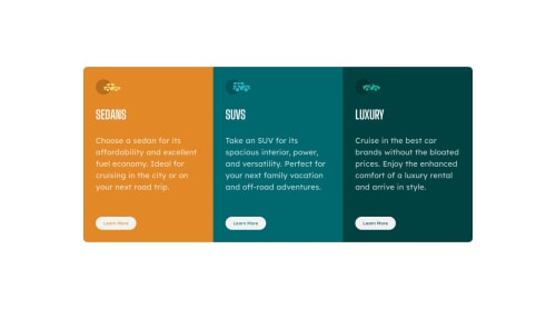
Skip to content
  • Unlock Pro
  • Log in with GitHub
Solution
Submitted over 1 year ago

3 column preview card component. Grid and Flex

jetskeeter•180
@jetskeeter1
A solution to the 3-column preview card component challenge
View live sitePreview (opens in new tab)View codeCode (opens in new tab)

Solution retrospective


It is easy, but I am trying to learn hard how I can have a responsive layout. It's difficult to do with my smooth brain.

Any tips to making responsive layout where the width increase/decrease when the screen gets smaller?

Any kind of feedback is appreciated.

Code
Select a file

Please log in to post a comment

Log in with GitHub

Community feedback

  • Kamal Muhammad•220
    @Meetkamal256
    Posted over 1 year ago

    hello @jetskeeter1 i have a few suggestions on how to improve your code and also make it responsive on smaller and larger devices.

    • You need to restructure your html layout to properly to make use of flex box for responsive design. in order to make use of flex box, you need to apply display flex to a parent container and within the parent container you need to have flex items. for the flex items you need to enclose each of the items in a <div>.
    - <section>
          <main class="container">
          <div class="box box1">
              <img>
            <h1 class="title">SEDANS</h1>        
            <p class="descript">
              Choose a sedan for its affordability and excellent fuel economy. Ideal for cruising in the city 
        or on your next road trip.
            </p>
            <a href="#sedan" class="button">Learn More</a>  
          </div>
        </section>  
    
    • do that for the other three sections. if you look closely the layout for the 3 sections are similar there is an image on the top, <h1>, <p> and <a>, in other to style all 3 you can give them the same class="box".for each of the other sections give them a diffrent class box1, box2 and box3 in that order so you can give them a diffrent background-color. Make sure that all three sections are enclosed within your main container. You can give the main container which serves as your parent <div> a display of flex. You are missing this part in your code that is why it is not responsive. in other to make use of flex box you need a parent container with display flex and flex items each enclosed in a <div> tag.

    • After applying css styling on your webpage then you can use media query and target smaller screen devices, change the flex-direction from row to column so the box1, box2 and box3 are stacked on top of each other.

    -  /* responsive style */
    @media(max-width: 920px){
        #card{
            flex-direction: column;
        }
    }
    @media(max-width: 425px){
        #card{
            margin: 2rem 1rem;
        }
    }
    
    • by effecting this changes you are going to have a responsive web page across large and smaller devices feel free to adjust css styling as you see fit.

    • [https://www.youtube.com/watch?v=z6tJ5ngiF14&list=PLC3y8-rFHvwg6rjbiMadCILrjh7QkvzoQ] - this is a link to a youtube playlist to learn how to use flex box correctly for responsive design.

  • Divine Ugorji•350
    @DivineUgorji
    Posted over 1 year ago

    Congratulations on finishing this challenge 🎉🎉 Your solution is nice.

    However, I have a few ideas for improvement on the project.

    • Your solution works, however, it has little issues with responsiveness. The ultimate hack I’ve found in making responsive designs is to start the project from the mobile workflow first, then make the desktop view, and other larger views using media query. This approach is highly recommended because it ensures that your design is responsive on the mobile as well as the desktop since the majority of internet users access the internet using their mobile devices. it also makes web development and maintenance much easier.

    • I also observed that your media query breakpoint for this project is set at @375px which is not the best in terms of responsiveness on bigger screens such as desktops. Media queries for desktops usually start at 37.5rem which is 600px. There’s a lot more I could suggest in terms of media queries, however, I would link the following articles to help you learn more about media queries and how to choose breaking points.

    • A Complete Guide to CSS Media Queries

    • Media Query CSS Example

    • Add display: inline-block to your button element. This makes the button element respect the width, height, and margins set to it and keeps the buttons in the same line as required in this project.

    • I also observed that you do not have a custom Readme page for your project on GitHub. It’s always a good practice to have a custom Readme for your projects, using the Readme template provided as a guide. The readme page is a good way to document your project and helps for future contributions on the project.

    • I’d also like to suggest that you move the attribution styles from your HTML file to your CSS file. It helps to make your code more organized.

    Your solution is a good one, and I hope these few suggestions help you to make it even better.

  • NOURisLIGHT•80
    @NOURisLIGHT
    Posted over 1 year ago

    A better approach for making responsive websites for mobile and desktop is to use the Mobile-first method. As most of the people visit websites through their mobile devices. Also it will be easier for you to convert from mobile to desktop rather than desktop to mobile. Make all mobile customs first and make sure everything is working correctly, then at last use media query to make desktop version of your code. Write changes only that is necessary to be changed.

Join our Discord community

Join thousands of Frontend Mentor community members taking the challenges, sharing resources, helping each other, and chatting about all things front-end!

Join our Discord
Frontend Mentor logo

Stay up to datewith new challenges, featured solutions, selected articles, and our latest news

Frontend Mentor

  • Unlock Pro
  • Contact us
  • FAQs
  • Become a partner

Explore

  • Learning paths
  • Challenges
  • Solutions
  • Articles

Community

  • Discord
  • Guidelines

For companies

  • Hire developers
  • Train developers
© Frontend Mentor 2019 - 2025
  • Terms
  • Cookie Policy
  • Privacy Policy
  • License

Oops! 😬

You need to be logged in before you can do that.

Log in with GitHub

Oops! 😬

You need to be logged in before you can do that.

Log in with GitHub

How does the accessibility report work?

When a solution is submitted, we use axe-core to run an automated audit of your code.

This picks out common accessibility issues like not using semantic HTML and not having proper heading hierarchies, among others.

This automated audit is fairly surface level, so we encourage to you review the project and code in more detail with accessibility best practices in mind.

How does the CSS report work?

When a solution is submitted, we use stylelint to run an automated check on the CSS code.

We've added some of our own linting rules based on recommended best practices. These rules are prefixed with frontend-mentor/ which you'll see at the top of each issue in the report.

The report will audit 1st-party linked stylesheets, and styles within <style> tags.

How does the HTML validation report work?

When a solution is submitted, we use html-validate to run an automated check on the HTML code.

The report picks out common HTML issues such as not using headings within section elements and incorrect nesting of elements, among others.

Note that the report can pick up “invalid” attributes, which some frameworks automatically add to the HTML. These attributes are crucial for how the frameworks function, although they’re technically not valid HTML. As such, some projects can show up with many HTML validation errors, which are benign and are a necessary part of the framework.

Oops! 😬

You need to be logged in before you can do that.

Log in with GitHub

Oops! 😬

You need to be logged in before you can do that.

Log in with GitHub

Oops! 😬

You need to be logged in before you can do that.

Log in with GitHub