Not Found
Not Found
Not Found
Not Found
Not Found
Not Found
Not Found
Not Found
Not Found
Not Found
Not Found
Not Found
Not Found
Not Found
Not Found
Not Found
Not Found
Not Found
Not Found
Not Found

Submitted

3 Column Preview Card Component (HTML + CSS)

Luis 270

@luibernip

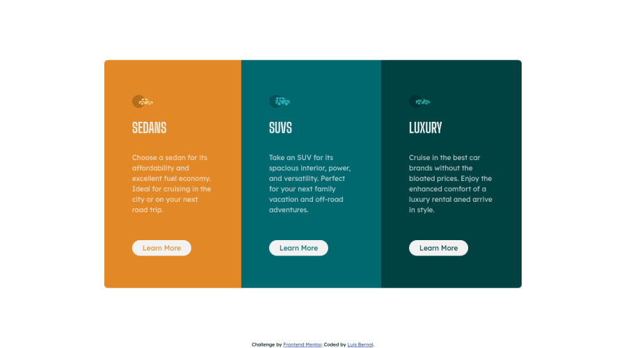
Desktop design screenshot for the 3-column preview card component coding challenge

This is a solution for...

  • HTML
  • CSS
1newbie
View challenge

Design comparison


SolutionDesign

Solution retrospective


Hello community, thank you for passing by my challenge solution.

My questions regarding this solution are:

  1. Do you think it is sufficiently responsive as it is or should it be more fluid?

  2. Should I set a max-width to the component as it was performed?

Thank you again for taking the time and helping me improve in my web dev road.

Have a great day!!

Edit: Thanks to community observations; padding was reduced, headings increased size, images are no longer modified and body has a background.

Community feedback

P
ApplePieGiraffe 30,545

@ApplePieGiraffe

Posted

Hello there, Luis! 👋

Just wanted to drop in to say well done on this challenge! 👍 Everything's looking pretty great and the card component responds well! 🙌

The only tiny thing that I suggest is to add the background color from the original design to the page. 🙂

Keep coding (and happy coding, too)! 😁

1

Luis 270

@luibernip

Posted

Hello @ApplePieGiraffe, thank you for your observations. I hadn't noticed that body had a background color, my bad. Your words encourage me on keep on going and keep improving coding skills and knowledge.

Have a great day!

1
KT 390

@KtGitIt

Posted

Hello Luis,

I think you did fantastic job on making it more fluid and more responsive.

Here are my couple of observations. At this point it is just neat picking from design perspective.

  1. You can decrease padding in your cards.
  2. Heading should be little bigger and you applied width to the icons(imgs) which made them little small. I would not change with of those image.

You code is easy to read and well organize. Good job. Keep coding!! KT

1

Luis 270

@luibernip

Posted

Thank you for your comments @KtGitIt. I will decrease padding in the card, increase heading and remove image width to improve overall design. I am very glad that code is somehow clean :).

Once again, thank you for passing by and helping me in my frontend growth.

Have a great day!

0

Please log in to post a comment

Log in with GitHub
Discord logo

Join our Discord community

Join thousands of Frontend Mentor community members taking the challenges, sharing resources, helping each other, and chatting about all things front-end!

Join our Discord