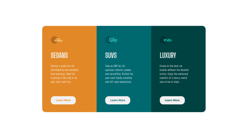
3 column preview card component with flexbox

Solution retrospective
Feedback is highly appreciated, I will add the responsive part later.
Please log in to post a comment
Log in with GitHubCommunity feedback
- @adityas24
Hey Sandesh! great job with this one.
One mistake i saw is that you are using unnecessary divs in your code. Inside each column you have 4 elements. And for each element you are using a div to contain it. You don't really need to do that.
Instead of writing
<div class="col1 box">
        <div class="col1Img">
          <img src="images/icon-sedans.svg" alt="sedansImg">
        </div>
        <div class="col1Title"><h2>Sedans</h2></div>
        <div class="col1Info">
          <p>Choose a sedan for its affordability and excellent fuel economy. Ideal for cruising in the city
            or on your next road trip.</p>
        </div>
        <div class="col1bottom">
          <button>Learn More</button>
        </div>
      </div>
You could have simply written
      <div class="col1 box">
          <img src="images/icon-sedans.svg" alt="sedansImg">
          <h2>Sedans</h2>
          <p>Choose a sedan for its affordability and excellent fuel economy. Ideal
                for cruising in the city or on your next road trip.</p>
          <button>Learn More</button>
      </div>
Still the code will work fine as every element inside the flexbox becomes a flex item irrespective of that item is inline or block element.
All the best 🙂👍
Marked as helpful - @NaveenGumaste
Hay ! Good Job you made it look nearly perfect to the preview
These below mentioned tricks will help you remove any Accessibility Issues
-> Add Main tag after body like it should be your container
-> For 1st heading or h1 tag, use header tag and then inside the header put your h1 or h2 etc
-> But use header tag only once in main heading element.
Keep up the good work!
Marked as helpful - @Aadv1k
Hey! Here are some fixes I would suggest you apply on your project.
- Media query on mobile; You should add a media query for smaller screen sizes as right now it gets messed up, so I would recommend you change the direction of flex to
columnand make some minor tweaks (spacing, padding etc) to make it look good on mobile.
- Media query on mobile; You should add a media query for smaller screen sizes as right now it gets messed up, so I would recommend you change the direction of flex to


Join our Discord community
Join thousands of Frontend Mentor community members taking the challenges, sharing resources, helping each other, and chatting about all things front-end!
Join our Discord