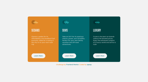
3 preview column card with flexbox

Solution retrospective
I totally forgot how center or align things without flex :)
Please log in to post a comment
Log in with GitHubCommunity feedback
- @bimalmagar10
Hey!You did great job building it and your build looks well! If you forgot about how we can center things wihtout flex then here's my reminder for you: -You can center text or inline elements using
text-align:center-You can also center the block or inline block elements having a certain width withmargin:0 auto-You can center any elements by posiitioning them likeposiition:absolutetop:50%left:50%andtransform:translate(-50%,-50%).This is just a reminder for you.These values may differ with situations you are facing with.And also the element you're centering should be positioned with relative to its parents or any elements i.e they should contain theposition:realtivecode. This is all about what I know.I hope this may help and get you. Happy Coding! - @pikapikamart
Hey great work on this one. Both the desktop and mobile layout is good but a scrollbar appear at the bottom at point 900px going to 860px. It is not that apparent but a good notice right. So maybe adjusting the breakpoint will be really awesome for that small issue.
Looks really good and scales very well. Just here to say great job^
Join our Discord community
Join thousands of Frontend Mentor community members taking the challenges, sharing resources, helping each other, and chatting about all things front-end!
Join our Discord