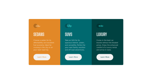
3-Column Preview Card Component

Solution retrospective
Any feedback is welcome! The thing I struggled with most on this project is rounding the corners of Bootstrap's .container element without Sass. I ended up having to manually round each corner and create media queries to change it based on the screen size. Any ideas how to do it on the container itself?
Please log in to post a comment
Log in with GitHubCommunity feedback
- @Bayoumi-dev
Hey Brian, It looks great!... Here are some suggestions:
- Instead round each corner and create media queries to change it based on the screen size, Give the parent these classes
rounded,overflow-hidden
<main class="container rounded overflow-hidden" id="container"> //... </main>- Using more than one
<h1>is allowed by the HTML specification, but is not considered a best practice. Using only one<h1>is beneficial for screenreader users.
---> Multiple
<h1>elements on one pageHope this help!... Keep coding👍
Marked as helpful - Instead round each corner and create media queries to change it based on the screen size, Give the parent these classes
- @OkaforRaph
Hey Brian, congratulations on completing the challenge! You did a great job 😉. Nice use of bootstrap by the way.
Let me give you some little tips for optimizing your code:
a) to make it look as close to the design as possible add "border-radius: .5rem and overflow: hidden" to container class.
b) instead of using px use relative units of measurement like rem .
Hope this help! Happy coding 😁


Join our Discord community
Join thousands of Frontend Mentor community members taking the challenges, sharing resources, helping each other, and chatting about all things front-end!
Join our Discord