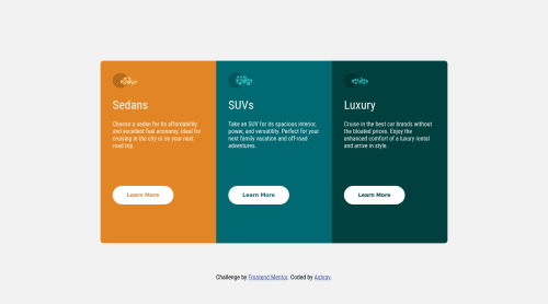
Submitted about 3 years agoA solution to the 3-column preview card component challenge
3-column-preview-card-component-main
vanilla-extract

@RayAsh37
Solution retrospective
Hi everyone, I have been trying to practice layout. I am getting pretty confident with it. I have skipped the mobile layout as I plan to come later and implement it for all of my other solutions later. This was a bit simple compared to the ones I previously encountered.
Code
Loading...
Please log in to post a comment
Log in with GitHubCommunity feedback
No feedback yet. Be the first to give feedback on Ashray's solution.
Join our Discord community
Join thousands of Frontend Mentor community members taking the challenges, sharing resources, helping each other, and chatting about all things front-end!
Join our Discord