Skip to content
  • Unlock Pro
  • Log in with GitHub
Profile
OverviewSolutions
7
Comments
7

Kostya Farber 🧟‍♂️

@kostyafarberLondon, United Kingdom220 points

Hey there! My name is Kostya 👨‍💻 and I am a developer living in London. I'm originally from Sydney, Australia 🏝. I love all things technology and using it to solve interesting problems and designing beautiful content.

I’m currently learning...

I am currently learning HTML/CSS, Sass, JavaScript and Java.

Latest solutions

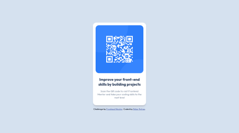
  • Product Preview using React/SCSS. Custom Product! Trying to use BEM!

    #react#sass/scss#bem

    Kostya Farber 🧟‍♂️•220
    Submitted over 2 years ago

    2 comments
  • Launch Countdown Timer HTML/CSS, JavaScript, Responsive

    #sass/scss

    Kostya Farber 🧟‍♂️•220
    Submitted over 2 years ago

    1 comment
  • Advice Generator using HTML/CSS, Sass and JavaScript!

    #sass/scss

    Kostya Farber 🧟‍♂️•220
    Submitted almost 3 years ago

    1 comment
  • Stats Preview Card built using Flexbox and Grid

    #sass/scss

    Kostya Farber 🧟‍♂️•220
    Submitted almost 3 years ago

    2 comments
  • NFT preview component using HTML/CSS

    #sass/scss#accessibility

    Kostya Farber 🧟‍♂️•220
    Submitted almost 3 years ago

    1 comment
  • Interactive Rating Component made with HTML/CSS Sass and Javascript


    Kostya Farber 🧟‍♂️•220
    Submitted almost 3 years ago

    1 comment
View more solutions

Latest comments

  • 이은지 / Angie Lee•30
    @angielxx
    Submitted over 2 years ago

    01. Product preview card component solution

    2
    Kostya Farber 🧟‍♂️•220
    @kostyafarber
    Posted over 2 years ago

    Hey there! 👋

    Really great solution. It looks pixel perfect! Your CSS is very structured and looks clean.

    Just a couple of suggestions:

    • Try adding your CSS document wide variables to the :root. It's best practise and looks a lot cleaner.
    • Make sure to remove any comments! The index.html has some commented out code. It will make it easier to read and more 'production ready'.
    • If you want follow a convention for naming your CSS look at the BEM convention. They provide an intuitive way to name your elements to make their meaning semantic. Check it out here.

    Really great work though! 🚀

    Happy coding.

    If you found my comment helpful please mark it as helpful 🙂

  • Maloth Aditya•20
    @Simply-huMAN
    Submitted over 2 years ago

    Responsive page made using Flexbox

    3
    Kostya Farber 🧟‍♂️•220
    @kostyafarber
    Posted over 2 years ago

    Hey there! 🚀

    Really good solution, I like the way your code is laid out!

    Just a couple of suggestions:

    • Try to use relative units such as rem or em. They are more versatile and are more responsive than px units.
    • Try use a css reset! It will make your life easier and remove any pesky default settings. (e.g here)
    • Perhaps add some whitespace between your css declarations. It will make it easier to read.
    body {
      font-family: Outfit;
      margin: 0;
      padding: 0;
      box-sizing: border-box;
      background: hsl(212, 45%, 89%);
    }
    
    main {
      margin: 30px;
      display: flex;
      justify-items: center;
      align-items: center;
    }
    
    • Delete any comments! This will make your code look a lot cleaner whilst also making it easier to read.

    Great work on this! 👏

    Happy coding.

    If you found this helpful, please mark it as helpful 🙂

    Marked as helpful
  • ayseakimsar•110
    @ayseakimsar
    Submitted over 2 years ago

    nft preview card component with css grid and flexbox

    2
    Kostya Farber 🧟‍♂️•220
    @kostyafarber
    Posted over 2 years ago

    Hey there!

    Really great solution 🚀 I think your code is well laid out and structured.

    A couple of suggestions:

    • Make use of the main tag. It is good practise to use semantic HTML to make the structure of your page more readable. Every page should have a main tag.
    • Delete your comments from your CSS! It will make it easier to read and reduce unnecessary code :)
    • Try using a pseudo element for the hover effect. You can use something like ::before. This will reduce and declutter the html.

    Overall really good stuff.

    Happy coding!

    If you found my comment helpful please mark it as helpful! Thanks 🙂

    Marked as helpful
  • Ashray•110
    @RayAsh37
    Submitted over 2 years ago

    3-column-preview-card-component-main

    #vanilla-extract
    2
    Kostya Farber 🧟‍♂️•220
    @kostyafarber
    Posted over 2 years ago

    Hey there!

    Really great solution. I like how clean and organised your css is.

    Just a couple of suggestions:

    • I would suggest perhaps using a css reset and importing it into your css. It will speed up your development and remove some annoying default settings. look here for more info.
    • To get the design looking even more pixel perfect you could reduce the line-height on the card content.

    Overall really good stuff.

    Thanks, happy coding!

    if you find my feedback helpful, please mark it as helpful. Thanks :)

    Marked as helpful
  • Joshua B. Yumul•50
    @joshuayumul19
    Submitted over 2 years ago

    Responsive using flexbox

    1
    Kostya Farber 🧟‍♂️•220
    @kostyafarber
    Posted over 2 years ago

    Hi there!

    Really great solution. Your SCSS is very well organised.

    Just a couple of suggestions that you might find useful:

    • Perhaps try adding some line-height to the p content. It would achieve the look in the design photo more closely.
    • Look into using relative units for your sizes rem, em. They make for more responsive design across different browsers and devices, check out this article

    Overall very strong solution with great code.

    Happy coding!

    If you find this solution helpful, please mark it as helpful :)

    Marked as helpful
  • 11thBam•10
    @petarchou
    Submitted over 2 years ago

    Pure CSS Solution

    2
    Kostya Farber 🧟‍♂️•220
    @kostyafarber
    Posted over 2 years ago

    Hey there!

    Awesome solution. It looks great!

    Just a couple of points of feedback if you don't mind!

    • You should wrap your content in a main tag as this represents the 'content' of your page see here
    • You don't have to set the @font-face everywhere! You can just go on google fonts and use the @import url() in your css.
    • I would analyse the pixel size using your computer on the image file and set your container to that size to achieve pixel perfect proportions as close to the image as possible (e.g ctrl+alt+4 on a mac)
    • Consider using a CSS reset to remove some annoying default settings (e.g)

    Really good solution!

    Happy coding!

    if you found my feedback helpful please mark it as helpful :)

    Marked as helpful
View more comments
Frontend Mentor logo

Stay up to datewith new challenges, featured solutions, selected articles, and our latest news

Frontend Mentor

  • Unlock Pro
  • Contact us
  • FAQs
  • Become a partner

Explore

  • Learning paths
  • Challenges
  • Solutions
  • Articles

Community

  • Discord
  • Guidelines

For companies

  • Hire developers
  • Train developers
© Frontend Mentor 2019 - 2025
  • Terms
  • Cookie Policy
  • Privacy Policy
  • License

Oops! 😬

You need to be logged in before you can do that.

Log in with GitHub

Oops! 😬

You need to be logged in before you can do that.

Log in with GitHub

Oops! 😬

You need to be logged in before you can do that.

Log in with GitHub

Oops! 😬

You need to be logged in before you can do that.

Log in with GitHub

Oops! 😬

You need to be logged in before you can do that.

Log in with GitHub

Oops! 😬

You need to be logged in before you can do that.

Log in with GitHub

Oops! 😬

You need to be logged in before you can do that.

Log in with GitHub

Oops! 😬

You need to be logged in before you can do that.

Log in with GitHub

Oops! 😬

You need to be logged in before you can do that.

Log in with GitHub

Oops! 😬

You need to be logged in before you can do that.

Log in with GitHub

Oops! 😬

You need to be logged in before you can do that.

Log in with GitHub

Oops! 😬

You need to be logged in before you can do that.

Log in with GitHub

Oops! 😬

You need to be logged in before you can do that.

Log in with GitHub

Oops! 😬

You need to be logged in before you can do that.

Log in with GitHub

Oops! 😬

You need to be logged in before you can do that.

Log in with GitHub

Oops! 😬

You need to be logged in before you can do that.

Log in with GitHub

Oops! 😬

You need to be logged in before you can do that.

Log in with GitHub

Oops! 😬

You need to be logged in before you can do that.

Log in with GitHub

Oops! 😬

You need to be logged in before you can do that.

Log in with GitHub

Oops! 😬

You need to be logged in before you can do that.

Log in with GitHub

Oops! 😬

You need to be logged in before you can do that.

Log in with GitHub

Oops! 😬

You need to be logged in before you can do that.

Log in with GitHub

Oops! 😬

You need to be logged in before you can do that.

Log in with GitHub

Oops! 😬

You need to be logged in before you can do that.

Log in with GitHub

Oops! 😬

You need to be logged in before you can do that.

Log in with GitHub

Oops! 😬

You need to be logged in before you can do that.

Log in with GitHub

Oops! 😬

You need to be logged in before you can do that.

Log in with GitHub

Oops! 😬

You need to be logged in before you can do that.

Log in with GitHub

Oops! 😬

You need to be logged in before you can do that.

Log in with GitHub

Oops! 😬

You need to be logged in before you can do that.

Log in with GitHub

Oops! 😬

You need to be logged in before you can do that.

Log in with GitHub