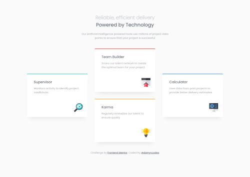
4 Card feature section - HTML, SCSS, Grid, @keyframes & mobile-first!

Solution retrospective
Hi everyone 👋
Well well well ... mobile-first!
I think this is a turning point for me, i finally embraced the dark-side. And what can i say, it's liberating. My code feels cleaner, simpler and more legible. It might be due to the design but i'm definitely converted 👀
I took the time at the start of the project to really understand how to work with min-width instead of max-width and it paid off. I also got a bit unnecessarily carried away with @keyframe animations at the end and changing them up per breakpoint 😂
Anyway, your feedback would be greatly appreciated!
Happy coding 🤙
Please log in to post a comment
Log in with GitHubCommunity feedback
- @Tiasstiass
Good job! 👏
Tested it on Safari iOS, looks neat! Few feedbacks:
- Regarding the colored top border:
You could make it a div or the best solution I think, is to use a
::beforepseudo element, - Setting fixed heights is not considered good practice, the content should define the height of an element, be it the padding etc..,
- Any reason behind the
font-size: 50%, 62.5% makes sense but why 50%? - @import is being depreciated and Sass team is discouraging us to use it, look into @use and @forward,
- You are using scss syntax not sass, consider renaming your folder.
Excellent job overall, keep up the good work 💪
Marked as helpful - Regarding the colored top border:
You could make it a div or the best solution I think, is to use a
- @arkharman12
Looks good! But why not import the
<svg>s in<img>tags? Instead of putting them in the markup and then linking them. - @darryncodes
Thanks for the nudge in the right direction @mattstuddert 🎉


Join our Discord community
Join thousands of Frontend Mentor community members taking the challenges, sharing resources, helping each other, and chatting about all things front-end!
Join our Discord