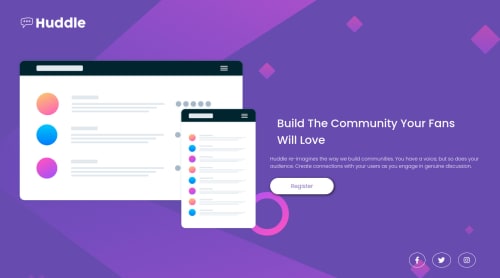
Submitted about 3 years agoA solution to the Huddle landing page with a single introductory section challenge
a vanilla responsive landing page with some hovers

@Lit2lLarry
Solution retrospective
How do you get the background to stretch and shrink with the window? Using the cover property will expand until it reaches its full size but I'd like it to stretch as big as the window.
my code below: @media screen and (min-width: 768px) { body { background: url("./images/bg-desktop.svg") no-repeat; background-size: 100% auto; display: flex; flex-direction: column; justify-content: center; align-items: center; }
Thanks!
Code
Loading...
Please log in to post a comment
Log in with GitHubCommunity feedback
No feedback yet. Be the first to give feedback on Lit2l's solution.
Join our Discord community
Join thousands of Frontend Mentor community members taking the challenges, sharing resources, helping each other, and chatting about all things front-end!
Join our Discord