Advice Generator using API with HTML, CSS and JS

Solution retrospective
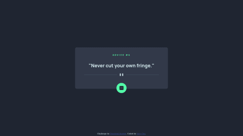
I am not sure if my styling in CSS is correct and/or consistent, especially how I positioned elements with absolute, relative and fixed. Also in the media query area, I used display: none to change the pattern divider between mobile and desktop view, and I am not sure if that's the correct way to do it. Any feedback for suggestions welcome, thank you guys in advance!
Please log in to post a comment
Log in with GitHubCommunity feedback
- @ChamuMutezva
Hi MightyKale’s. So far so good with your first challenge.
- the display looks generally good but as the device gets smaller the image divider is not scaling well - it is overlapping the container.
- the recommended way for dealing with responsive images is to use methods such as the srcset and picture element. Controlling the images between sizes by using
display: noneworks, but it is not the best practice. Some of the reasons why usingdisplay: noneto interchange the images is because it wastes bandwidth as the html is parsed first - hence all the images will be downloaded, making it an expensive method. That can cause you project to load slow when the site has a lot of images. I normally use the picture element, here is a site that can get you started Responsive Images 101 - the first heading element of your site should be an h1, heading elements should follow a sequential order without skipping heading elements.
- use semantic elements where possible, one case is where you used the div for interactive purposes. Click events should be associated with an element such as a button , a div is not recommended to use - it has no semantic meaning. Assistive technology users will not be able to interact with your site.
- the advice message is not changing if i click the dice. Try to clear the cache by editing the fetch statement as follows `const response = await fetch(apiUrl, {cache: "no-cache"});
Marked as helpful - @eslam-94
great work
- @sansarj17
Hello Kale, Congrats on completing the challenge.
My suggestion would be to light up the dice when the person hovers on it so the user knows that he can interact with it. As for the divider, I think using anyone would have been fine and you can scale up/down the divider image according to the viewport. However, I do like how you tackled the issue.


Join our Discord community
Join thousands of Frontend Mentor community members taking the challenges, sharing resources, helping each other, and chatting about all things front-end!
Join our Discord