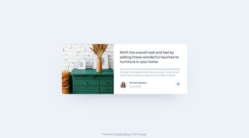
Article Component with Vanilla JS & Sass

Solution retrospective
What would you improve from the code ?
Are semantic tags properly set ?
Is this proficient ? Is there anything you would add to make it more lighthouse audit acceptable ?
Please log in to post a comment
Log in with GitHubCommunity feedback
- @Dorian30
You can surely guess my surprise when I realised that the found of front end mentor had just reviewed my solution. How awesome and refreshing it is to see that you take the time for that.
Thanks a lot for the feedback! I totally missed the GitHub link detail and I didn't know you could add those attributes for accessibility, I've been coding for a while but just recently started to pay more attention to this.
About the media queries I totally agree, I was actually planning to do a refactor of this with an implementation of mobile first! I was kind of used to desktop first 'cause at my workplace we don't often get the mobile design ahead. Just the desktop and we work with that while the design team builds the mobile view.
Would you say mobile first (min media queries) is the way to go even when you don't have a mobile design ahead (only the desktop version) ?
- @mattstuddert
Hey Dorian, nice work on this challenge. Just a quick heads up that the GitHub link is currently broken. You can update it by clicking the 3 vertical dots in the top right and selecting "Edit Solution".
The semantics all look good. If you wanted to make it truly accessible you could add
aria-controlsandaria-expandedattributes to the sharebutton. But everything looks great!Have you ever tried using
min-widthmedia queries instead ofmax-width? It's quite a common workflow with front-end developers to use them and work mobile-first. It can often lead to less CSS code and has the benefit of loading in fewer styles for mobile users, which can be a nice performance gain.I hope that helps. Your solutions are looking great! 🙌

Join our Discord community
Join thousands of Frontend Mentor community members taking the challenges, sharing resources, helping each other, and chatting about all things front-end!
Join our Discord