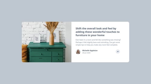
Article preview

Please log in to post a comment
Log in with GitHubCommunity feedback
- @porumbachanov
Hi there, your responsiveness breaks on tablet sized screens, the image reaches its maximum width and can't take up more space. This is easily fixable if you apply
max-widthto the parent container. The background color is not the same as in the design, the colors are all described in thestyle-guide.mdfile. Hope this helps :)Marked as helpful - @undrthegraveyard
Hey,
I opened up the live preview site on my laptop, and for some reason, it's not responsive. It's not showing up like it should, as given in the design brief. I'm seeing it on a 14-inch Macbook Pro.
I have uploaded a screenshot in Google Drive for reference, just in case.
Lemme know...
Happy Coding.
Join our Discord community
Join thousands of Frontend Mentor community members taking the challenges, sharing resources, helping each other, and chatting about all things front-end!
Join our Discord