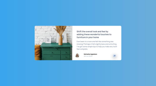
Not Found
Not Found
Not Found
Not Found
Not Found
Not Found
Not Found
Not Found
Not Found
Not Found
Not Found
Not Found
Not Found
Not Found
Not Found
Not Found
Not Found
Not Found
Not Found
Not Found

Submitted

Article Preview Card - Mobile First Approach - HTML/CSS/JS

@codingkapur

Desktop design screenshot for the Article preview component coding challenge

This is a solution for...

  • HTML
  • CSS
  • JS
1newbie
View challenge

Design comparison


SolutionDesign

Solution retrospective


This is not exactly as the design demands so I would love to see other solutions.

My takeaway here is that it is easier to go mobile first and then the desktop version. Going from desktop to mobile get complicated. I wonder how that will apply to full fledged websites though.

Only way to find out is to keep coding!

Community feedback

P
Patrick 14,325

@palgramming

Posted

100% going to mobile to desktop is easier once a person gets out of the desktop first mindset. It did take me a while to grasp it till I saw how adding CSS properties is easier than removing them

while not the same as the design specs any changes you made look good and does not change the overall functionality and intent of the design

Ido think you should try to create the desktop popup shape for for the experience cause it is good to now how to transition the popup to become two different things

1

@codingkapur

Posted

@palgramming I definitely want to make that pop up and the concern arose in my mind as well. But I couldn't make it over ride the overflow:hidden on the main container. And I tried this when I tried desktop first. So eventually after pulling my hair out for some time, I decided to restart and just do the best i could.

Any input on how to override the overflow: hidden would be appreciated though! Thanks!

0
P
Patrick 14,325

@palgramming

Posted

@codingkapur my code might not be the best but you can at least see how I did it and it might give you ideas how you want to do it https://www.frontendmentor.io/solutions/article-preview-component-RhXY5s5Pl

0
P
ApplePieGiraffe 30,565

@ApplePieGiraffe

Posted

Hey, Raghav Kapur! 👋

Nice work on this challenge! 🙌

I'd just like to suggest adding a favicon and title to your page. 😉 And perhaps adding cursor: pointer so the social media popup button. 🙂

When it comes to responsive design, the mobile-first approach definitely makes things easier in many situations (and works well for larger projects, too). I'd recommend trying it out more in future projects (since that'll help you become more comfortable with the workflow). 👍

Keep coding (and happy coding, too)! 😁

0

Please log in to post a comment

Log in with GitHub
Discord logo

Join our Discord community

Join thousands of Frontend Mentor community members taking the challenges, sharing resources, helping each other, and chatting about all things front-end!

Join our Discord