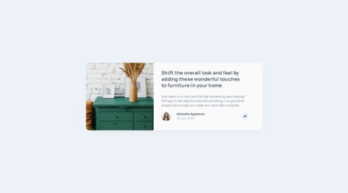
Article Preview Component Solution

Solution retrospective
I am proud of myself for figuring out how to add the modal using JS. I did not do the mobile modal, and the tablet and dekstop's modals displayed properly on fixed sizes, but It was not my main goal in this challenge. Overall, I am proud of myself, and while I made many mistakes during the code, I feel like I took what I needed from this challenge, and will build on those mistakes on future challenges.
Please log in to post a comment
Log in with GitHubCommunity feedback
- P@SimonCassan
HTML
-
An article needs a heading to be considered valid. You could replace your paragraph "Share" with an <h2>, for example.
-
Consider adding an aria-hidden to your <div class="bottom-arrow"></div> for accessibility purposes.
-
Your article should be inside your footer so that you can position it absolutely relative to your share icon and make it responsive.
CSS
- cursor: pointer should be applied to .modal__img, not the entire card.
JS
- Adding a class that you style in your CSS makes more sense than using inline styles repeatedly.
Marked as helpful -
- @SortJakke
Hi, here are some comments about your project:
General observations:
- The share box is missing in mobile mode;
- The share box (share__modal) is misaligned on certain screen widths;
- The share button does not change color according to the defined design styles.
In your HTML code:
- I suggest placing the <img> tag inside a <figure> tag for better semantics and organization.
- Replace the <p> tag with an <h1> in "article__description--main" to improve semantics and HTML hierarchy.
- Placing descriptions inside a <section> or <article> tag can make the HTML more structured and SEO and accessibility friendly.
In your CSS:
- You used predefined declarations, which is great! However, some unnecessary declarations could be removed to reduce clutter and improve performance.
Additional tip: To avoid misaligning the "share__modal", I recommend moving it inside the "article__footer" and applying position: relative to the footer. This will help maintain alignment and make it easier to maintain the layout.
Final thoughts: Despite these minor adjustments, the site is very close to the original design, and the code is readable for other developers. Congratulations on the excellent work!
Marked as helpful


Join our Discord community
Join thousands of Frontend Mentor community members taking the challenges, sharing resources, helping each other, and chatting about all things front-end!
Join our Discord