Submitted 9 months agoA solution to the Recipe page challenge
bam blocks, flexbox, grid, media queries

@KristinaHorbenko
Solution retrospective
What challenges did you encounter, and how did you overcome them?
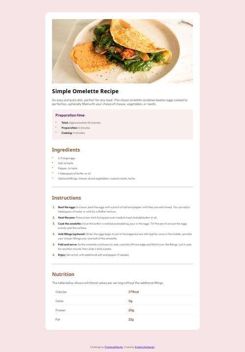
While developing the recipe page, I encountered a difficulty. namely, the correct display of the recipe image in the mobile version so that it occupies the entire width of the screen without unnecessary indents. There were also difficulties with centering the section-attribution block so that it is located exactly in the center on all devices.
Code
Loading...
Please log in to post a comment
Log in with GitHubCommunity feedback
No feedback yet. Be the first to give feedback on Khrystyna Horbenko's solution.
Join our Discord community
Join thousands of Frontend Mentor community members taking the challenges, sharing resources, helping each other, and chatting about all things front-end!
Join our Discord