Skip to content
  • Unlock Pro
  • Log in with GitHub
Solution
Submitted 5 months ago

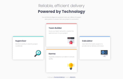
Beginner Flexbox Four Cards Component

Marvin•80
@elMarMar
A solution to the Four card feature section challenge
View live sitePreview (opens in new tab)View codeCode (opens in new tab)

Solution retrospective


What are you most proud of, and what would you do differently next time?

I'm proud that my solution seems pretty spot-on. However, I think my code is a little disorganized since I'm still learning flexbox. As I continue to learn flexbox's properties, I believe I'll be able to more elegantly and efficiently code these front end sites.

What challenges did you encounter, and how did you overcome them?

I still don't perfectly understand certain flexbox properties. For example, flex-basis is still a fuzzy concept for me. It's the default size of an element based on what? When does it shrink/grow from that size.

What specific areas of your project would you like help with?

I would like to know if I used flexbox efficiently. Sometimes it feels like I'm abusing flexbox, but I'm struggling to my head around other methods that could better position my elements.

Code
Select a file

Please log in to post a comment

Log in with GitHub

Community feedback

  • P
    Huy Phan•3,430
    @huyphan2210
    Posted 5 months ago

    Hi @elMarMar,

    I've reviewed your solution and would like to share my thoughts:

    • The properties flex-grow, flex-shrink, and flex-basis are meant to be applied to the children of a Flexbox container, not the container itself. Therefore, you can remove these properties from your <main> element.
    • flex-basis should be used with CSS units (e.g., flex-basis: 200px). When you set flex-basis: 200px, it means that the flex item will have an initial width of 200px (or height if flex-direction: column is applied on the Flexbox) unless its content requires more space.
    • If the content exceeds this size, whether it overflows or shrinks depends on the flex-shrink property. This property controls how much the item should shrink to fit within the container when there isn’t enough space.
    • flex-grow determines how much a flex item should expand to fill any remaining space in the container, after flex-basis is accounted for. Items with higher flex-grow values will take up more of the available space.

    If you're concerned about using Flexbox too much, consider exploring other layout techniques like CSS Grid, which can be more suitable depending on the layout requirements.

  • Peter Forster•170
    @peterforster10
    Posted 5 months ago

    looks quite good

Join our Discord community

Join thousands of Frontend Mentor community members taking the challenges, sharing resources, helping each other, and chatting about all things front-end!

Join our Discord
Frontend Mentor logo

Stay up to datewith new challenges, featured solutions, selected articles, and our latest news

Frontend Mentor

  • Unlock Pro
  • Contact us
  • FAQs
  • Become a partner

Explore

  • Learning paths
  • Challenges
  • Solutions
  • Articles

Community

  • Discord
  • Guidelines

For companies

  • Hire developers
  • Train developers
© Frontend Mentor 2019 - 2025
  • Terms
  • Cookie Policy
  • Privacy Policy
  • License

Oops! 😬

You need to be logged in before you can do that.

Log in with GitHub

Oops! 😬

You need to be logged in before you can do that.

Log in with GitHub

How does the accessibility report work?

When a solution is submitted, we use axe-core to run an automated audit of your code.

This picks out common accessibility issues like not using semantic HTML and not having proper heading hierarchies, among others.

This automated audit is fairly surface level, so we encourage to you review the project and code in more detail with accessibility best practices in mind.

How does the CSS report work?

When a solution is submitted, we use stylelint to run an automated check on the CSS code.

We've added some of our own linting rules based on recommended best practices. These rules are prefixed with frontend-mentor/ which you'll see at the top of each issue in the report.

The report will audit all CSS, SCSS and Less files in your repository.

How does the HTML validation report work?

When a solution is submitted, we use html-validate to run an automated check on the HTML code.

The report picks out common HTML issues such as not using headings within section elements and incorrect nesting of elements, among others.

Note that the report can pick up “invalid” attributes, which some frameworks automatically add to the HTML. These attributes are crucial for how the frameworks function, although they’re technically not valid HTML. As such, some projects can show up with many HTML validation errors, which are benign and are a necessary part of the framework.

How does the JavaScript validation report work?

When a solution is submitted, we use eslint to run an automated check on the JavaScript code.

The report picks out common JavaScript issues such as not using semicolons and using var instead of let or const, among others.

The report will audit all JS and JSX files in your repository. We currently do not support Typescript or other frontend frameworks.

Oops! 😬

You need to be logged in before you can do that.

Log in with GitHub

Oops! 😬

You need to be logged in before you can do that.

Log in with GitHub