Skip to content
  • Unlock Pro
  • Log in with GitHub
Profile
OverviewSolutions
54
Comments
187
P

Huy Phan

@huyphan2210Ho Chi Minh City, Vietnam3,430 points

😁Hi! My name is Huy. I'm a software developer. I'm mostly interested in web development.

I’m currently learning...

I tried to learn whatever related to web development which means learning different frameworks, methods, etc.

Latest solutions

  • Frontend Quiz App | Fullstack application

    #c##postgres#react#sass/scss#typescript

    P
    Huy Phan•3,430
    Submitted 5 months ago

    I will update the Readme.md in my repository on how to setup and run the application on local machine, but that would take some time.

    In the meantime, feel free to ask me any question regarding this solution.


    1 comment
  • Green Earth Coming Soon | Vue 3 + Typescript + SCSS

    #typescript#vue#sass/scss

    P
    Huy Phan•3,430
    Submitted 9 months ago

    Is my design too simple? I'd like to have feedbacks for my design.


    1 comment
  • CodeBlue Signup Form | Preact + SCSS

    #accessibility#preact#sass/scss

    P
    Huy Phan•3,430
    Submitted 10 months ago

    I’d love to hear your thoughts on how I can improve this design/website. Is there anything you feel is missing or could be done better?

    I’d really appreciate your feedback!


    0 comments
  • Rock, Paper, Scissors, Lizard, and Spock | Svelte + Typescript +Scss

    #accessibility#svelte#typescript

    P
    Huy Phan•3,430
    Submitted 11 months ago

    0 comments
  • Bookmark Landing Page | Blazor Web Page (.NET + C#)

    #accessibility#blazor#sass/scss

    P
    Huy Phan•3,430
    Submitted 12 months ago

    I encountered some issues with deploying the code to Azure/GitHub, so I decided to switch to Heroku due to its convenience.

    I really need to learn about clouds :)


    0 comments
  • Multi-step Form | Angular, ASP.NET Core, Google Firestore + Heroku

    #accessibility#angular#sass/scss

    P
    Huy Phan•3,430
    Submitted about 1 year ago

    0 comments
View more solutions

Latest comments

  • P
    Huy Phan•3,430
    @huyphan2210
    Submitted 5 months ago
    What are you most proud of, and what would you do differently next time?

    The app is built with:

    • UI: React with TypeScript, Vite, and SASS/SCSS
    • Server: ASP.NET Core (C#), using Entity Framework Core as the ORM (Object Relational Mapper)
    • Database: PostgreSQL
    • Hosting: Vercel (UI) and Heroku (Server)
    What challenges did you encounter, and how did you overcome them? 1. Database Choice

    Initially, I used SQLite for my app. However, I quickly discovered that Heroku doesn't support SQLite well, as its ephemeral file system causes data loss upon app restarts. To resolve this, I switched to PostgreSQL, using Heroku's built-in PostgreSQL add-on, which provides better scalability and persistence.

    2. Preventing Users from Seeing Quiz Answers in the Network Tab

    I considered the possibility that users who know how to inspect the Network tab in their browser could view quiz answers before attempting them. This was a serious concern, as it could compromise the integrity of the quiz.

    From a performance perspective, making a request every time the user advances to the next question is inefficient. Instead, I decided to fetch all questions for a selected category at once. However, this introduces the risk of exposing answers in the network response.

    Solution: Encrypting Answers Before Sending Them to the Client

    To prevent answer leakage, I implemented client-side encryption:

    1. The UI generates a unique encryption key using Crypto API whenever it requests questions.
    2. This key is sent securely to the server, which uses it to encrypt the answers before sending them back.
    3. The UI then decrypts the answers using the same key, ensuring they remain unreadable in transit.

    This approach enhances security while maintaining efficient data retrieval.

    There are other challenges as well, but the above caused the most trouble.

    What specific areas of your project would you like help with?

    I will update the Readme.md in my repository on how to setup and run the application on local machine, but that would take some time.

    In the meantime, feel free to ask me any question regarding this solution.

    Frontend Quiz App | Fullstack application

    #c##postgres#react#sass/scss#typescript
    1
    P
    Huy Phan•3,430
    @huyphan2210
    Posted 5 months ago

    I forgot to mention:

    The Server is hosted on Heroku's Eco Dynos plan, which is the most affordable but also the slowest. Since the server sleeps when inactive, expect a delay when accessing the app for the first time—it may take a few seconds to wake up.

  • OGHOSA AGBONTAEN•60
    @OghosaAgbontaen
    Submitted 5 months ago
    What are you most proud of, and what would you do differently next time?

    I would definitely make it more responsive.

    What challenges did you encounter, and how did you overcome them?

    I had issues making it responsive.

    What specific areas of your project would you like help with?

    I tried to make it responsive for different devices, I did it but whenever I inspect again, it stops being responsive.

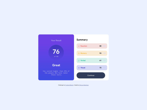
    Results Summary Webpage using Html and Css

    1
    P
    Huy Phan•3,430
    @huyphan2210
    Posted 5 months ago

    Hi @yeeezzzus,

    I've seen your solution and would like to share some thoughts:

    I'm not sure what you mean by "whenever I inspect again, it stops being responsive". You’ve defined a media query:

    @media (max-width: 600px)
    

    This means 600px is the breakpoint where the layout changes. Are you having trouble with this behavior?

    Could you clarify what you mean by "make it more responsive"? Your page currently has two layouts:

    • One for viewports 600px and below
    • Another for 601px and above (based on your media query)

    If you're referring to adding more breakpoints, you'll need to define where and how you'd like the layout to change.

    That said, media queries aren’t the only way to achieve responsiveness. CSS provides other techniques, such as:

    • CSS functions like clamp(), min(), and max()
    • Flexible units like em, rem, vw, and vh
    • CSS properties like flexbox, grid, and aspect-ratio

    Hope this helps!

    Marked as helpful
  • Yasmim•150
    @Yasmim-Coimbra
    Submitted 5 months ago
    What are you most proud of, and what would you do differently next time?

    Most proud of:

    • Successfully fixing all the size dimension issues i've encountered making this (there were a lot lol)
    • Mobile view
    What challenges did you encounter, and how did you overcome them?

    The hardest task by far was to make the cards size dimension exactly like the reference image. To do that i used fixed width values and positions: relative and absolute

    What specific areas of your project would you like help with?

    I'd like to know if there's another way to make the cards sizes as close to the reference as possible, but without using fixed width values and position: relative, position: absolute

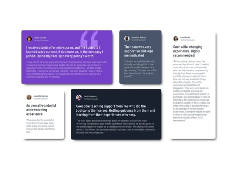
    Responsive Testimonial Section using Grid

    #pure-css#accessibility
    1
    P
    Huy Phan•3,430
    @huyphan2210
    Posted 5 months ago

    Hi @Yasmim-Coimbra,

    I've reviewed your solution and wanted to share some thoughts:

    For viewports larger than 1173px, you've defined the grid-template-areas as follows:

    grid-template-areas:
      "daniel daniel jonathan kira"
      "jeanette patrick patrick kira";
    

    This indicates that you're aware the Grid .container is divided into four columns. However, you haven't explicitly defined the width of each column. To maintain a structured layout, measure the width of each column and apply grid-template-columns accordingly. For example:

    .container {
      display: grid;
      grid-template-areas:
          "daniel daniel jonathan kira"
          "jeanette patrick patrick kira";
      grid-gap: 30px;
      grid-template-columns: repeat(4, 300px); /* Replace 300px with your measurements */
    }
    

    In this example, each column has a width of 300px. Since you've already assigned grid-area to each card, the next step is to remove the width properties you've applied to individual cards and the .container (e.g., width: 115%, width: 85%, or width: 82%). This will prevent them from interfering with the Grid layout.

    Additionally, remove position: relative from .container and position: absolute from .patrick to ensure proper alignment within the Grid.

    Hope this helps! Let me know if you need any clarifications.

    Marked as helpful
  • Muhamad Rukhul Kirom•380
    @rukhulkirom
    Submitted 5 months ago
    What are you most proud of, and what would you do differently next time?

    What are you most proud of?

    • Successfully implemented an interactive rating component that dynamically updates the UI based on user input.

    • Improved code structure by organizing JavaScript event listeners efficiently.

    What would you do differently next time?

    • Improve state management by using localStorage so that the rating persists even if the page refreshes.

    • Add a "rate again" button in the thank-you state so users can submit another rating without refreshing.

    What challenges did you encounter, and how did you overcome them?

    Challenge: Initially, clicking a rating button didn’t properly update the selected state, as multiple buttons could remain highlighted.

    Solution: Used forEach to remove the active class from all buttons before adding it to the selected one:

    ratingBtn.forEach((btn) => btn.classList.remove("active"));
    button.classList.add("active");
    

    This ensured only one rating could be selected at a time.

    What specific areas of your project would you like help with?
    1. Are there any redundant lines of code in my JavaScript that could be optimized?

    2. Does my CSS structure follow best practices? Could I improve it for better readability or maintainability?

    3. Is there a better way to handle rating selection without using forEach to remove the active class from all buttons?

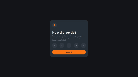
    Interactive Rating Component

    #accessibility#pure-css#web-components
    1
    P
    Huy Phan•3,430
    @huyphan2210
    Posted 5 months ago

    Hi @rukhulkirom,

    I've reviewed your solution, and I'd like to share some suggestions for improvement:

    1️⃣ Use a CSS Naming Convention (e.g., BEM)

    Using a convention like BEM can make your CSS more structured and easier to maintain. For example, instead of having .card and .thankyou-card, you could use:

    .card { /* Base styling */ }
    .card--thank-you { /* Modifier for thank-you card */ }
    

    This keeps your styles consistent and scalable.

    2️⃣ Remove Unnecessary id Attributes

    You assign ids to your cards but style them using classes instead. Since the ids aren’t necessary, I recommend removing them to avoid redundancy.

    3️⃣ Use Semantic HTML for Better Accessibility

    Instead of relying heavily on <div>, consider using semantic elements:

    • Use <article> instead of <div> for your cards.
    • Wrap <img> elements inside <figure> (or <picture> for responsive images).
    • You’ve correctly used <ul> with <li> for the .rating-btns—great! However, add type="button" to each .rating-btn for better behavior.

    4️⃣ Wrap Your Rating System Inside a <form>

    Instead of handling each button click separately, wrap your <ul class="rating-buttons"> and .submit-btn inside a <form>, then:

    • Set type="submit" on .submit-btn.
    • Handle the form’s submit event instead of attaching a click event to each rating button.

    5️⃣ Optimize Your JavaScript with Event Delegation

    If you're keeping the click event on each rating button instead of using a <form>, you can still make your JavaScript more efficient using Event Delegation:

    Before (Less Efficient)

    ratingBtn.forEach((button) => {
      button.addEventListener("click", () => {
        ratingBtn.forEach((btn) => btn.classList.remove("active"));
        button.classList.add("active");
        selectedRating = button.getAttribute("data-value");
      });
    });
    

    After (More Efficient with Event Delegation)

    document.querySelector(".rating-buttons").addEventListener("click", (event) => {
      const button = event.target.closest(".rating-btn");
      if (!button) return; // Ignore clicks outside buttons
    
      document.querySelectorAll(".rating-btn").forEach((btn) => btn.classList.remove("active"));
      button.classList.add("active");
      selectedRating = button.getAttribute("data-value");
    });
    

    ✅ Why is this better?

    • Only one event listener instead of one per button.
    • Less memory usage and improved performance.

    Hope this helps!

  • P
    Erik S. Carlsten•290
    @ecarlste
    Submitted 6 months ago
    What are you most proud of, and what would you do differently next time?

    When I initially looked at solving this it initially occurred to me to use a grid, although I wanted to see if I could get it right with flex box. It ended up being pretty simple to set up breakpoints to change only a few properties in order to get the layout to work in all 3 screen sizes.

    What challenges did you encounter, and how did you overcome them?

    I was hard time realizing that the tailwind classes for adjusting position in a container, switch the direction they work with depending on the main axis of the flex box. Some of them work with the main axis and some with the perpendicular axis.

    I ended up finding some helpful info in the tailwind docs.

    What specific areas of your project would you like help with?

    I'd like recommendations on how to improve the semantic html elements used throughout the page and components.

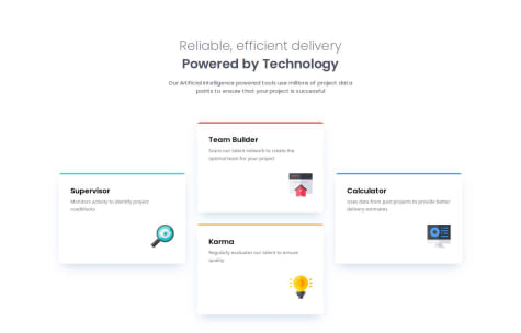
    Four Card Feature in React, Next.js, tailwindcss, and TypeScript.

    2
    P
    Huy Phan•3,430
    @huyphan2210
    Posted 6 months ago

    Hi @ecarlste,

    I've reviewed your solution and would like to share my thoughts:

    • You're wrapping a <div> inside <main>, even though it's the only child. Consider removing it and applying the CSS classes directly to <main> to reduce unnecessary nesting.
    • The first <section> works fine, but you could use <hgroup> instead, as it represents the page's headings.
    • Each card in the second <section> could be an <article> rather than a <div>. Also, there’s quite a bit of <div> nesting inside the cards. You could simplify it, as many of these elements can stand on their own with some CSS adjustments.
    • Tailwind provides utility classes for styling, but it's built on top of CSS, which ultimately controls your layout. I'd recommend deepening your understanding of pure CSS—it will help you work effectively with any CSS library, not just Tailwind.

    Hope this helps!

    Marked as helpful
  • Zi•150
    @code269
    Submitted 6 months ago
    What are you most proud of, and what would you do differently next time?

    I was able to apply the skills that I've learned so far in regards to spacing, writing more clean CSS, and how HTML/CSS interacts with each other. I believe my solution is very close to the design.

    What challenges did you encounter, and how did you overcome them?

    Getting the image sizing right was tricky, definitely an area of improvement / comfort I'd like to explore.

    What specific areas of your project would you like help with?

    Any optimizations or suggestions whether it's to my code structuring or naming conventions would be greatly appreciated!

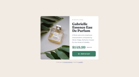
    Product preview card component - Mobile first, desktop responsive

    1
    P
    Huy Phan•3,430
    @huyphan2210
    Posted 6 months ago

    Hi @code269,

    I've reviewed your solution and would like to share some thoughts:

    Use <picture> for Responsive Images
    Instead of using CSS to switch between <img> elements based on viewport size, you can use the <picture> element to handle this more efficiently, reducing unnecessary CSS.

    Instead of this:

    <img class="card__img-mobile" src="./images/image-product-mobile.jpg" alt="Chanel perfume bottle">
    <img class="card__img-desktop" src="./images/image-product-desktop.jpg" alt="Chanel perfume bottle">
    

    Use this:

    <picture>
      <source media="(min-width: 768px)" srcset="./images/image-product-desktop.jpg">
      <img class="card__img" src="./images/image-product-mobile.jpg" alt="Chanel perfume bottle">
    </picture>
    

    This approach makes your code cleaner, more semantic, and reduces CSS complexity.

    Improve HTML Semantics

    You can enhance readability and structure by using more appropriate HTML elements instead of <div>:

    • card__content → Use <section> for better semantics.
    • card__text → Use <p> if it represents a paragraph.
    • card__subtitle → Use <span>, as it behaves as an inline element, making it a better fit for short text like tags.
    • The same applies to price-tag__bold and price-tag__small; using <span> is more appropriate than <div>, as they should remain inline.

    Hope this helps!

    Marked as helpful
View more comments

Stay up to datewith new challenges, featured solutions, selected articles, and our latest news

Frontend Mentor

  • Unlock Pro
  • Contact us
  • FAQs
  • Become a partner

Explore

  • Learning paths
  • Challenges
  • Solutions
  • Articles

Community

  • Discord
  • Guidelines

For companies

  • Hire developers
  • Train developers
© Frontend Mentor 2019 - 2025
  • Terms
  • Cookie Policy
  • Privacy Policy
  • License

Oops! 😬

You need to be logged in before you can do that.

Log in with GitHub

Oops! 😬

You need to be logged in before you can do that.

Log in with GitHub

Oops! 😬

You need to be logged in before you can do that.

Log in with GitHub

Oops! 😬

You need to be logged in before you can do that.

Log in with GitHub

Oops! 😬

You need to be logged in before you can do that.

Log in with GitHub

Oops! 😬

You need to be logged in before you can do that.

Log in with GitHub

Oops! 😬

You need to be logged in before you can do that.

Log in with GitHub

Oops! 😬

You need to be logged in before you can do that.

Log in with GitHub

Oops! 😬

You need to be logged in before you can do that.

Log in with GitHub

Oops! 😬

You need to be logged in before you can do that.

Log in with GitHub

Oops! 😬

You need to be logged in before you can do that.

Log in with GitHub

Oops! 😬

You need to be logged in before you can do that.

Log in with GitHub

Oops! 😬

You need to be logged in before you can do that.

Log in with GitHub

Oops! 😬

You need to be logged in before you can do that.

Log in with GitHub

Oops! 😬

You need to be logged in before you can do that.

Log in with GitHub

Oops! 😬

You need to be logged in before you can do that.

Log in with GitHub

Oops! 😬

You need to be logged in before you can do that.

Log in with GitHub

Oops! 😬

You need to be logged in before you can do that.

Log in with GitHub

Oops! 😬

You need to be logged in before you can do that.

Log in with GitHub

Oops! 😬

You need to be logged in before you can do that.

Log in with GitHub

Oops! 😬

You need to be logged in before you can do that.

Log in with GitHub

Oops! 😬

You need to be logged in before you can do that.

Log in with GitHub

Oops! 😬

You need to be logged in before you can do that.

Log in with GitHub

Oops! 😬

You need to be logged in before you can do that.

Log in with GitHub

Oops! 😬

You need to be logged in before you can do that.

Log in with GitHub

Oops! 😬

You need to be logged in before you can do that.

Log in with GitHub

Oops! 😬

You need to be logged in before you can do that.

Log in with GitHub

Oops! 😬

You need to be logged in before you can do that.

Log in with GitHub

Oops! 😬

You need to be logged in before you can do that.

Log in with GitHub

Oops! 😬

You need to be logged in before you can do that.

Log in with GitHub

Oops! 😬

You need to be logged in before you can do that.

Log in with GitHub